What Is Embossing a Guide for Modern Teams and Brands
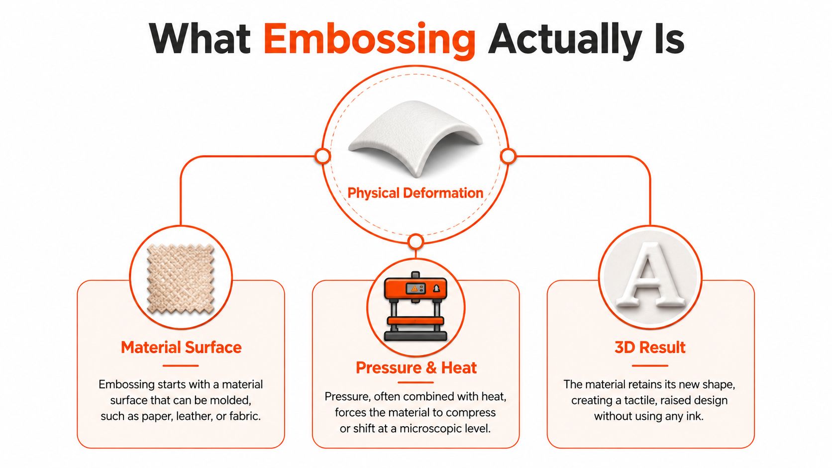
Embossing is a finish that uses matched male and female dies to permanently press a raised design into your material. No ink is required, the design becomes part of the substrate itself, which is why it feels premium and lasts as long as the garment.
That's the short answer, but the question teams ask is simpler: will this make the merch better, or just more expensive? If you've ever held a hoodie, notebook, or presentation box and felt the difference before you even read the logo, you already understand why embossing still has a place in modern merch.
Table of Contents
What Embossing Actually Is
You know the feeling when a piece of merch lands in your hand and it immediately feels more intentional than the rest of the stack. The logo doesn't sit on top of the surface, it looks built into it, and that subtle change does a lot of work before anyone reads a single word.
The physical part is the whole point
Embossing is a controlled deformation process. In manufacturing terms, it uses matched male and female dies to press material into a raised or recessed shape, sometimes with heat and sometimes with pressure alone, so the substrate permanently takes on the die geometry (IEEE topic overview, Britannica's embossing entry). That's why it isn't just decoration. It's surface engineering.
The technique has deep roots. Archaeological evidence from Italy identifies seven iron tools interpreted as embossing punches, gouges, and metalworking chisels dated to roughly 250–150 BC, and historical surveys note that embossed coinage long predates modern printing because coins were struck between die plates for centuries (Italian embossing evidence). By the 19th century, embossing had shifted from object-specific handwork into broader industrial use as printing and manufacturing scaled up.
Why it reads as premium instantly
A raised surface changes how light hits the material, and that's a big part of the appeal. The design catches the eye through shadow and relief, not color. That's why embossed merch often feels quieter, more restrained, and more expensive than a loud print.
For teams building branded apparel or packaging, the takeaway is simple. Embossing makes the logo part of the garment or object, not a layer sitting on top of it. If your goal is a finish that feels intentional in hand, this is one of the cleanest ways to get there.
Practical rule: if the brand needs to be noticed when someone touches the product, embossing earns its keep fast.
For a broader merch-technique overview, the Banger FAQ on merch printing techniques is a useful companion read.
The Main Types of Embossing
Different embossing styles solve different problems. Some are about subtle texture, some are about sharp definition, and some are about pushing a premium signal harder with shine or contrast.
The three versions you'll actually see
Blind embossing is the quiet one. It creates a raised design with no ink and no foil, so the effect comes entirely from form, shadow, and touch. On a heavyweight crewneck, that can look sharp, especially for a chest logo that should feel understated instead of loud.
Heat embossing uses elevated temperature to help the material take a cleaner impression. On thicker blanks like heavyweight hoodies or structured caps, that usually gives the design better definition and a crisper edge. It's the kind of choice that makes sense when you want the surface to read as polished, not handmade.
Foil embossing pairs the raised form with a metallic foil layer. That's the move when the goal is a more reflective, more obvious premium signal, like a welcome kit envelope or presentation sleeve that needs to stand out before it's even opened. If you want metallic shine, the finish starts to pull its weight there.
The book world has a strong reference point for this kind of detail work too. If you want to see how specialty finishing gets layered into a polished production system, Marquis Book Printing's advanced book finishing techniques is a solid resource.
Where each one fits
- Blind embossing: chest logos on crewnecks, notebook covers, packaging seals.
- Heat embossing: cap brims, thicker hoodies, structured paper goods.
- Foil embossing: invitation cards, welcome kits, launch mailers.
The interesting part is that each style carries a different brand message. Blind embossing says restraint. Heat embossing says precision. Foil embossing says arrival.
Embossing vs Debossing vs Foil Stamping
Your team choosing between embossing finishes is really deciding between three options. They want to know what looks best, what feels best, and what won't feel like a compromise six weeks later.
Side by side, the differences are clear
| Technique | Appearance | Tactile feel | Cost implication | Best use case |
|---|---|---|---|---|
| Embossing | Raised above the surface | Strong, noticeable relief | Usually higher because of tooling and setup | Logos that should physically stand out |
| Debossing | Recessed below the surface | Subtle indentation | Similar tooling logic, often used for understated looks | Matte, low-key branding |
| Foil stamping | Metallic surface detail | Can be flat unless paired with a die | Depends on foil and setup complexity | Shine, contrast, premium accents |
Embossing raises the design. Debossing pushes it inward. Foil stamping adds metallic visual impact, but it doesn't create depth unless it's combined with a die-based process. That's the cleanest way to think about it.
For a deeper look at foil-specific production, the Banger guide to foil hot stamping is helpful context.
Choosing the right one
If the logo should feel like a physical object on the product, embossing is the move. If you want a quieter, matte impression that doesn't shout, debossing usually lands better. If you're chasing shine and contrast more than depth, foil stamping wins.
Practical rule: choose the finish that matches the vibe of the item itself, not the one that looks biggest on a mockup.
That's where a lot of merch goes sideways. Teams pick the most dramatic finish in a preview, then realize the product needed restraint, not noise.
Materials and Substrates That Work with Embossing
Embossing only looks premium when the material can hold the form. Some blanks take a clean ridge. Others collapse, blur, or get crushed into something that reads cheap instead of deliberate.
Heavier materials usually behave better
Cotton and polyester blends can work well, especially when the fabric has enough body to hold the impression. Premium European blanks in the 400 to 500 GSM range tend to produce the cleanest raised detail because the surface has more structure to work with. Leather, canvas, and felt are also strong candidates because they hold depth and give the finish a tactile payoff.
The material math matters. One technical guideline says the width of lines and lettering should be at least twice the gauge of the material, and gives 0.474 mm stock as an example where a minimum stroke width of 1 mm helps avoid weak or incomplete raised detail (technical embossing guideline). Thin lines on the wrong substrate tend to vanish or deform. That's not a design issue, it's a physics issue.
Where embossing starts to fail
Thin fabrics are the obvious problem, but coated materials can be just as tricky. If the surface is too slick or too compressed, the die doesn't create a clean ridge, it just crushes the weave. That's when embossing starts to feel like a compromise instead of a premium detail.
For teams comparing finishes across materials, Banger's laser engraving guide is a useful adjacent reference because it helps separate raised surface treatment from precision marking on harder substrates. If you're also looking at industrial marking on metals, Evright Industrial's precision marking work shows how different materials call for different processes.
Best instinct: if the substrate already feels thin, floppy, or overcoated, embossing usually isn't the finish to force onto it.
Choose the blank first, then the finish. That order saves money and protects the end result.
Design and File Preparation for Embossing
Embossing is less forgiving than a lot of other merch techniques. A pretty mockup doesn't mean the die will translate cleanly, and production teams usually spot the problems long before the first press.
Start with vector artwork, not a screenshot
The die is engraved from the approved design, so embossing starts with vector artwork. iPackU notes that the artwork should be prepared as a vector file, and that the male and female dies are engraved from it using methods like photo-etching, routering, or hand-tooling (iPackU embossing overview). Printing for Less similarly describes the die as two metal plates built from the approved design.
Raster images, low-resolution PNGs, and hand-drawn sketches won't hold up here. They might be fine for a mockup, but they're not a production-ready starting point for die engraving. If the linework can't stay clean at full size, it won't survive the press.
Keep the design simple and readable
The strongest embosses usually have clear shapes, clean spacing, and enough line weight to survive the transfer. Fine detail gets lost fast. Gradients don't belong here at all, because a die doesn't create tonal transitions. It creates physical form.
A good production team will review the file before approval and flag the issues that matter. That e-proof step is where a lot of save-the-day revisions happen, and it's worth slowing down for.
- Use vector files: they scale cleanly and translate into dies properly.
- Avoid fragile detail: tiny text and hairline strokes usually disappear.
- Approve the e-proof carefully: once the die is made, fixes are slower and costlier.
The right design review is the difference between a crisp result and a soft, muddy one.
Cost, Production Timeline, and Quality Considerations
Embossing is one of those finishes that makes sense when you understand what you're paying for. If you only look at the first run, it can feel expensive. If you're planning reorders, it starts to make a lot more sense.
The tooling is the real upfront decision
Embossing usually requires a die set, and that tooling is the setup cost teams have to absorb first. The upside is that the die can often be reused on future reorders, which makes the process more economical when the same design comes back again. That's why embossing works better for recurring team apparel, packaging, and premium brand kits than for one-off novelty items.
Production setup also takes longer than simpler print methods because the die has to be engraved and mounted. Once the press is running, though, the per-unit pace is efficient. The bottleneck is usually in setup, not in the individual impressions.
When it's worth it
Embossing is worth the spend when the finish itself is part of the brand value. If the goal is a permanent tactile mark that helps the product feel deliberate, it earns a spot. If the goal is just to get a logo on a cheap item for a single event, it's usually overkill.
That's the commercial gap most explainer content misses. Buyers don't just need a definition, they need a decision framework. They need to know whether the added tooling, lead time, and material constraints are justified by how the merch will be used.
For teams thinking in fulfillment terms, the Banger merch fulfillment services overview is a practical companion because production choice and delivery strategy usually live in the same conversation.
Worth it when: the piece will be handled often, kept around, or reordered.
Not worth it when: the item is disposable, budget-first, or built for a one-night handoff.
Embossing also spans a wider substrate range than generic guides suggest, from leather and textiles to polymer films, but the result still depends on thickness and structure. That's the part to respect.
Merch Use Cases and Examples for Teams and Events
Embossing shines when the object itself is meant to feel kept, not tossed. The finish works because it adds restraint and depth, which is exactly what most premium merch is missing.
Where it shows up best
On onboarding kit envelopes and welcome packs, blind embossing on heavy cardstock creates a first impression that feels considered before the box is even opened. On heavyweight hoodies and crewnecks, a small chest or sleeve emboss reads like understated branding instead of noisy graphic merch. On caps and beanies, a tiny front-panel mark can feel like a detail rather than a billboard.
Tote bags and leather goods are where the finish can really earn its place. Those natural materials hold embossing in a way print can't replicate, and the result usually looks more permanent than decorative. If the object is meant to move through a lot of hands, that difference matters.
The Banger swag ideas guide is useful if you're mapping embossing to a broader merch drop and want to compare it against other product ideas.
The rule in practice
- For welcome kits: use embossing when the unboxing moment matters.
- For apparel: use it when the logo should feel architectural, not loud.
- For accessories: use it when the material itself can carry the detail.
Banger works with teams that want merch people wear and keep, not pieces that disappear after the event. Embossing is one of the finishes that helps make that happen because it changes how the item feels in hand, not just how it looks on a screen.
Making the Right Finish Choice for Your Next Drop
The easiest way to choose is to ask three blunt questions. First, do you want the design to feel raised or recessed. That splits embossing from debossing immediately.
Second, do you need metallic shine or a pure tone-on-tone finish. If you want shine, foil enters the conversation. If you want quiet depth, it doesn't.
Third, is this a one-time event run or something you'll reorder. That's where the tooling question becomes real, because a reused die can make a premium finish much easier to justify over time.
The best merch decisions usually aren't the flashiest ones. They're the ones that make the piece feel intentional every time someone picks it up. That's the lane embossing fits into when it's matched to the right material, the right file, and the right use case.
If you're weighing embossing against other finishes for your next merch drop, Banger can help you narrow it down with product previews, material guidance, and a quote built around the actual item you want to make. Visit Banger to explore options and start a custom merch run that feels intentional from the first touch.