Branding Water Bottles: A Guide for Modern Teams
Most advice on branding water bottles is stuck in promo-land. Bigger logo. Louder color. Cheaper unit cost. That's how you end up with a bottle nobody wants, nobody carries, and nobody remembers.
A branded bottle isn't a hydration tool first. It's a piece of daily gear. It sits on desks, in gym bags, on airport trays, in Zoom frames, and next to laptops all day. If it feels cheap, your brand feels cheap. If it looks like generic conference merch, it gets treated like generic conference merch.
The mistake is thinking design lives on the surface. It doesn't. Material, weight, grip, lid feel, silhouette, and finish do more work than most logos ever will. Existing guides also miss a blunt reality: 82% of users discard branded bottles within 3 months due to poor ergonomics, not just bad design, and brand recall happens during the act of drinking, which is why more teams are moving toward subtle details like laser-engraved marks and modular components instead of loud all-over promo treatment, as noted in this ergonomics discussion and trend reference.
There's another problem. Sustainability language is a mess. If your bottle says “eco-friendly” and nothing else, people read that as lazy at best, dishonest at worst. Material choice isn't just procurement. It's a brand statement. You're signaling taste, standards, and whether your team understands the difference between a product people keep and a product people politely throw away.
Good branding water bottles work the same way good streetwear or good hardware works. The object has to earn its place first. The branding should feel considered, not forced.
Table of Contents
- What's the best material for branding water bottles?
- Should the logo be big?
- Is engraving better than printing?
- How do you talk about sustainability without sounding fake?
- What design detail gets overlooked most?
- Are branded water bottles still worth doing?
Your Intro to Branding Water Bottles
Most branded bottles fail before the logo even gets applied. The wrong shape feels awkward in hand. The lid leaks or drinks badly. The finish scratches fast. Then marketing teams wonder why nobody keeps them.
That's not a branding problem. That's a product judgment problem.
The fastest way to improve branding water bottles is to stop treating them like disposable event giveaways. Treat them like a product drop. Ask the same questions you'd ask for a jacket, cap, or tote: would someone choose this if your logo wasn't on it? Would it still look good after months of actual use? Does it fit the visual world your brand already lives in?
Why culture beats visibility
A bottle people use becomes part of routine. That makes it more powerful than most low-effort merch because it earns repeated exposure without begging for attention. The bottle should fit into someone's desk setup, commute kit, training bag, or travel carry without looking like office leftovers.
Practical rule: If the bottle looks like something a recruiter would hand out at a trade show, start over.
There's a reason premium teams are moving toward quieter branding. A tonal logo, a clean powder coat, a sharp cap silhouette, or a subtle engraved mark reads better than a giant centered print on a shiny blank. People keep objects that respect their taste.
The sustainability trust gap is now a design problem
A lot of teams still think sustainability lives in campaign copy. It doesn't. It shows up on the object itself. If your bottle uses vague claims, fake-earthy colors, and generic “green” language, you've already lost credibility.
What matters is clarity. Name the material. Be specific about the finish. Make sure the physical quality backs up the message. If you choose a durable bottle and communicate it cleanly, the product does the talking.
Here's the opinion that saves budget: don't make a bottle that tries to say everything. Make one that says one thing well. Clean. Durable. Useful. Good-looking. Trustworthy. Pick the lane and build the object around it.
Choose Your Canvas A Guide to Bottle Materials and Types
Material choice is the first branding decision. It lands before the logo, before the packaging, before the insert card. People judge the bottle the second they touch it.
The broader category is only getting bigger. The reusable water bottle market is projected to reach USD 14.6 billion by 2032, and while plastic still holds the biggest share, stainless steel is growing faster at a 5% CAGR because brands are moving toward more durable, higher-perceived-value options, according to reusable water bottle market data from Market.us.
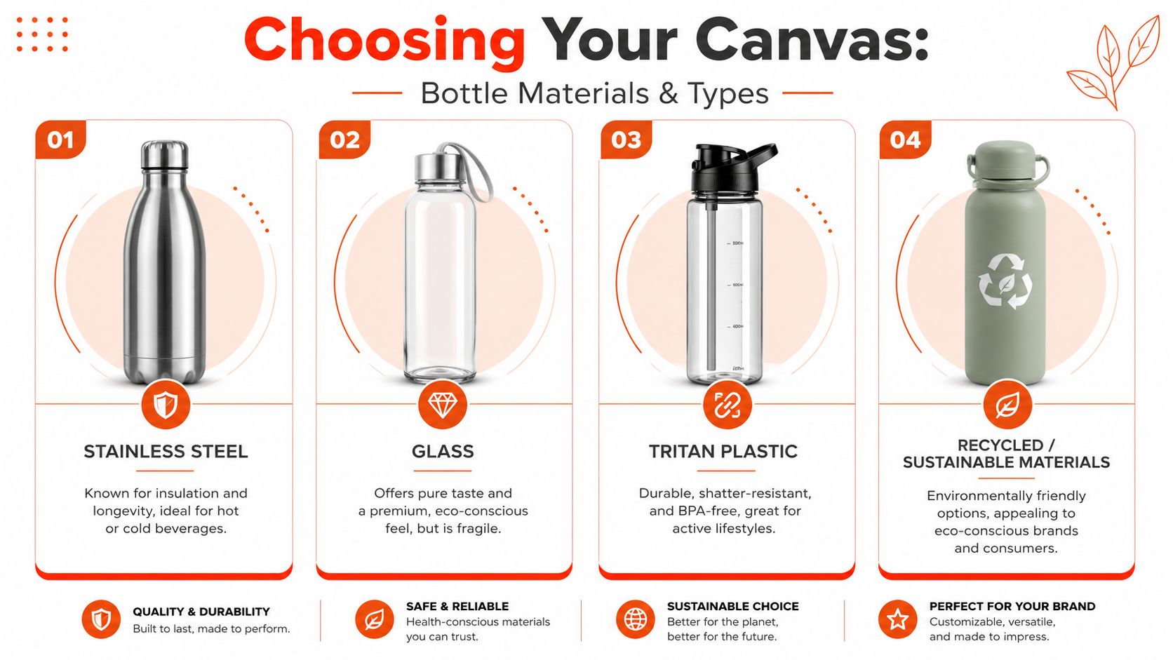
If you're comparing options for a team drop or event run, it helps to browse a real custom drinkware catalog before locking the material. Shape and finish matter as much as base spec.
Material is the message
Stainless steel is the strongest choice for premium positioning. It feels substantial, travels well, and takes engraving beautifully. If your brand sits anywhere near tech, finance, crypto, or minimalist fashion, this is usually the right move.
Glass has a sharp office aesthetic. It feels clean, pure, and design-forward. It also asks more from the user. It's better for desk culture than movement-heavy environments.
Tritan or quality plastic works when weight, durability, and cost discipline matter. That doesn't mean it has to look cheap. The clear versions can look crisp if the silhouette is right and the branding stays restrained.
Recycled or sustainability-led materials can work, but only if the product still feels good in use. Don't hide mediocre design behind eco language.
What each bottle type says about your brand
| Material | What it signals | Best fit |
|---|---|---|
| Stainless steel | Durable, premium, intentional | Team gifts, founder kits, executive drops |
| Glass | Clean, minimal, office-friendly | Creative studios, desk setups, wellness spaces |
| Tritan plastic | Lightweight, active, straightforward | Events, onboarding, large-volume giveaways |
| Recycled materials | Values-led, considered, modern | Sustainability campaigns, community drops |
The wrong move is copying what everyone else buys.
A startup with a sleek, stripped-back identity shouldn't use a glossy plastic bottle with a full-wrap print just because it's easy. A creative agency with a louder visual system shouldn't default to bare metal if the whole brand language is expressive.
The bottle should feel native to your brand world, not like a random SKU your procurement team approved.
A final note on form. Wide-mouth bottles are easier to clean and refill. Some neck shapes drink better. Some lids feel better one-handed. Those details decide whether the bottle lasts in rotation. Branding water bottles starts with use. If the product annoys people, the logo won't save it.
Make Your Mark Customization Techniques Decoded
Customization determines whether the bottle is enhanced or ruined. The technique should match the material and the brand mood. If those two things fight each other, the final product looks off even when the art is good.
Pick the technique that matches the vibe
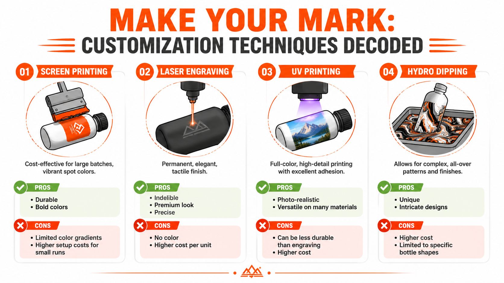
Laser engraving is the best option when you want restraint. It's permanent, tactile, and doesn't scream. For stainless steel, it usually gives the most expensive-looking result.
Screen printing is strong when the graphic system is bold and simple. Think solid spot colors, big iconography, and direct statements. It can look great on the right bottle, but it needs confidence and discipline.
UV printing makes sense when the visual identity needs more detail or full color. That's useful for creative teams, campaign graphics, or limited-edition art treatments. It can also drift into “promo product” fast if the bottle shape or finish isn't strong enough.
Hydro dipping is niche. It's for statement pieces, not everyday team basics. Use it when the bottle itself is meant to be the visual event.
A quick cheat sheet:
- Minimal brand system: choose engraving.
- Graphic streetwear energy: choose screen print.
- Illustration-heavy campaign: choose UV print.
- Experimental art object: consider hydro dipping.
If you want a technical breakdown of small-object decoration logic, this guide to pad printing services is useful because it shows how print method changes detail, durability, and feel.
Artwork mistakes that make premium bottles look cheap
A few mistakes show up constantly.
Too much branding
Front logo, side slogan, back URL, lid mark, hashtag. Stop. Pick one hero move.Using a colorful print on the wrong bottle
Matte black steel with a one-color engraving feels precise. The same bottle with bright multi-color print can feel confused.Ignoring moisture and handling
If you're building a labeled bottle for sports, school, or heavy daily use, look at practical references for waterproof labels for water bottles. The point isn't to copy label aesthetics. It's to understand what survives real life.
Good customization looks inevitable. It feels like the bottle was made that way, not decorated after the fact.
The smartest branding water bottles often use less decoration, not more. A neck engraving. A small vertical mark. A tactile grip area with subtle branding. Quiet wins when the object itself is strong.
Nail the Design Artwork Dielines and File Prep
A sharp concept can still die in production if the file setup is sloppy. Bottles are curved, reflective, and less forgiving than flat merch. What looks balanced on a screen can warp, shrink, or disappear once it wraps onto the product.
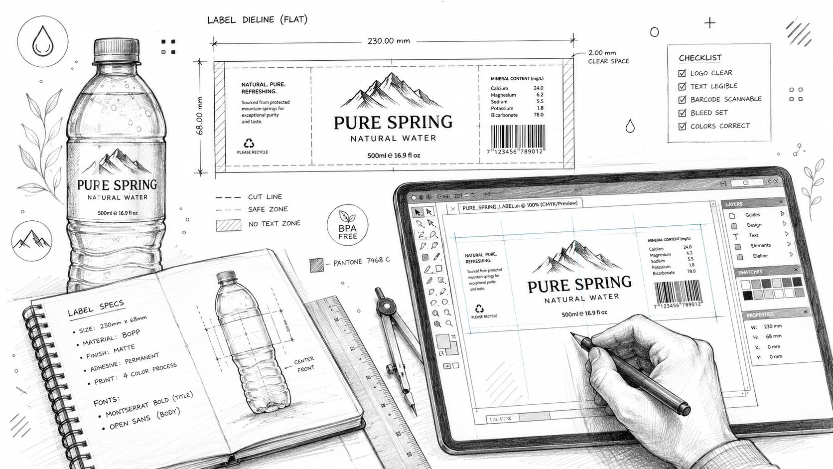
The core specs aren't optional. For cylindrical bottles, the logo should be centered and take up 15% to 25% of the front-facing area for visibility. Graphics need 300 DPI at actual print size, and curved surfaces work best with bold sans-serif fonts at a minimum of 10-point size plus strong contrast between text and background, based on water bottle label design guidance from Grand Springs.
The non-negotiables
Use vector files first. AI, EPS, or SVG is the standard. A web JPEG is usually the fastest route to fuzzy edges and bad color translation.
Then check placement against the dieline. Every bottle has a printable zone, and that zone is rarely as generous as people think. Caps, curves, tapers, and grip changes all eat space.
Here's the production checklist that avoids most headaches:
- Start with vector artwork: logos should scale cleanly without softness.
- Use the actual template: don't center by eye on a mockup and hope.
- Simplify tiny details: thin strokes and delicate serifs get ugly fast on curves.
- Test contrast hard: if your text only works on a bright monitor, it won't hold up in hand.
- Match the print method: engraving, UV, and screen print all interpret art differently.
How to plan files without production drama
The expensive part of bottle production usually isn't the bottle. It's the delay. Wrong files create proofing rounds, rework, and missed launch dates.
That's why it's smart to get help early if your internal team is strong on brand but weaker on production setup. A solid custom design services team can translate a clean identity system into files that survive manufacturing.
Bad file prep doesn't just hurt print quality. It slows approvals, confuses vendors, and turns a simple merch run into an operations problem.
If you want the bottle to look premium, treat dielines like design tools, not admin paperwork. That's where precision starts.
The Bottom Line Budget MOQs and Lead Times
Teams often waste money on water bottles in one of two ways. They either buy too cheap and regret the quality, or they over-order because someone got hypnotized by volume pricing.
Both are avoidable.
Where budget actually matters
Spend on the parts people touch. Bottle body, finish, lid mechanism, and customization method matter more than novelty extras. A cheap cap ruins a good bottle faster than a simple graphic ever will.
The smartest budget split usually looks like this:
- Upgrade the vessel first: better material and better hand feel beat bigger print areas.
- Keep branding tight: one strong application usually outperforms layered decoration.
- Protect the finish: if the coating or print can't handle daily use, the bottle ages badly.
- Leave room for packaging: presentation changes how the product is perceived on arrival.
A bottle that feels solid out of the box can carry a lighter graphic treatment. A weak bottle forces branding to overcompensate, and that never ends well.
Why low minimums beat bulk panic
High minimum order quantities push teams into bad decisions. You order one safe design for everyone, too many units, and end up storing leftovers that nobody's excited about.
Low minimums are better strategy. They let you test one engraved version for internal teams, one louder version for events, and a tighter run for partners or creators. That's how merch starts acting like product, not office supply.
One more practical issue is sourcing. If you're trying to hit a specific silhouette, lid style, or finish that isn't standard catalog stock, custom sourcing can save the drop. A resource like custom product sourcing FAQs assists by framing what's realistic before you commit.
The best bottle programs also think about the handoff moment. A good unboxing creates context. The recipient opens a mailer, sees a bottle nested cleanly with an insert or message card, and instantly understands it as a deliberate object, not random merch. That's the difference between “free stuff” and “they nailed this.”
Beyond the Bottle The Unboxing and Fulfillment Drop
You can make a great bottle and still lose the moment on delivery. If it arrives loose, generic, or badly packed, the product drops a level before anyone unscrews the cap.
Unboxing is part of the brand
The package should support the object, not compete with it. Clean mailers, a good insert, tissue if it fits the aesthetic, and a bottle bag when portability matters. For teams that want a functional add-on instead of more printed paper, Jolitee bottle bags are a useful reference point for how carrying accessories can extend the usefulness of the bottle itself.
Don't over-style it. Premium doesn't mean stuffing the box with filler. It means every element feels intentional.
A simple sequence works best:
- The outer box looks clean and brand-right.
- The bottle is secure and presented upright or centered.
- The insert says something worth reading.
- Nothing rattles, leaks, or feels accidental.
Fulfillment should feel invisible
Modern teams rarely ship to one office anymore. They ship to remote hires, speakers, creators, clients, and communities across different countries. That makes fulfillment part of product design, not back-office admin.
A proper merch fulfillment service matters because it handles multi-address shipping, tracking, and packaging consistency without forcing your internal team to become a warehouse.
The best fulfillment is boring in the best way. People get the right bottle, in the right packaging, at the right address, and nobody on your team spends a week chasing tracking links.
That's how a bottle drop feels polished. Not just because the object is good, but because the whole experience lands clean.
Branded Water Bottle FAQs
What's the best material for branding water bottles?
If you want the safest premium choice, pick stainless steel. It has the strongest mix of durability, perceived value, and clean decoration options. Glass works for office-heavy environments. Tritan or quality plastic works when you need lighter weight and higher-volume distribution.
The right answer depends on who's using it and where.
Should the logo be big?
Usually, no. Most bottles look better with restraint. A centered logo can work, but only when the shape, finish, and scale are right. Huge marks often make the bottle feel like event overflow.
If your identity is strong, you don't need to scream it.
Is engraving better than printing?
For many premium bottles, yes. Engraving feels more permanent and more considered, especially on stainless steel. Printing still has a place when your brand relies on color, illustration, or a more expressive visual system.
Pick the method that fits the object. Don't force a loud decoration onto a quiet bottle.
How do you talk about sustainability without sounding fake?
Be specific. Consumers are skeptical for a reason. 73% of water bottle labels contain misleading claims, and 68% of consumers distrust generic “eco-friendly” language when there's no third-party verification displayed on-pack, according to Food Dive's coverage of water bottle label confusion.
That means vague copy hurts trust. Name the material. State what's verifiable. If you can't prove it, don't print it.
What design detail gets overlooked most?
Ergonomics. Bottles need to feel good in hand, fit daily routines, and drink well. Shape, cap style, grip, and carry comfort all affect whether the bottle survives beyond launch week.
A beautiful bottle that's annoying to use is still a failed product.
Are branded water bottles still worth doing?
Yes, if you treat them like gear. No, if you treat them like filler merch.
A good bottle has real staying power because it lives in routine. It gets used at desks, on flights, in gyms, and during commutes. That makes it one of the few branded objects people will keep close, but only if the product quality is there first.
If you want help building branded bottles that feel more like a product drop than a giveaway, Banger is worth a look. They make premium custom merch for internet-native teams, with factory-direct pricing, low minimums, French atelier production, and worldwide fulfillment. You can request a quote, get product previews within 24h, and build merch your team wants to keep.