Company Jacket Logo: Design Tips Your Team Will Love
The most repeated advice on company jackets is also the thing that ruins them: put the logo on the left chest, make it visible, call it done.
That logic builds uniforms, not pieces people choose. For internet-native teams, a jacket has to survive outside the office, outside the offsite, outside the launch event. If it reads like compliance wear, it dies in a closet. If it reads like an actual garment, it stays in rotation.
A good company jacket logo isn't just about placement. It's about proportion, fabrication, customization method, and whether the final piece feels closer to a brand drop than a corporate handout.
Table of Contents
- Why Most Company Jackets End Up in the Back of a Closet
- Logos on apparel have always been strategic
- The best company jacket logos feel intentional
- Embroidery when you want permanence
- Print when the logo needs air
- Patches when you want a designed object
- Customization Technique Comparison
- Should I use the full-color logo or a monochrome version
- Can we reorder small batches for new hires later
- Can one order include mixed jacket styles, sizes, and colors
Why Most Company Jackets End Up in the Back of a Closet
Most company jackets fail before production starts. The team picks an average blank, drops a logo in the standard spot, and assumes brand visibility is the win. It isn't. The true test is whether someone throws it on for coffee, a flight, a coworking day, or dinner after an event.
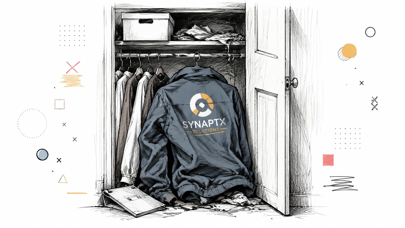
The problem is familiar. The fit is boxy in the wrong way, the logo is oversized, and the whole thing feels like managed culture. That's why the company jacket category gets a bad reputation. Not because jackets are a weak merch product, but because they are often treated like leftover event inventory instead of actual apparel.
If you want ideas that avoid that trap entirely, this roundup of swag ideas people keep using is a better starting point than the usual promo catalog mindset.
A jacket becomes valuable when the wearer forgets it was made for work.
The brands that get this right don't start with placement rules. They start with the garment's role in a wardrobe. Is it supposed to feel clean and minimal? Utility-driven? Streetwear-adjacent? Executive but relaxed? Once that's clear, the logo becomes part of the composition instead of an interruption.
That shift changes everything. Suddenly the company jacket logo stops being decoration and starts acting like identity.
Your Logo Is a Vibe Not Just a Brand Mark
A logo on a jacket does two jobs at once. It identifies the company, and it tells people what kind of brand this is. For startups, creator brands, fintech teams, crypto protocols, and modern tech companies, that second job usually matters more.
There's real business weight behind that. 75% of consumers globally recognize a brand solely by its logo, and consistent logo use across platforms, including branded apparel, correlates with a 23% increase in revenue, according to these logo statistics. That's why a company jacket logo isn't a throwaway embellishment. It's a brand asset with real stakes.
Logos on apparel have always been strategic
This isn't some new startup-era trick. Adidas used the three stripes as its identity mark on clothing and shoe designs as a marketing aid, a precedent documented in the brand's historical overview. The playbook is old. The styling has changed.
What changed is taste. Loud placement used to signal confidence. Now it often signals low design sensitivity. Teams want something that feels like a product, not a promo item. That means your logo has to carry more than recognition. It has to carry mood.
The best company jacket logos feel intentional
A good logo treatment should match how the brand behaves online and in person. If your product language is restrained, the jacket shouldn't scream. If your brand is bold and irreverent, whisper branding may feel too precious.
A few sharp rules help:
- Match the logo to the garment energy. A technical shell, a wool overshirt, and a heavyweight bomber don't want the same treatment.
- Reduce before you enlarge. Simplifying the mark often creates a stronger result than scaling it up.
- Choose one signal. Minimal placement, bold texture, tonal color, contrast print. Pick a lane.
For teams that need support refining the mark itself before it hits apparel, custom design services for merch can help clean up lockups, simplify details, and adapt a logo for fabric instead of screens.
If the logo makes the jacket feel less wearable, the logo is doing the wrong job.
The goal isn't maximum exposure. The goal is association. People should want to be seen in it.
Beyond the Left Chest Strategic Logo Placement
The left chest isn't wrong. It's just overused, and often used without taste. The bigger issue is that standard placement ignores how people currently wear jackets.
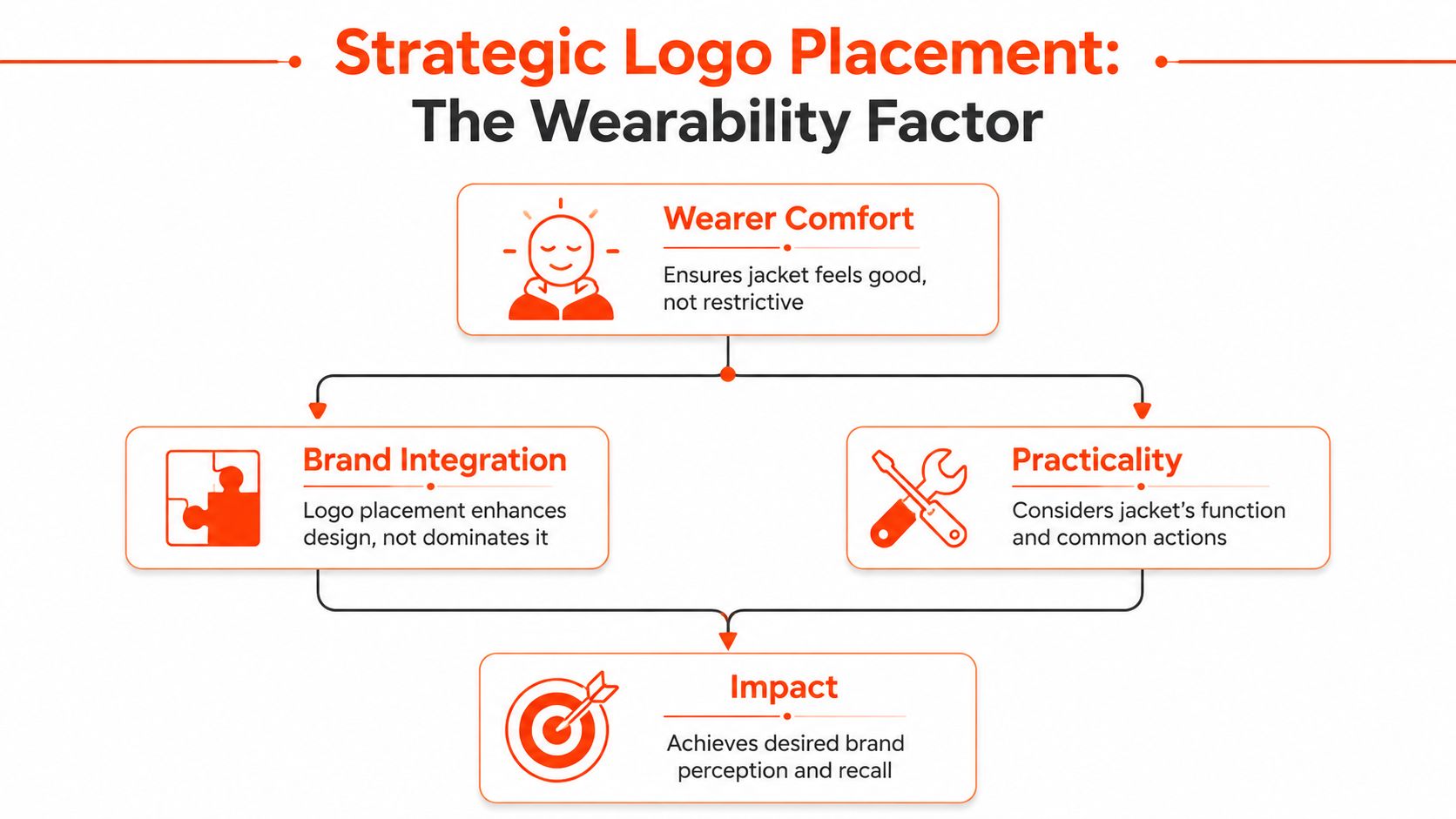
68% of employees reject uniform-style swag because it feels too corporate, which is why the better question is where to place the logo so teammates choose to wear the jacket outside work, as discussed in this guide on logo placement for jackets. That gets into fashion psychology fast. Placement changes whether a piece feels branded, styled, or forced.
Wearability beats visibility
A logo can be technically visible and still ruin the jacket. Large chest embroidery on a casual fleece can pull the eye to the wrong area. A low placement on a zip jacket can look accidental. A wide logo across the shoulder blades can turn a clean silhouette into conference merch.
Use placement to support the jacket's natural lines:
- Work with seams and panels. Yokes, cuffs, sleeve heads, and hem spaces often create cleaner visual anchors than open-body placement.
- Respect drape. If the logo stiffens the garment or interrupts how it falls, the piece starts looking cheaper.
- Think in motion. Standing still in a mockup isn't real life. People zip jackets, sit down, layer hoodies, sling bags over shoulders.
For a more technical breakdown, this embroidery placement guide is useful when you're deciding what can be executed cleanly on different garments.
Later in the process, seeing examples in motion helps more than static diagrams. This quick video is worth a look:
Placement options and what they signal
Different placements create different social reads. That matters more than most merch buyers admit.
| Placement | What it feels like | Where it works best |
|---|---|---|
| Left chest | Familiar, clean, safe | Corporate outerwear, team issue jackets, understated basics |
| Back yoke | Quiet and premium | Minimal shells, coach jackets, overshirts |
| Sleeve hit | Sporty, technical, slightly streetwear | Softshells, bombers, quarter zips |
| Cuff or forearm | Insider detail | Fashion-leaning jackets, niche communities |
| Hem area | Lifestyle-coded | Casual jackets, denim, chore coats |
| Interior neck label or hidden placement | Quiet luxury, low-key affiliation | Founder gifts, premium onboarding, design-sensitive teams |
Practical rule: The less a jacket looks like assigned clothing, the more often people wear it.
Here's what usually doesn't work:
- Huge front logos on premium fabrics. They flatten the whole look.
- Placement too close to pockets or zips. The logo ends up fighting hardware and stitching.
- Symmetry for its own sake. Adding a second hit just to balance the jacket often makes it busier, not better.
The best company jacket logo placement depends on what role the jacket plays. Team uniform. Community signifier. Founder gift. Event piece. New hire onboarding. Each one asks for a different level of visibility.
The Right Customization for Your Jacket and Brand
Technique decides whether the logo feels expensive, subtle, bold, or off. Often, teams overlook this key point. They choose customization based on habit instead of matching the method to the fabric and silhouette.
The pairing matters. Thick embroidery on heavy 400 to 500 GSM fabrics can cause puckering, and oversized embroidery often looks cheaper than small, strategic prints. For chest logos, a 3.5-inch max width is recommended to preserve garment drape, according to this workwear embroidery placement guide.
Embroidery when you want permanence
Embroidery gives a company jacket logo weight and texture. It's usually the right move when the jacket already has structure and can carry that extra dimension.
Jackets can support flat, 3D, and chenille embroidery, which opens up very different outcomes, from subtle to bold and tactile, as shown by apparel customization examples from UNBND Blanks.
- Flat embroidery works for restrained chest logos, tonal branding, and refined placements like cuffs or sleeves.
- 3D embroidery has presence. It's better on caps and some heavier outerwear than on every jacket by default.
- Chenille is graphic and textured. It fits varsity language, heritage references, and larger patch-style applications.
Print when the logo needs air
Print is often the smarter choice when the logo has fine detail, softer edges, or a more graphic feel. It can sit flatter, read cleaner, and avoid the stiffness that embroidery adds.
Use print when:
- the fabric has texture that could distort thread
- the design needs a sharper silhouette
- the jacket is casual enough to handle a more editorial graphic treatment
This is also where minimalist branding starts to make sense. A small tonal print at the back yoke or hem can feel much more current than a thick embroidered chest mark.
Patches when you want a designed object
Patches create separation between logo and garment. That can be a strength. An embroidered patch, woven patch, or PVC patch can make the branding feel more considered, especially on workwear-inspired jackets or utility shapes.
The risk is obvious. Cheap patch execution reads cheap immediately. Wrong border thickness, wrong edge finish, wrong scale, and the whole jacket starts feeling like giveaway gear.
Here's the cleanest way to compare the main options:
Customization Technique Comparison
| Technique | Best For (Fabric/Style) | Aesthetic Feel | Durability | Cost Factor |
|---|---|---|---|---|
| Embroidery | Structured jackets, bombers, fleece, premium outerwear with stable surfaces | Textured, premium, permanent | Strong when scaled appropriately | Mid to high |
| Lightweight jackets, smoother shells, graphic-led styles | Clean, modern, less bulky | Depends on fabric and method | Low to mid | |
| Patches | Workwear jackets, varsity references, utility styles | Designed, tactile, layered | Strong if patch and attachment are done well | Mid |
One practical note. If you're comparing vendors, ask whether they can handle multiple techniques on the same project, including embroidery, print, patches, labels, and finishing details. Banger is one example of a custom merch partner that does that across French ateliers and factory-direct production, which is useful when the jacket needs more than a basic chest hit.
Prepping Your Artwork Like a Pro
Bad artwork is the fastest path to bad merch. A weak file can make even a good jacket look off. Edges get soft, colors drift, details fill in, and the final logo loses all the discipline it had on screen.
What production ready actually means
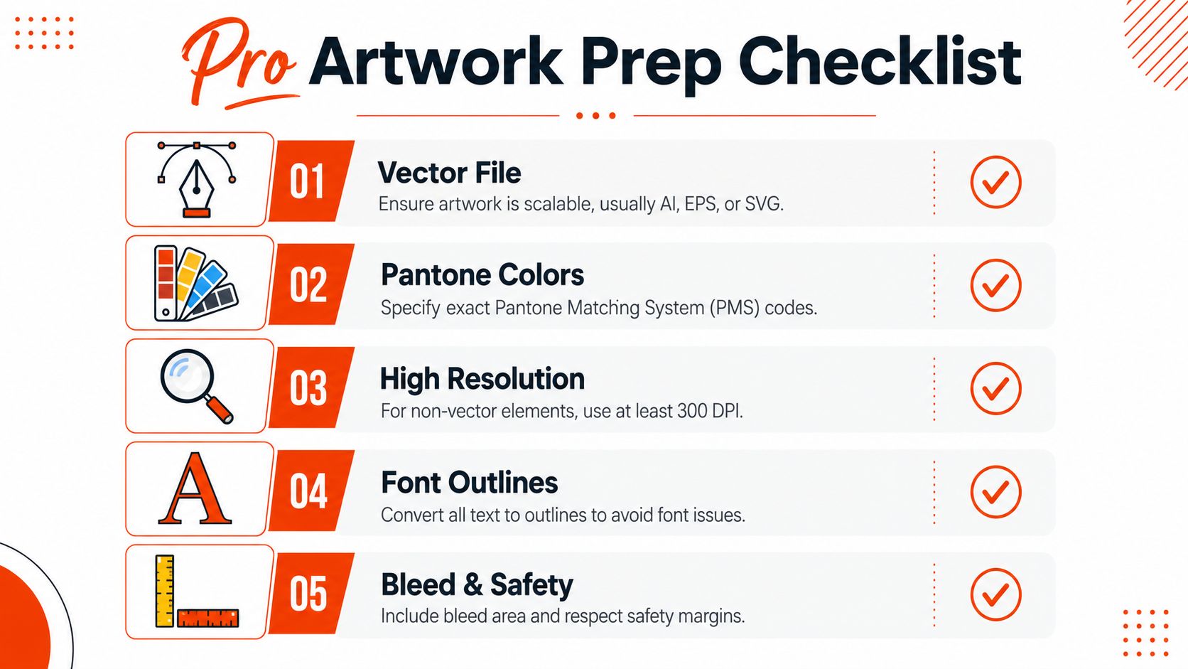
Start with vector files. AI, EPS, or SVG are the formats that keep edges sharp at different scales. PNG and JPG files can be useful for reference, but they're not a substitute for production art if you want clean embroidery digitizing or precise print output.
Your handoff should include:
- Vector master file. AI, EPS, or SVG with the final approved logo.
- Color references. Pantone codes if brand color accuracy matters.
- Size callouts. State the intended width for each placement, not just “small” or “large.”
- Placement notes. Left chest, sleeve, back yoke, hem, or interior label. Be exact.
- Outlined fonts. Convert type to outlines so nothing breaks at production.
If you're sending a visual reference, include a mockup that shows placement relative to seams, zippers, or pockets. This prevents the classic mistake where a logo is technically centered but visually wrong.
For teams that need a cleaner approval flow, this guide to a custom merch mockup process is useful because it shows what to confirm before anything goes into sampling.
Send one source-of-truth file package. Multiple versions with unclear naming create production mistakes fast.
A production-ready logo isn't about being fancy. It's about removing ambiguity.
From Quote to Unboxing The Production Timeline
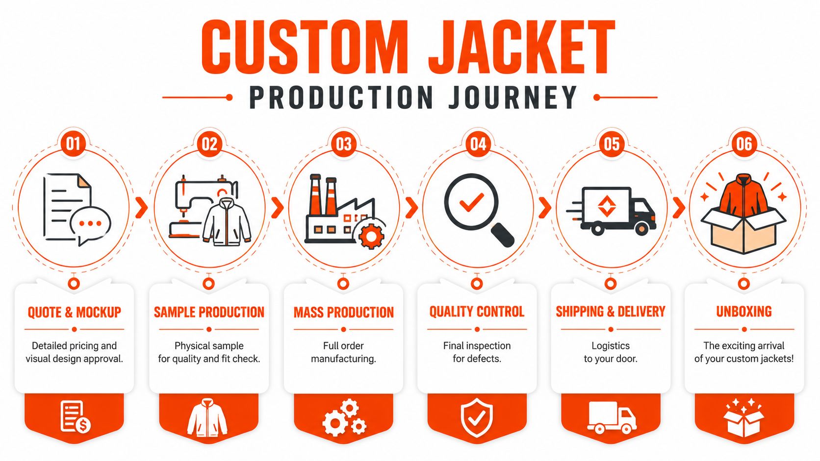
Most frustration around custom jackets comes from not knowing what happens after the first inquiry. Teams assume the hard part is choosing the jacket. Usually the hard part is aligning artwork, approvals, sampling, logistics, and distribution without something drifting.
What happens before production
The early phase is where good projects stay clean.
Quote and product selection
You lock the jacket style, customization method, quantities, and shipping setup.Mockup review
During mockup review, scale and placement get corrected on screen before money gets burned in thread, ink, or patches.Sample or BAT approval
If the jacket matters, don't skip approval. During approval, you catch issues in proportion, thread sheen, fabric behavior, and logo visibility under real light.
If you need a sense of how long the quoting stage typically takes, this page on custom merch quote timing lays out the front-end process clearly.
What happens after approval
After signoff, the workflow becomes operational.
- Production covers decoration, assembly, and finishing details.
- Quality control checks that the logo is consistent and the garments are clean.
- Packing and fulfillment determine whether this lands as a pile of bulk cartons or a polished distributed-team shipment.
For modern teams, logistics often matter as much as the jacket. Founders need small runs for new hires. Marketing leads need multi-address shipping for remote teams. Community teams need packaging that doesn't feel like commodity fulfillment.
The unboxing is part of the garment. A strong jacket in weak packaging still feels unfinished.
The cleanest partners make this boring in the best way. Clear approvals, realistic lead times, low minimums where possible, direct factory pricing, and worldwide fulfillment without a maze of intermediaries. That matters because company jackets usually aren't one-and-done. If the first run works, someone will need reorders, size swaps, event extras, or onboarding batches.
Quick Guide to Avoiding Bad Merch
Most bad merch isn't one big mistake. It's a stack of small lazy decisions that add up to a jacket nobody reaches for.
A quick pre-flight check helps.
- Don't start with a weak blank. If the jacket fabric, fit, or silhouette feels generic, no logo treatment will save it.
- Don't force a corporate lockup onto a lifestyle garment. A streetwear bomber and a boardroom softshell don't speak the same design language.
- Don't overbuild the chest hit. As covered earlier, oversized decoration can distort the garment and cheapen the look.
- Don't ignore embroidery style. Flat, 3D, and chenille embroidery each create a different outcome, from subtle and premium to bold and textured.
- Don't skip the sample. Mockups catch one kind of mistake. Physical approval catches the rest.
- Don't treat packaging like an afterthought. If this is a premium team drop, the arrival should match the jacket.
- Don't design for one event only. Design for repeat wear. Conference relevance fades fast. A clean jacket lasts.
The strongest company jacket logo projects are the ones with restraint. Better blank. Better scale. Better finish. Less noise.
Your Company Jacket Questions Answered
Should I use the full-color logo or a monochrome version
Use the version that belongs on the jacket, not the one that's most familiar from slides or your website. Full color can work, but monochrome usually wears better on outerwear. If the jacket is already doing a lot with texture, panels, or hardware, simplify the logo so it doesn't compete.
Can we reorder small batches for new hires later
Yes, if the original design files, placement specs, and approvals were documented properly. Reordering gets much easier when the first run has a locked source-of-truth package. That includes the exact jacket style, decoration method, thread or print references, and approved placement notes.
Can one order include mixed jacket styles, sizes, and colors
Often yes, but only if you make the decoration strategy consistent enough to survive across those variations. A logo that works on a black fleece may not look right on a navy shell or a cream overshirt. Before mixing styles or colors, check whether the same company jacket logo treatment still feels intentional on each base.
A good rule is to standardize the visual system, not force identical execution. Keep the logo family, placement logic, and overall brand mood consistent, then adapt the method where needed.
If you're building a company jacket that should feel like part of your team's wardrobe, not leftover event merch, Banger can help with product selection, customization, production, and global fulfillment. You can explore the catalog, request a quote, or get product previews within 24h.