Acrylic Keychain Maker: The Complete Buyer's Guide 2026
You're probably staring at a merch brief right now with the usual tension baked in. The event team wants something affordable, leadership wants it on-brand, and nobody wants another forgettable item that ends up at the bottom of a tote bag by lunch.
That's where acrylic keychains get misread. They are often treated like filler merch. Cheap add-on. Last-minute conference table piece. In practice, they can work a lot harder than that. A well-made acrylic keychain holds color well, carries shape cleanly, travels easily, and gives you more visual freedom than most low-cost event items.
The difference is the maker. A generic acrylic keychain maker will give you a flimsy rectangle with bad hardware and a print that looks tired before the event even starts. A good one turns a small object into a real brand asset, something people clip to a bag, camera case, or keys because it looks good.
Table of Contents
- Why acrylic still wins
- What separates premium from disposable
- The small details that change perception
Beyond The Giveaway Bin
Most event merch fails for one simple reason. It feels temporary.
You've seen the pile. Thin lanyards, generic notebooks, stress balls, plastic pens, and a random keychain nobody asked for. It all lands in the same category. Low intention, low quality, low recall. If you're already spending on event giveaways, that's a bad trade.
Acrylic keychains deserve a better reputation than the swag industry gives them. The base material is PMMA, or Polymethyl Methacrylate, first developed in 1928 and industrialized in 1933, which is why it became such a strong fit for durable, transparent promotional products according to Ankeral's acrylic keychain overview. That matters because acrylic isn't the problem. Cheap execution is.
Why most giveaway keychains look cheap
The failure usually starts with one of these decisions:
- Bad artwork choices: A tiny logo dropped onto a blank shape rarely feels intentional.
- Weak hardware: Even a decent print looks low-grade when the ring bends or tarnishes fast.
- No point of view: If the piece doesn't connect to the brand's culture, it reads like procurement, not design.
Teams that get better results treat the keychain like a miniature product, not a throwaway trinket. They think about silhouette, finish, print method, and how the object will live in practice. On keys. On a tote. On a zipper pull. On a desk tray after the event.
A keychain is small, but it's still packaging your brand in physical form.
That's the useful shift. Stop asking whether acrylic keychains are premium enough. Start asking whether your current merch standards are high enough. If you're rethinking the whole event table, this broader list of event swag ideas that don't feel disposable is a smart place to pressure-test the rest of the lineup too.
What a good acrylic keychain actually does
A strong keychain can:
- Carry complex visuals well
- Fit high-volume distribution without becoming visually generic
- Work for launches, onboarding kits, creator merch, and event giveaways
- Feel collectible when the art direction is sharp
That last point matters more than people think. The best merch items aren't always expensive. They're considered.
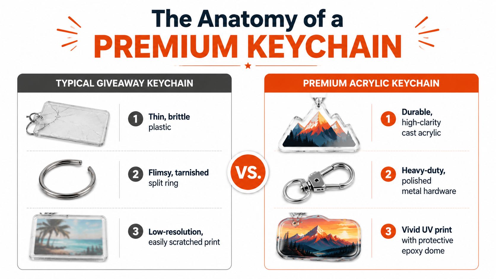
The Anatomy of a Premium Keychain
Premium acrylic keychains aren't just “printed plastic.” They're built objects. Once you understand the construction, it gets easy to spot the difference between a decent sample and something you'd be proud to hand out.
Why acrylic still wins
Acrylic gives you a combination other materials struggle to match. It's clear, lightweight, color-friendly, and easy to cut into custom shapes without losing crispness. For design-heavy teams, that freedom matters more than people expect.
Metal can look refined, but it changes the whole mood. Leather feels warmer, but it limits color and shape language. Acrylic stays versatile. It can go playful, sharp, graphic, minimal, or collector-style depending on how you build it.
If your broader merch system includes desk accessories and branded utility pieces, this kind of custom office supplies catalog helps frame where acrylic sits in the full mix.
What separates premium from disposable
The strongest build for double-sided keychains uses a four-layer assembly. That includes the acrylic substrate, UV-printed design, adhesive bonding layer, and top acrylic sheet. The print bonds at the material level, and CNC machining holds a ±0.1mm tolerance for clean edges and proper durability, as described in this commercial printing discussion on double-sided acrylic production.
That sounds technical, but the design effect is simple. Better edge finish, cleaner alignment, stronger feel in hand.
Here's how I usually break the tiers down for clients:
| Build style | What it feels like | Best use |
|---|---|---|
| Single-board basic print | Flat and serviceable | Short-run promos with simple art |
| Double-board acrylic | Cleaner, more durable, more finished | Brand merch, retail-style drops, better event pieces |
| Epoxy-domed acrylic | Glossy, tactile, more visual depth | Collector-style designs, illustrated artwork, polished gifting |
The small details that change perception
Hardware matters almost as much as the acrylic itself. A polished split ring, colored clasp, or more deliberate attachment style changes the object from giveaway to accessory. The same goes for shape. A clean die-cut silhouette always looks more intentional than a default circle or rectangle unless the graphic system specifically calls for that restraint.
A few quality tells worth checking before approval:
- Edge clarity: Cloudy or rough edges make the whole piece look rushed.
- Print registration: If layers drift, the artwork loses sharpness.
- Hole placement: Off-center holes make even good art feel amateur.
- Protective finish: Without proper surface protection, wear shows too fast.
Practical rule: If the hardware looks like an afterthought, the whole keychain will feel like one.
Thickness is another subtle cue. Buyers may not know the spec sheet, but they notice heft, rigidity, and how the piece sits in the hand. Premium perception usually comes from stacking several smart choices, not one flashy add-on.
Dialing In The Details
Acrylic gets interesting when you stop treating it like a logo carrier and start treating it like a format.
That's where an acrylic keychain maker either becomes useful or limiting. The generic version offers standard clear stock, basic cut lines, maybe one hardware option, and calls it customization. A better partner understands that finish, light, texture, and silhouette are doing branding work too.
Finishes that change the whole read
A clear keychain with a straightforward print can look clean. It can also look unfinished if the artwork needs more dimension. Therefore, finish decisions are vital.
A glossy dome changes how light rolls across the surface. Holographic accents add movement without forcing brightness into the art itself. Glitter can work well for creator merch, community drops, or playful campaigns, but it needs restraint. Too much effect and the object starts reading novelty instead of brand system.
Good finish choices usually follow the identity, not the trend:
- Spot gloss works when the logo or icon needs contrast against a matte or flatter visual field.
- Holographic foil fits internet-native brands, gaming-adjacent teams, creator merch, and launches with a digital-first feel.
- Glitter accents make sense when the brand already has humor, color, or collectibility built in.
- Frosted effects soften the look and can push a cleaner, more editorial aesthetic.
The best finish is the one that makes the artwork feel more itself, not more decorated.
If you're selling multiple variants online, the customization logic matters as much as the object. Teams running Shopify stores should understand mastering Shopify line item properties, especially when customers need to choose artwork versions, attachments, names, or limited-edition options before checkout.
Shape is part of the branding
The fastest way to make a keychain feel generic is to force a logo into a default shape that has nothing to do with the brand. Custom die-cut outlines solve that. A mascot, icon, UI element, symbol, product silhouette, or even a strange asymmetric contour can make the piece feel designed instead of ordered.
I've seen simple concepts work better than crowded ones. A bold silhouette with disciplined negative space usually lands harder than five visual ideas competing inside a tiny format.
A few creative directions that consistently hold up:
Icon-first pieces
Use one unmistakable brand mark and let the cutline do the talking.Character or mascot charms
Strong for creators, gaming teams, communities, and drops with fandom energy.Object-based shapes
Product miniatures, tools, packaging silhouettes, or interface references can feel smart when the audience gets the reference.Layered storytelling
Front side for the main graphic, back side for a phrase, date, event title, or subtle secondary mark.
If the artwork includes small logos, symbols, or tiny placement areas across other merch formats too, understanding pad printing services for detailed applications helps you choose the right decoration method across the rest of the collection.
From Your Screen to Their Hands
Good acrylic production gets decided long before the machine starts cutting. Most disappointments happen in the file.
A design can look sharp on a monitor and still fail in hand if the scale, color setup, or cut path isn't ready for physical production. That's why the handoff matters. Marketing team, designer, and maker all need the same read on what “approved” means.
Start with the production checklist.
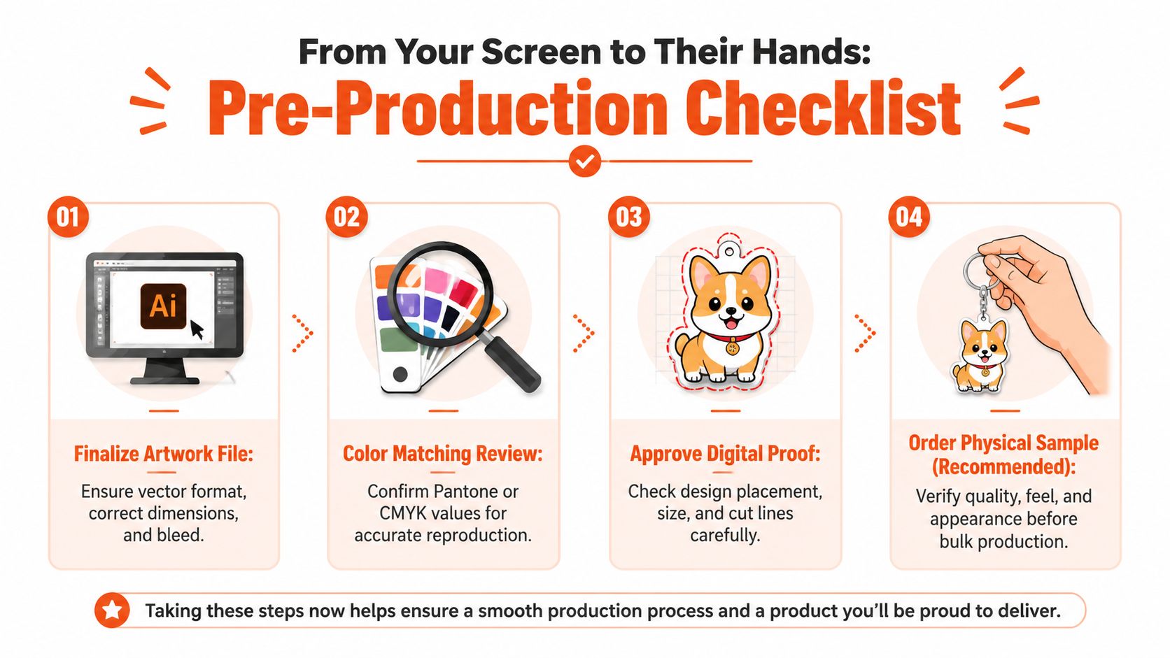
A production file checklist that saves reprints
For clean output, production files should be set to CMYK, 300 DPI, and at least 1000 pixels wide. For the hardware hole, laser cutters require a 4mm inner circle diameter and a 2mm threshold so the keyring stays secure, based on this production walkthrough on acrylic keychain setup.
Those specs aren't optional polish. They're the difference between a crisp object and a compromised one.
Use this as a pre-proof filter:
- Artwork setup: Build in CMYK from the start if possible, not as a last export fix.
- Resolution check: If the file only works when viewed small on screen, it probably won't hold up physically.
- Transparent background: PNG or PSD is usually the safest route when the design relies on clean edges around the cut shape.
- Cutline awareness: Don't let key elements drift too close to the edge or hardware hole.
For teams building physical products more broadly, Quikly's guide on producing products is a useful companion read because it frames the production workflow in a way non-manufacturing teams can use.
A design partner can help catch these issues before they become expensive. If the in-house team is strong on brand but less experienced in object production, custom design support for merch development can close that gap.
Designing for a small format
This is the part people usually underestimate. A keychain is tiny. That changes the hierarchy.
Small-format art works best when you simplify aggressively:
- Make one thing dominant: Usually the icon, mascot, or central phrase.
- Use negative space on purpose: Crowded art looks cheaper faster.
- Respect the attachment point: The top hole interrupts the design whether you plan for it or not.
- Check edge safety: Fine lines at the perimeter can disappear or look fragile.
If someone has to squint to understand the piece, the design is still in draft form.
The proof should answer practical questions, not just aesthetic ones. Can the linework survive the cut? Does the hardware placement fight the composition? Does the backside add value or just duplicate the front? That's the standard to use before signing off.
The Numbers Behind The Drop
Price gets people's attention first, but quantity strategy matters just as much.
Acrylic keychains have one major advantage over a lot of other branded accessories. They scale well. In the custom market, per-piece pricing drops from about $1.09 for orders of 100 to 249 units to about $0.44 for orders above 25,000 units, according to Vivipins' custom keychain pricing breakdown. That's a real reason event teams keep coming back to them.
Where price actually moves
The biggest cost levers are usually straightforward, even when the quote feels opaque.
| Cost driver | What changes the quote |
|---|---|
| Quantity | Higher volume improves per-piece efficiency |
| Complexity | Extra finishes, layered builds, and unusual shapes add work |
| Hardware choice | Better clasps and upgraded attachments change the unit price |
| Number of designs | More variants can complicate setup and batching |
That doesn't mean bigger is always smarter. If your audience is narrow or the campaign is experimental, over-ordering is how merch turns into dead inventory.
To better understand:
- High-volume events: Optimize for clean design, efficient production, and broad appeal.
- Community drops: Spend more attention on art direction and collectibility.
- Onboarding kits: Keep the piece durable and brand-right, but don't overcomplicate it.
- Retail-adjacent merch: Prioritize finish, hardware, packaging, and consistency.
Low minimums change the strategy
MOQ shapes behavior. If a maker forces large quantities, teams play it safe. One design. One version. Minimal experimentation. That usually leads to generic merch.
On the other hand, low minimums let you test a concept before scaling it. That's useful for capsule drops, event-specific runs, creator collaborations, or pilot programs. In the European custom production space, some premium manufacturers support minimum order quantities as low as 1 unit per item, with a practical floor of 10 units per apparel order, based on Lemuta's custom production page. That flexibility is a useful benchmark for how modern merch production is changing.
The operational side matters too. Once quantities rise, warehousing, kitting, and multi-address shipment start affecting the actual cost of the drop more than people expect. If your order is headed to events, distributed teams, or customer gifts, it helps to plan with a partner that already handles merch fulfillment services for global distribution.
Lead times should be discussed early, especially if sampling is involved. The fastest quote means very little if the proof cycle is messy.
Choosing the Right Acrylic Keychain Maker
Most buyers compare acrylic keychain makers by price and sample photos. That's not enough.
You're not just buying a unit cost. You're choosing edge quality, print discipline, communication habits, packaging standards, and in some cases whether your merch is even compliant for the markets you operate in. For global brands, that last point isn't a legal footnote. It's part of the sourcing brief.
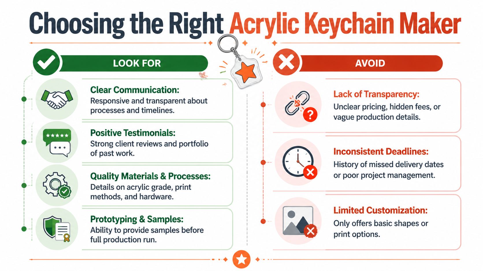
Questions worth asking before you place the order
A serious maker should be able to answer basic production questions clearly. If they can't, expect trouble later.
Ask things like:
- What material are you using exactly? “Acrylic” isn't specific enough.
- How is the print protected? A good sample should tell you how the surface will age.
- How are edges finished? This is one of the fastest visual tells of quality.
- Can you provide a real sample or proof photo? Mockups hide a lot.
- What hardware options are available? Attachment quality changes perception fast.
You should also pay attention to how they communicate. Fast replies are nice. Clear replies are better. If timelines, material details, and limitations stay vague, the production probably will too.
A broader guide to sustainable promotional materials is also useful here, especially if your team is reviewing merch choices across multiple categories instead of keychains alone.
Cheap samples can hide expensive problems. The proof stage should reduce uncertainty, not create it.
Compliance is not a side issue
Acrylic buying advice often falters. Teams talk about color, shape, and pricing, then ignore whether the material is viable for corporate gifting across regions.
Many “no-minimum” acrylic keychains use non-recyclable polystyrene, which is non-compliant for corporate gifting in several EU countries under REACH guidelines, making certified sustainable bio-acrylic the only viable option for global brands, according to Melody Charms' clear acrylic product page. If you're sourcing for Germany, the Netherlands, or a broader EU rollout, that should be reviewed before artwork is approved, not after units arrive.
This changes the buying criteria:
Material documentation matters
If a maker can't explain what the substrate is, don't guess.Sustainability claims need verification
“Eco-friendly” on a product page means nothing without specifics.Global brand standards are stricter than creator merch standards
What works for a small online shop may not work for a multinational gifting program.
Acrylic keychains can absolutely be on-brand and responsibly sourced. You just need a maker that treats compliance as part of quality control, not as an optional upsell.
Create Keychains People Wont Throw Away
A buyer leaves a conference with a tote full of branded stuff, then clears half of it into the hotel trash that night. The pieces that survive are rarely the cheapest. They are the ones that feel intentional enough to earn a place on keys, a bag, or a zipper pull for the next six months.
That is the true standard for acrylic keychains. The job is not to produce the lowest-cost unit. The job is to create a small branded object that keeps showing up in daily life, without creating compliance headaches for a regional team or sustainability questions from procurement later.
A kept keychain has a long tail. It stays in photos, on desks, in UGC, and in the hand every time someone turns a key. A throwaway version does the opposite. It burns budget once, disappears fast, and can subtly lower the perceived quality of the rest of the brand system.
So the closing advice is simple. Design for attachment, not distribution volume.
That usually means choosing one graphic idea that reads instantly at small scale, producing fewer SKUs, and resisting the urge to cram a campaign message into every millimeter. It also means asking one final question before approval: would someone keep this if the logo were smaller? Teams that answer that candidly tend to make better merch decisions across the board.
For global brands, there is one more layer. A keychain that looks good but creates material or documentation issues is still a bad buy. The strongest programs treat aesthetics, usability, and sourcing as part of the same brief, because brand value drops fast when a giveaway has to be excluded from certain markets or explained after the fact.
The acrylic keychains that last are usually the quiet winners. Clean shape. Clear artwork. Material choices a brand team can stand behind. That is how a small format stops acting like event filler and starts working like brand infrastructure.
If you want to build merch that feels considered instead of disposable, Banger is worth a look. They help internet-native teams create custom merch with premium materials, low minimums, French atelier production, and worldwide fulfillment. You can explore the catalog, request a quote, and get product previews within 24h for your next drop.