Custom Shirt Printing: A Guide for Modern Teams
You're probably here because someone on your team said, "We need shirts," and now you're staring at a mess of options that all claim to be premium, fast, and affordable.
Most custom shirt projects don't go wrong at the design stage. They go wrong in the decisions underneath it. The design might be good. The logo might be great. But custom shirt printing lives or dies on what sits under the graphic: the blank, the print method, the placement, the finish, and the production setup behind it. Get those right and your shirt feels like a real piece of apparel. Get them wrong and it feels like conference swag with a startup logo on it.
That distinction matters more than ever. The global custom t-shirt printing market was valued at USD 5.16 billion in 2024 and is projected to reach USD 9.82 billion by 2030, with a projected 11.5% CAGR from 2025 to 2030, according to Grand View Research's custom t-shirt printing market analysis. This isn't a side category anymore. It's a real industry with room for cheap promo tees, fashion-grade drops, and everything in between.
Table of Contents
Why Most Company Merch Is Forgettable
Many have owned the same bad tee. Boxy fit. Rough fabric. A logo printed too big across the chest. After one wash, the print starts looking tired and the shirt becomes sleepwear at best.
That result usually isn't caused by one catastrophic decision. It's death by a hundred shortcuts. Someone picks the cheapest blank because the budget's tight. Someone exports the art from a slide deck. Someone places the logo where it fits on the mockup instead of where it looks right on a body. The shirt gets made, technically. It just doesn't get worn.
The problem is that teams often treat merch like procurement, not brand building. But apparel doesn't behave like a sticker or a landing page. People judge it with their hands first. Then with the mirror. Then with social context. If the piece feels off, they know immediately.
Great merch doesn't happen by accident. It's a stack of small, intentional decisions that all point in the same direction.
The gap between disposable swag and wearable apparel is usually the gap between “put our logo on something” and “make something our team would choose on a Saturday.” That's why the best operators obsess over details most buyers skip.
A useful starting point is understanding what a premium custom merch supplier actually handles behind the scenes. Once you see how many variables shape the final product, the bad merch story stops feeling mysterious. It becomes fixable.
What forgettable merch usually gets wrong
The blank feels generic: Thin fabric, awkward fit, and a collar that loses shape quickly.
The print method doesn't match the design: Fine-detail art forced into a method that can't hold it cleanly.
The scale is wrong: Oversized graphics on small tees, tiny chest marks on oversized silhouettes.
The finishing is missing: No custom label, no thoughtful packaging, no signal that anyone cared beyond checkout.
Good custom shirt printing is part production logic, part taste. Both matter.
The Print Method Matrix
A founder approves the graphic on a laptop, then the sample arrives and the shirt feels wrong. Same logo. Same colors. Different energy. That shift usually comes from the print method.
Print choice is not a production footnote. It decides whether the piece reads like retail, tour merch, team uniform, or conference freebie. Ink weight, surface texture, edge definition, and how the graphic ages after washes all shape that read.
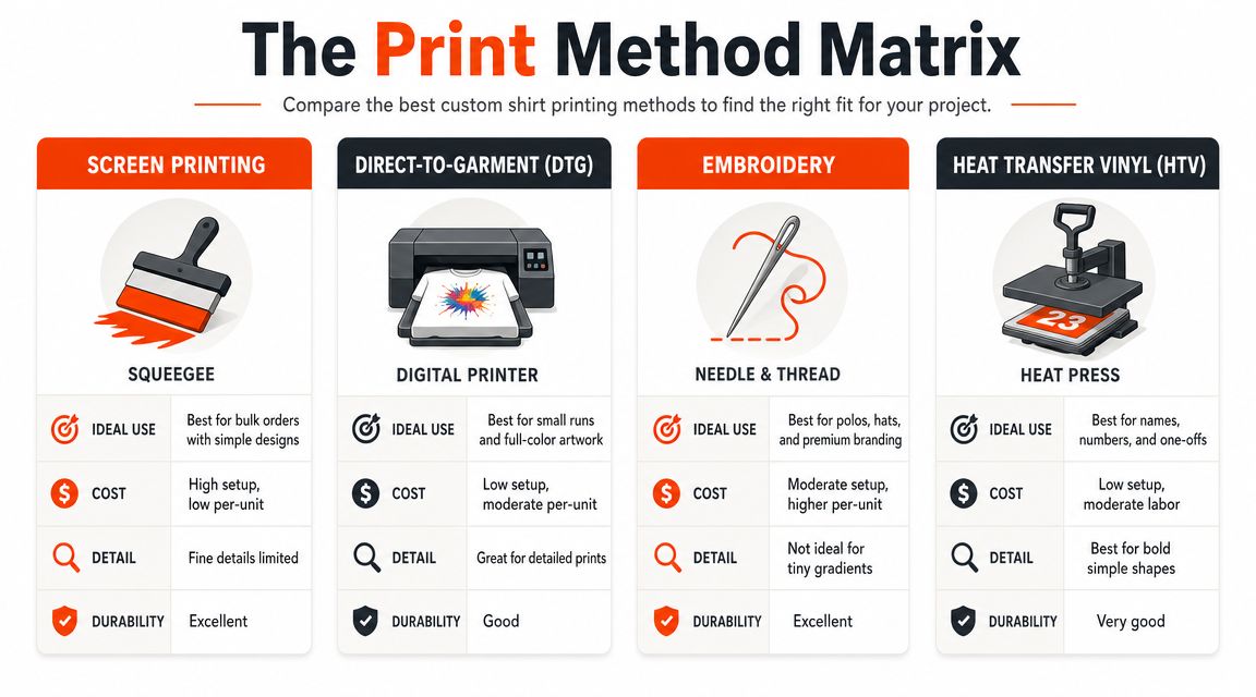
Start with the side-by-side view.
Screen printing for bold consistency
Screen printing still sets the standard for graphic tees. Each color usually needs its own screen, so setup takes time and money. Once the job is dialed in, repeatability is strong and the unit cost starts making more sense as quantities rise.
It also carries a specific aesthetic language. Screen print looks best when the art has conviction. Clean type, hard shapes, limited palettes, and graphics with intentional negative space tend to look sharper here than they do in softer digital methods. If the goal is a shirt that feels grounded in streetwear, music merch, skate, or brand uniforms with some backbone, screen print usually wins.
The trade-off is flexibility. Photographic art, subtle gradients, and frequent design changes can turn a screen print job into a slower, more expensive route than it needs to be.
DTG, DTF, embroidery, and sublimation in real life
DTG prints directly into the garment, which makes it useful for artwork with tonal shifts, painterly texture, and image-heavy compositions. It is often the cleanest answer for short runs when you want detail without paying for multiple screens. The visual result usually feels less assertive than plastisol screen print, which can be a strength if the brand world is softer, more editorial, or more art-driven.
DTF is the practical fixer. It works across more fabric types, handles small details well, and helps when the blank is not ideal for DTG. But it can introduce a transfer character that is visible and tangible, especially on larger prints. For some projects that is acceptable. For a premium fashion-forward tee, it can be the thing that makes the shirt feel produced instead of designed.
Embroidery belongs in this conversation because it changes status fast. A small stitched mark on a cap, quarter-zip, or heavyweight fleece reads more permanent than ink. On the wrong artwork, though, embroidery can look stiff, busy, or cheap. Fine lines, tiny type, and large filled areas often fight the medium.
Sublimation sits in its own lane. It works best on garments built for all-over color and synthetic performance fabrics. On the right product, the print becomes part of the surface rather than sitting on top of it. On the wrong product, it looks like a workaround.
Here's a quick visual walk-through of shirt printing in practice:
Print Method Decision Guide
| Technique | Best For | Feel & Vibe | Cost Profile |
|---|---|---|---|
| Screen printing | Larger runs, bold graphics, simple color builds | Classic streetwear, confident, durable-looking | Higher setup, better economics as volume rises |
| DTG | Small runs, detailed art, photo-style graphics | Softer visual finish, more image-driven | Lower setup, less ideal when scaling the same print |
| DTF | Mixed fabrics, flexible production needs, detailed logos | Practical, versatile, less heritage-driven than screen print | Useful when other methods are restrictive |
| Embroidery | Caps, chest logos, premium basics, uniform-style pieces | Textural, elevated, structured | Depends on stitch complexity and placement |
| Sublimation | All-over graphics, performance-oriented pieces | Integrated, graphic-heavy, sport-adjacent | Best when the product is built for it |
A good rule is simple. Match the method to the garment first, then to the artwork. Brands that skip that step usually end up with merch that is technically correct and culturally off. For a broader breakdown of how different merch printing techniques fit specific garments and design goals, review the method in context instead of treating it like a generic spec sheet.
Choosing Your Canvas The Art of Blank Selection
A strong print on a bad blank still reads as a bad shirt.
Founders often spend hours on artwork, then treat the base garment like a commodity. That's backwards. The blank decides the drape, the weight, the collar shape, the softness, and whether the piece still looks good after repeat wear. It also sets expectations before anyone notices the graphic.
The blank sets the ceiling
If you want merch that feels retail, start with a blank that already feels like something worth buying. A premium tee should have presence. Not stiffness for the sake of it. Presence. The fabric should hang well, the neck should feel clean, and the silhouette should suit the brand. A crypto conference tee and a design-led creator drop probably shouldn't use the same body.
There's also a values layer here. The World Economic Forum notes that the fashion sector remains under scrutiny for waste and emissions, and consumer expectations are moving toward more durable, lower-impact products in its piece on fashion's environmental impact. Better blanks aren't just a taste choice. They align with the idea that merch should be kept, not discarded.
What to look for in a premium blank
Fit first: Standard retail, boxy, oversized, cropped, and vintage-inspired fits all tell different stories. Choose the shape that matches your brand world.
Fabric hand: Some shirts feel dry and structured. Others feel smooth and broken-in. Neither is automatically better. The point is intentionality.
Collar and construction: Cheap ribbing and weak necklines ruin even good prints.
Material story: Organic cotton, recycled blends, and better sourcing matter more when the piece is meant to live beyond one event.
Material rule: If the shirt doesn't feel good blank, printing on it won't save it.
The easiest way to calibrate taste is to browse a premium blanks and apparel catalog the same way you'd shop for your own wardrobe. Ignore the logo for a minute. Would you wear that body if it came from a brand you already like? If the answer is no, keep looking.
Decoding Costs and Production Timelines
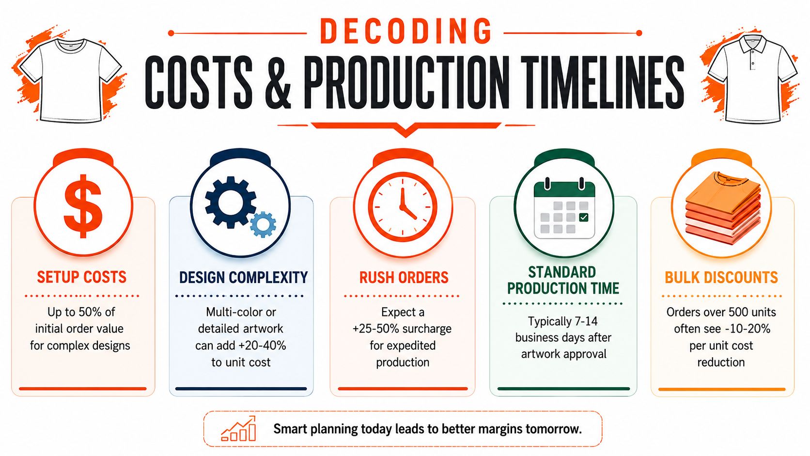
A founder gets two quotes for 250 shirts, same artwork, same delivery week, and the cheaper option comes in far lower than expected. Nine times out of ten, that gap is not magic. It is a different garment, a different print setup, a different level of QC, or a shop pricing for speed by stripping out the details that make the shirt feel worth keeping.
That matters because cost is not only about budget. It shapes perception. A stiff blank with a flat print can hit your target price and still read like conference swag. A better body, cleaner placement, and tighter finishing cost more up front, but they change how people wear the piece, photograph it, and talk about your brand.
Why two similar quotes can feel miles apart
Pricing usually moves on four levers, and each one affects both the invoice and the final read of the product:
Garment choice: The blank sets the floor. Cheap tees lower unit cost fast, but they also change drape, collar shape, and how premium the print feels in hand.
Print complexity: Extra colors, oversized prints, sleeve hits, specialty inks, inside labels, and precise placement all add labor and setup time.
Order size: Some print methods get efficient at volume. Others are better for small runs, but the per-unit cost stays higher.
Service level: Art cleanup, pre-production sampling, proofing, folding, bagging, relabeling, and multi-address fulfillment all show up somewhere in the quote.
A low number can be the right number. It depends on the job. Event tees, staff shirts, and one-day activations have different priorities than a brand drop or investor mailer. The mistake is treating them like the same product.
What slows production down
Production usually breaks before the press ever starts.
Low-resolution art needs repair. Print size is still being debated. The team approves a mockup, then changes the blank. Shipping addresses come in after packing starts. Someone asks for a "premium feel" without defining fit, fabric, or finish. That is how a five-day plan turns into a two-week scramble.
A cleaner schedule looks like this:
Lock the garment early
Match the print method to the artwork
Approve placement carefully
Finalize fulfillment before production begins
If you want real numbers, not vague estimates, get a custom merch quote based on your artwork, garment, and production scope - free, no-commitment, in 24 hours.
The Finishing Details That Make the Difference
A shirt becomes a piece when the hidden details feel considered.
Anyone can print a front graphic. Fewer teams think about what happens at the neck label, the hem, the tag, or the packaging. That's where the shirt stops feeling like an order and starts feeling like a product.
Small upgrades that change the whole read
Custom neck labels do a lot of work. Replacing a generic brand tag with a woven or screen-printed label removes the “blank with a logo” feeling immediately. The same goes for custom hang tags. They don't need to be elaborate. They just need to feel like they belong to the brand.
Other strong upgrades include:
Woven labels: Best when you want a cleaner retail-style finish.
Printed inside neck details: Useful for comfort and a lighter result.
Embroidered name tags: Good for team gear, hospitality, field staff, or utility-inspired apparel.
The main print gets attention. The finishing details earn trust.
Packaging is part of the product
If you're shipping to distributed teams, creators, clients, or community members, the package becomes the handoff. A shirt tossed into a plain mailer lands like a transaction. A branded shipper with tissue, insert, or sticker lands like a drop.
That doesn't mean overdesign everything. It means making the experience coherent. The packaging should match the shirt's tone. If the garment feels minimal and refined, the unboxing should too.
For teams building a fuller identity system, custom labels and name tag options for merch are often the detail that shifts the whole project into a different category.
How to Avoid Common Custom Merch Fails
Most merch fails are predictable. The good part is that they're also avoidable.
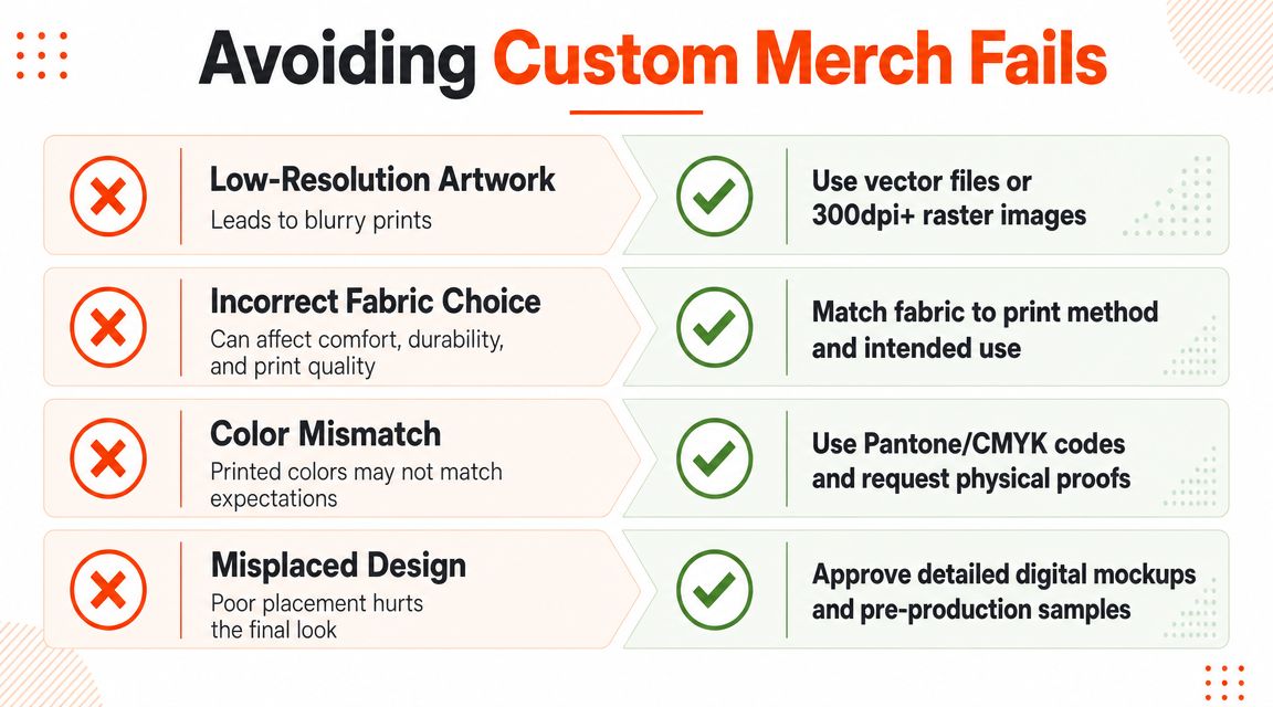
The first trap is assuming a nice mockup guarantees a nice result. It doesn't. Mockups are marketing images. Production files are manufacturing inputs. If those two worlds aren't aligned, the final shirt will expose the gap immediately.
Bad files create expensive problems
For digital shirt artwork, the practical benchmark is 300 DPI at final print size, not upscaling a smaller file later. Print-production workflows also recommend matching the artboard to the intended print area and using RGB for DTG-oriented files, while screen print files are commonly prepared in CMYK/Pantone with color separation by layer.
That means:
Don't send tiny JPGs: If the file only looks sharp on your laptop screen, it may fall apart on fabric.
Don't upscale and hope: Bigger dimensions don't magically add detail.
Don't mix file logic: Digital print files and screen print files aren't built the same way.
Placement is where good merch becomes great merch
A major blind spot in custom shirt printing is placement. Most advice online stops at method selection, but placement and scale often decide whether a shirt feels premium or awkward. One technical tutorial on print-area setup highlights practical constraints like pressure, platen size, and standard sheet sizes such as 11.25" x 14" and 12.5" x 17.5", which points back to the core issue: people struggle with layout decisions on the actual garment, as shown in this print placement tutorial.
Common mistakes show up fast:
The logo sits too close to the collar: It crowds the neckline and feels cheap.
The print is too low: The shirt looks off-balance when worn.
The back graphic is oversized without intent: Big isn't the same as strong.
The design ignores garment shape: Oversized blanks, fitted tees, and hoodies all need different visual proportions.
A good front print doesn't just fit the file. It fits the body, the blank, and the way the shirt moves.
Approve the right proof
Ask for a detailed digital mockup at minimum. If the project matters, ask for a pre-production sample or photo proof that shows scale, placement, and color on the actual garment. The point isn't perfectionism. The point is preventing avoidable disappointment after the whole run is done.
The Banger Stack How Full-Service Production Works
Custom shirt printing usually breaks down across vendors, not designs. One vendor handles blanks. Another handles printing. Someone else does packaging. Fulfillment lives in a spreadsheet. Nobody owns the whole outcome.
Every handoff introduces interpretation. The printer may not understand the brand standard. The fulfillment partner may not understand the garment sensitivity. The buyer becomes project manager by default.
Banger works the opposite way. We work directly with some of France's best manufacturers and production ateliers - the same ateliers used by enterprise clients (Airbnb, Netflix, Google, LVMH, Chanel) - and handle the full production stack in-house: premium European blanks, customization in our French ateliers, branded packaging, and worldwide fulfillment. One partner, one quote, one accountable team.
That also means endless customization options under one roof. Embroidery (flat, 3D puff, chenille / Cornely), screen printing (water-based inks, plastisol, puff print, foil, metallic, glow-in-the-dark, reflective), digital printing (DTG), DTF transfers, sublimation, woven and embroidered patches, rubber and leather patches, pad printing, embossing, laser engraving, garment dyeing, tie-dye, acid wash, and custom trims (buttons, zippers, drawstrings). Plus finishing details: custom woven and screen-printed inside neck labels, hang tags, branded care labels, and full trim development. We match the right technique to each garment and design - so a heavyweight hoodie doesn't get treated like a giveaway tee.
That structure also changes the economics. Because we work directly with the ateliers, you get direct factory pricing - no middlemen, no markup layers, no swag-agency margins. Premium quality at a fair price, and one person to call if something needs to change.
Why full-stack merch is becoming the default
The broader print-on-demand market was valued at about USD 13 billion in 2025 and is projected to reach USD 103 billion by 2034, with a projected CAGR of roughly 26%, according to Wix's print-on-demand market statistics roundup. That shift matters because it reflects a move away from heavy preprinted inventory and toward smaller, more flexible order models.
For modern teams, that flexibility changes what good operations look like. You don't always need a giant run sent to one office anymore. You may need lower minimums, multiple destinations, better proofing, and a production partner that can manage design, customization, and logistics in one place. That's exactly what Banger is built for.
How the workflow should feel
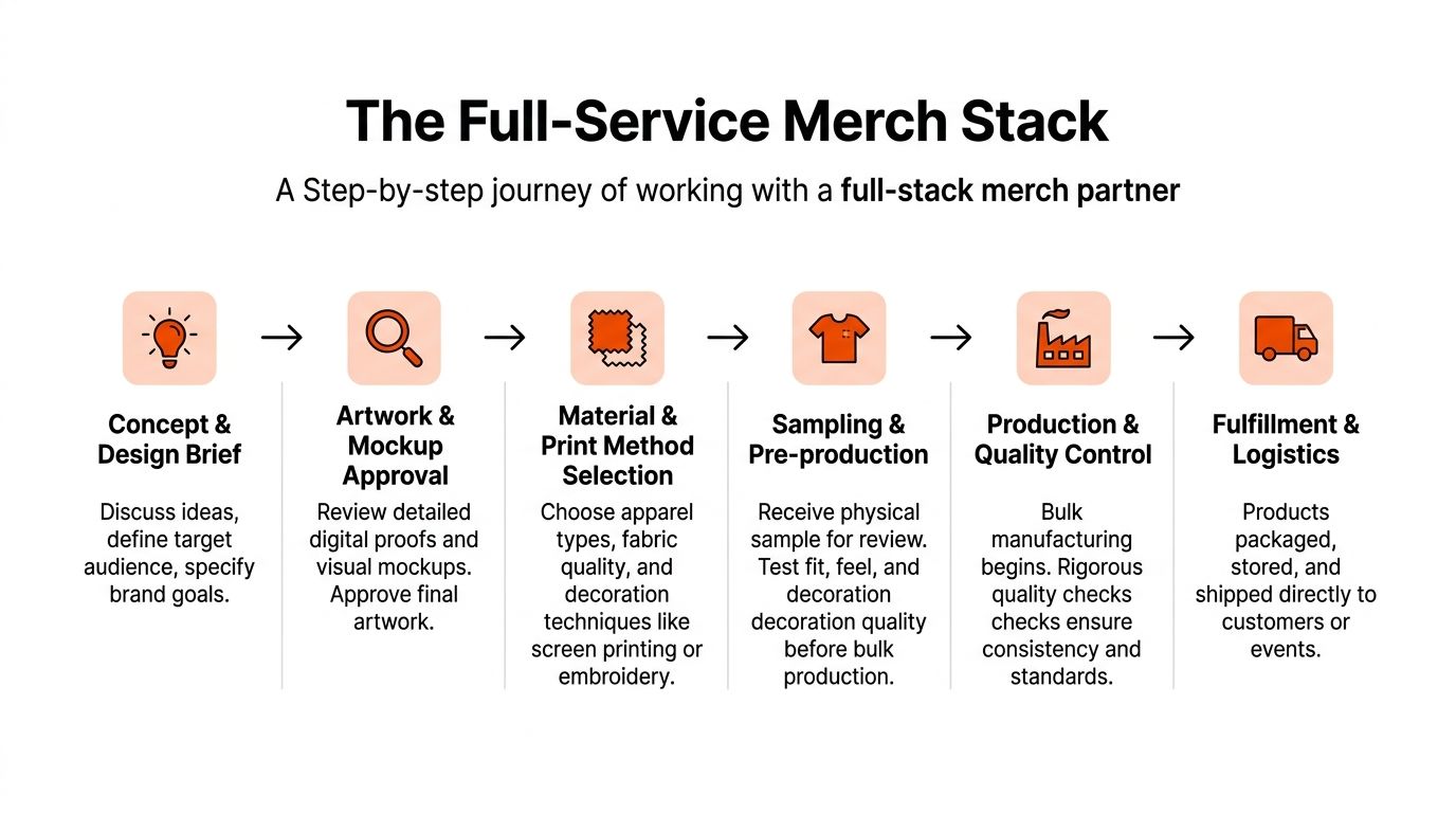
A good full-service setup usually follows a clean path:
Product selection
Start with blanks that fit the brand. Don't force the art onto the wrong garment.Artwork and mockup review
The proof should solve problems, not hide them.Method and finish selection
Printing, embroidery, labels, and packaging should work as one system.Production control
Quality checks matter most when the order includes multiple variants or destinations.Fulfillment
Shipping should feel like the end of the process, not the start of a new one.
This model works because it removes decision fatigue. The buyer doesn't have to translate between five specialists. The product stays coherent from concept to delivery.
Frequently Asked Questions
Some of the best questions show up after the design is already approved. That's normal. The operational details are where custom merch gets real.
| Question | Answer |
|---|---|
| What's the best print method for custom shirt printing? | It depends on the garment, artwork, quantity, and desired feel. Screen printing suits bold graphics and larger runs. DTG works well for detailed artwork and smaller batches. Embroidery is often the right move for logos on caps, hoodies, and premium basics. |
| How do I make merch feel premium instead of promotional? | Start with a better blank. Then tighten the placement, choose a print method that suits the artwork, and add finishing details like custom neck labels or thoughtful packaging. |
| Is sustainable custom merch actually possible? | Yes, but it's mostly a choice about durability and materials. Better blanks, lower-waste ordering, and products people keep wearing are usually stronger moves than disposable event tees. |
| How should I handle shipping for a remote team? | Build fulfillment into the project from the start. Multi-address shipping, sizing collection, packaging, and destination planning should be locked before production begins. |
| Can I do low-minimum custom apparel without it looking cheap? | Yes. Low minimum doesn't have to mean low quality. The key is picking the right production method and not overcomplicating the artwork for the run size. |
| When does cut and sew make sense? | Cut and sew makes sense when you want control over the entire garment, not just what's on it. It's the move for custom silhouettes, private label pieces, or more fashion-led capsule drops. |
The short version is simple. Great custom shirt printing is about alignment. The artwork, blank, print method, placement, finish, and logistics all need to tell the same story.
Want merch your team will actually wear? Banger brings the whole production stack under one roof. Premium European blanks, endless customization (embroidery, screen printing, DTG, DTF, custom labels, branded packaging), and a free, no-commitment quote with product previews in 24 hours. Built for internet-native teams that care about their brand, speed, and getting the details right.