Basics of Screen Printing: A Practical Guide for Custom
You've got the sample tee in hand, the team chat is moving fast, and someone just asked whether the new drop should be screen printed, DTG, or DTF. That's usually the moment where the basics of screen printing stop being abstract and start affecting real decisions, like how the shirt will feel, how long it'll last, and whether the run makes sense for a small launch or a bigger rollout. If you're buying merch for a team, a creator drop, or a conference, the process is a lot less mysterious once you know what the print shop is doing.
Table of Contents
Why Screen Printing Still Matters for Modern Merch
A launch is about to go live, the conference tees need to look sharp, and the creative team wants something people will still reach for after the event ends. Screen printing still earns that brief because it handles bold color, repeatable output, and a print that settles into the garment instead of sitting on top like a sticker. That is why it keeps showing up in apparel and, as historical context, in other industrial uses too as historical context.
The process has older roots than many merch buyers expect. Historians usually place early versions in China during the Song Dynasty, roughly 960 to 1279 CE, and the modern Western method gained momentum in 1907 when Samuel Simon patented a screen-printed form, with photo-imaged stencils following in 1910 source. That history matters because the basic logic still holds up in a production room today, ink passes through the open mesh and stays blocked where the stencil closes it off. The tools changed, the materials improved, the working principle stayed the same.
Practical rule: if the design uses strong blocks of color, needs to hold up, and has to look clean across a batch, screen printing is usually the first process to ask about.
For a modern merch buyer, that means you are not choosing an old technique just because it has a long track record. You are choosing a method that became central to industrial production because it could lay down patterned layers consistently on many substrates source. In practice, that is why it still fits premium branded apparel, especially when the goal is merch people keep in rotation instead of tossing into a drawer.
If you are sorting through ideas for a team drop or event kit, this swag ideas guide is a useful companion read.
The main promise stays straightforward. Screen printing gives you durable, vibrant, repeatable results, especially when the design and garment choice work together. It also gives startup teams and creators a real production decision to make, since mesh count changes how sharp or soft a print feels, and low MOQs can make a small drop possible without forcing a huge inventory bet.
How Screen Printing Works
A merch order in a small atelier usually starts with a simple question, which parts of the artwork should let ink through, and which parts should stay blocked? Screen printing answers that question with a stencil-based setup. The design sits on a stretched mesh screen, ink is pushed through the open areas, and the blocked areas keep the garment clean. A standard setup uses a mesh screen, a stencil, ink, and a squeegee, and each color layer needs its own screen source.
The workflow in plain English
First, the artwork is split into print-ready layers. Then each layer becomes a stencil on a fine mesh screen. The screen is held above the garment, ink is pulled across it with a squeegee, and the open mesh lets the ink pass through onto the fabric while the blocked areas stay clean. After that, the print is cured, which is the step that locks it in so it lasts properly source.
The easiest mental model is a screen door. Air moves through the open parts and gets stopped by the solid parts. Screen printing works the same way, except the “air” is ink and the “solid parts” are the blocked stencil areas.
You can picture the squeegee like controlled jam across toast. Too much pressure, and everything gets messy. Too little, and the ink doesn't transfer evenly.
Production teams care about mesh tension, squeegee angle, and how the ink behaves across the screen because those variables change the final print. A process guide notes common mesh tension targets around 20 to 40 N/cm, with mesh counts from 90 to 305 threads per inch, and a polyurethane squeegee often in the Shore A 60 to 90 range at a 65° to 75° attack angle source. Those choices are part of why one print feels soft and another comes out heavier and more opaque.
For a deeper merch-focused look at process choices, the custom shirt printing guide is useful context.
The part buyers usually miss is that every extra color adds another screen, another setup, and another pass through the press. That is why multicolor art can push cost and turnaround higher, even before you talk about the garment itself. If you can picture the process end to end, you are already in a better position than most first-time merch buyers.
Key Terms You Will Hear from a Production Team
A quote from a print shop can feel like a small foreign language at first. Most of the words point to practical choices about detail, coverage, durability, and how the job will behave on press. Once those terms make sense, the back-and-forth with a production team becomes much easier to follow.
The glossary that actually matters
| Term | What it is | Why it matters for your merch |
|---|---|---|
| Mesh count | How fine the screen mesh is | Higher mesh usually supports finer detail, lower mesh lays down heavier ink |
| Screen | The frame with mesh stretched over it | Each color layer needs its own screen, which affects setup and cost |
| Squeegee | The blade that pushes ink across the screen | Hardness and angle affect how much ink transfers and how clean the print looks |
| Platen | The flat surface that holds the garment | It keeps the shirt stable during printing |
| Underbase | A base layer printed under lighter colors | It helps bright colors pop on dark garments |
| Flash cure | A quick partial cure between layers | It keeps multicolor prints from smearing while the next layer goes on |
| Spot color | A single, solid ink color mixed for a specific target | It gives predictable, clean brand colors |
| Simulated process | A way of mixing spot colors and halftones for image-like prints | It helps if the art has gradients or a more photo-like feel |
Mesh, squeegee, and ink choices
For production teams, mesh count is one of the first calls they make. Finer mesh is better for detail, while lower mesh lets more ink through, which gives the print a heavier hand feel and stronger coverage. That choice also connects directly to the kind of artwork you send in, so a delicate logo and a bold streetwear graphic do not get treated the same way.
The same is true for the squeegee. A polyurethane blade with Shore A 60 to 90 hardness and a 65° to 75° attack angle changes how the ink moves through the screen, which affects sharpness, ink deposit, and the overall finish. Production teams talk about those settings because small shifts there can change whether a print feels crisp, soft, or dense on the garment.
If a print quote mentions mesh count and ink type together, the shop is usually telling you how much detail the art can realistically hold and how the print will feel in hand.
Ink choice matters just as much. A shop may aim for bold opacity, a softer touch, or a finish that sits differently on dark garments, and that decision often shapes both the look and the wear of the final piece. If you are preparing a design brief, the custom design services overview is a useful example of how art direction feeds into production choices.
Screen Printing vs DTG vs DTF vs Embroidery
A merch buyer usually isn't asking, “Which process is best in theory?” They're asking, “Which one makes this drop look right, feel right, and not turn into a production headache?” That's the better question.
Choose based on the job, not the buzz
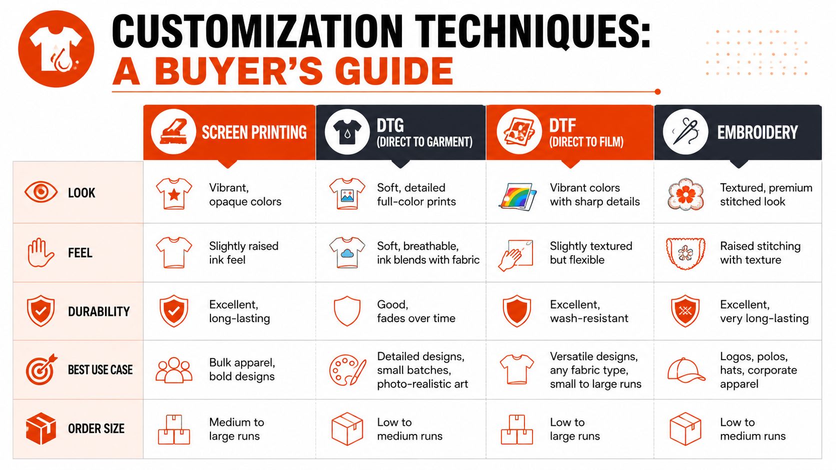
Screen printing wins when the design has strong solid colors, the run needs consistency, and the goal is durable apparel that still looks sharp after a lot of wear. It's also the most natural fit for larger quantities and repeat orders, especially when the art is logo-driven or built around a few colors.
DTG works better when the design is image-heavy, highly detailed, or looks more like a photograph. DTF is useful for similar reasons, especially when you want printed detail on a wider range of garments without building the job around screens. The DTF printing guide is helpful if you're weighing that route against screen printing.
Embroidery is different. It's not about a flat printed image. It's about texture, depth, and a more premium feel, which is why it makes sense for caps, polos, and outerwear where a stitched logo looks better than ink.
| Technique | Look | Feel | Durability | Best use case | Order size |
|---|---|---|---|---|---|
| Screen printing | Vibrant, opaque colors | Smooth to lightly raised | Excellent when cured properly | Bold merch, team tees, bulk apparel | Medium to large runs |
| DTG | Photo-like detail | Very soft | Good on the right fabric | Small runs, detailed artwork | Small runs |
| DTF | Sharp, flexible detail | Slightly layered feel | Good for mixed garment types | Complex art, flexible production | Small to medium runs |
| Embroidery | Raised, textured | Structured | Strong and long-wearing | Caps, jackets, polos | Small to medium runs |
The quick rule of thumb is simple. If the art is bold and the run needs consistency, screen printing is usually the cleanest answer. If the art is image-heavy, very colorful, or the order is tiny, DTG or DTF may be easier. If the piece is meant to feel more like a uniform or a premium stitched layer, embroidery belongs in the conversation.
Preparing Artwork the Right Way
A print run often goes wrong before the ink ever hits the shirt. The handoff usually starts with the artwork file, and that is where a lot of avoidable back-and-forth begins. Clean files save time because the production team can separate colors, size the design, and build screens without guessing.
File choices that make production smoother
A vector file is still the safest starting point because it scales cleanly without getting blurry. That matters if the same logo needs to move from a small chest print to a back print or even a cap later. Raster images pulled from Instagram or a low-resolution screenshot do not give a workshop the same control.
Use spot colors if you want brand colors to stay predictable from order to order. RGB may look fine on a screen, but print shops work with ink, not pixels, so a specified color target is easier to reproduce consistently. Keep the background transparent unless you want a box around the art on purpose, and leave a safe zone so text does not crowd seams, hems, or labels.
Thin strokes and tiny type are where a lot of first-time merch files fall apart. If it feels fragile on screen, it will usually feel fragile in print too.
For teams building designs faster, an automated t-shirt design workflow can help generate concepts, but the final export still needs a human production check before it reaches the press. Automation can speed up ideation. It does not replace a clean file.
A practical handoff checklist:
- Send a vector file so the art scales cleanly.
- Use spot colors if brand accuracy matters.
- Keep the background transparent unless the print calls for otherwise.
- Avoid ultra-thin lines and tiny text that could break on press.
- Leave safe space around edges, seams, and label areas.
- Separate versions by placement if you want chest, sleeve, and back prints.
If you need help cleaning up a file before it goes live, the custom design services page shows how production teams can support that part of the process.
Costs, MOQs, Quality, and Sustainability
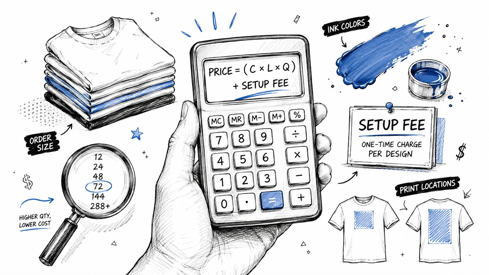
A screen-printed quote usually comes down to a handful of moving parts. The biggest ones are number of colors, number of print locations, garment cost, setup work, and order size. More colors mean more screens. More placements mean more press time. Better blanks cost more up front.
Why MOQs exist
MOQs exist because screen printing has setup work. Screens need to be prepared, aligned, and tested before the actual run starts. That's why low-order jobs can feel surprisingly expensive relative to the number of shirts. You're paying for the prep as much as the print itself.
Low-MOQ partners change the equation for startups, creator drops, and small team launches. Instead of forcing a huge order just to make the math work, a French atelier or similar production setup can let you test a concept without overcommitting inventory. That matters if you're not sure the design will become a long-term staple.
For anyone comparing fabric performance, a colour fastness testing guide is a useful companion reference, especially if you care about how prints and garments behave through wash and wear. The better the blank and ink choice, the better the shirt ages.
What quality looks like in the hand
Quality is usually visible before you even read a spec sheet. Look for clean registration, meaning the layers line up properly. Check opacity, especially on dark garments. Feel the hand, because a heavy, plastic-like print can look loud but wear badly if the design needs softness.
On sustainability, the most meaningful gains usually come from water-based inks, organic or recycled blanks, and not over-ordering in the first place. Direct factory pricing helps because it cuts out extra layers between you and production, which reduces the chance of buying more than you need. The custom apparel no minimum guide is relevant if you're trying to keep the order tight and intentional.
Ordering Screen-Printed Merch Without the Headaches
Start with a tight brief. List the garment, the print placement, the number of colors, the quantity, and the deadline. If you already know the blank, include it. If not, ask for options and compare the hand feel before you lock anything in.
A clean process usually looks like this. Pick the blanks, choose the decoration method, review a real photo proof, then move into production and shipping. For a modern merch buyer, that's the difference between a vague quote thread and an actual drop you can launch with confidence.
If you're comparing blanks for a premium long-sleeve or mesh-style piece, the Los Angeles Apparel Rns745p is a good example of how garment choice can shape the final result. The right fabric changes how the print sits, how it wears, and whether the whole piece feels intentional.
Keep it simple:
- Define the brief so the printer isn't guessing.
- Choose the blank before approving the art.
- Review the proof carefully for placement and color.
- Ask about low minimums if the drop is small or experimental.
- Confirm shipping scope so the finished merch reaches the right people on time.
If you want merch that feels considered instead of generic, Banger can help you turn a print idea into a real product with premium blanks, French atelier production, and fast turnaround. Send the brief, get product previews, and build the kind of custom merch people actually want to wear.