Screen Printed Polos: The 2026 Guide for Modern Teams
Most advice on polos is lazy. It says embroidery is the default, printing is for tees, and anything else is a compromise. That's fine if you're buying golf-club uniforms from a catalog, but it's a weak framework for startup teams, event crews, and brands that want a polo to feel more like part of the drop than a corporate afterthought.
Screen printed polos work when the garment is engineered for print, the artwork respects the placket, and the run is big enough to justify setup. That combination is why they've stayed relevant for decades, from the industrial roots of screen printing to modern branded apparel programs that trace back through a long print history. If you want a broader merchandising lens, branding tips from Display Guru are worth a look before you decide what the garment should communicate.
Table of Contents
Why Screen Printed Polos Deserve a Second Look
The default “polos get embroidered” rule is too blunt. It works for a lot of office basics, but it breaks down fast when the brief is a launch uniform, a conference drop, or merch that needs to feel closer to streetwear than a sales team uniform. Screen printed polos make sense when you want bolder graphics, cleaner color blocking, and a flatter, more graphic read on camera.
The real reason they're back
Screen printing isn't some new workaround. It has a long industrial history, with roots traced to China, a 1907 patent by Samuel Simon in England, and later adaptation for mass-market production in the 1960s as documented in the history of screen printing. That matters because the process is mature, scalable, and predictable when you're trying to run consistent branded apparel at volume.
Practical rule: if the garment is meant to read like merch, not a stitched badge, screen printing usually gives you the sharper brand signal.
The economics are just as important. Custom apparel research compiled in 2025 puts the custom t-shirt printing market at $4.57 billion to $7.01 billion, with screen printing making up 41% to 51.8% of production volume according to the market data summarized here. That doesn't make screen printing universally right, but it does show the method is still central where high-volume decoration and unit economics matter.
What premium buyers are actually choosing
For tech teams and modern brands, the question usually isn't “Can polos be printed?” It's whether the finished piece feels intentional. A printed logo on a well-cut polo can look more contemporary than a stitched mark, especially when the design has strong geometry or limited color blocks. If you're mapping the brand side of that decision, the customization framework in this polo shirt customization guide is a useful internal reference point.
Screen printing also fits the broader merch shift toward pieces people wear outside the office. That's the difference between a garment that gets filed away and one that lands in a rotation. For branded programs built around events, creator drops, or team identity, that's the point.
Fabric Weights and Blends That Work
The blank decides a lot before ink ever reaches the press. A polo can carry a clean logo and still read as cheap if the fabric is too light, too stretchy, or too unstable under heat. For screen printed polos, the practical weight window is 180 to 220 g/m². That range is heavy enough to cut down show-through and support crisp ink laydown, while still staying light enough to keep the shirt drapey and wearable.
The weight range that doesn't fight the print
Drop below 160 g/m² and the risks rise fast, especially visible show-through. Push past 240 g/m² and the fabric starts giving up flexibility, while press dwell time rises too. That is not just a production annoyance, it changes the handfeel and the way the polo sits on the body after a few wears.
| Polo Fabric Specifications for Screen Printing | |||
|---|---|---|---|
| Fabric Weight | Blend Ratio | Print Quality | Best Use Case |
| 180 to 220 g/m² | 65/35 cotton-poly or 50/50 | Clean laydown, good opacity, stable on press | Team polos, event merch, uniform runs |
| Below 160 g/m² | 65/35 or lighter blends | Higher show-through risk, more fragile finish | Avoid for most print-forward programs |
| Above 240 g/m² | Heavier cotton-rich or dense knits | Solid opacity, but less drape and slower pressing | Structured premium pieces, if the fit is intentionally heavier |
| Pre-shrunk 100% cotton | Cotton only | Strong print surface when controlled well | Short runs where natural fiber feel matters |
Blend matters as much as weight
Cotton-poly blends like 65/35 and 50/50 are usually the sweet spot because they balance breathability, shrink control, and ink adhesion. Pure cotton can work, but only when it is pre-shrunk and controlled tightly enough to keep dimensional change at or below 3.5% under AATCC 135 conditions as noted in this fabrication guide. That is the number I care about when I am buying for teams, because a print that lines up on sample day but shifts after wash is a production miss, not a design choice.
A polo that feels nice on the hanger but warps after wash is the wrong blank, even if the catalog shot looked premium.
For a practical breakdown of how fabric mass affects handfeel and decoration, this GSM guide is worth reading. The short version is simple. Spec polos by weight, shrink behavior, and whether the fabric can hold the print without turning translucent.
Placement Rules and Garment Engineering Constraints
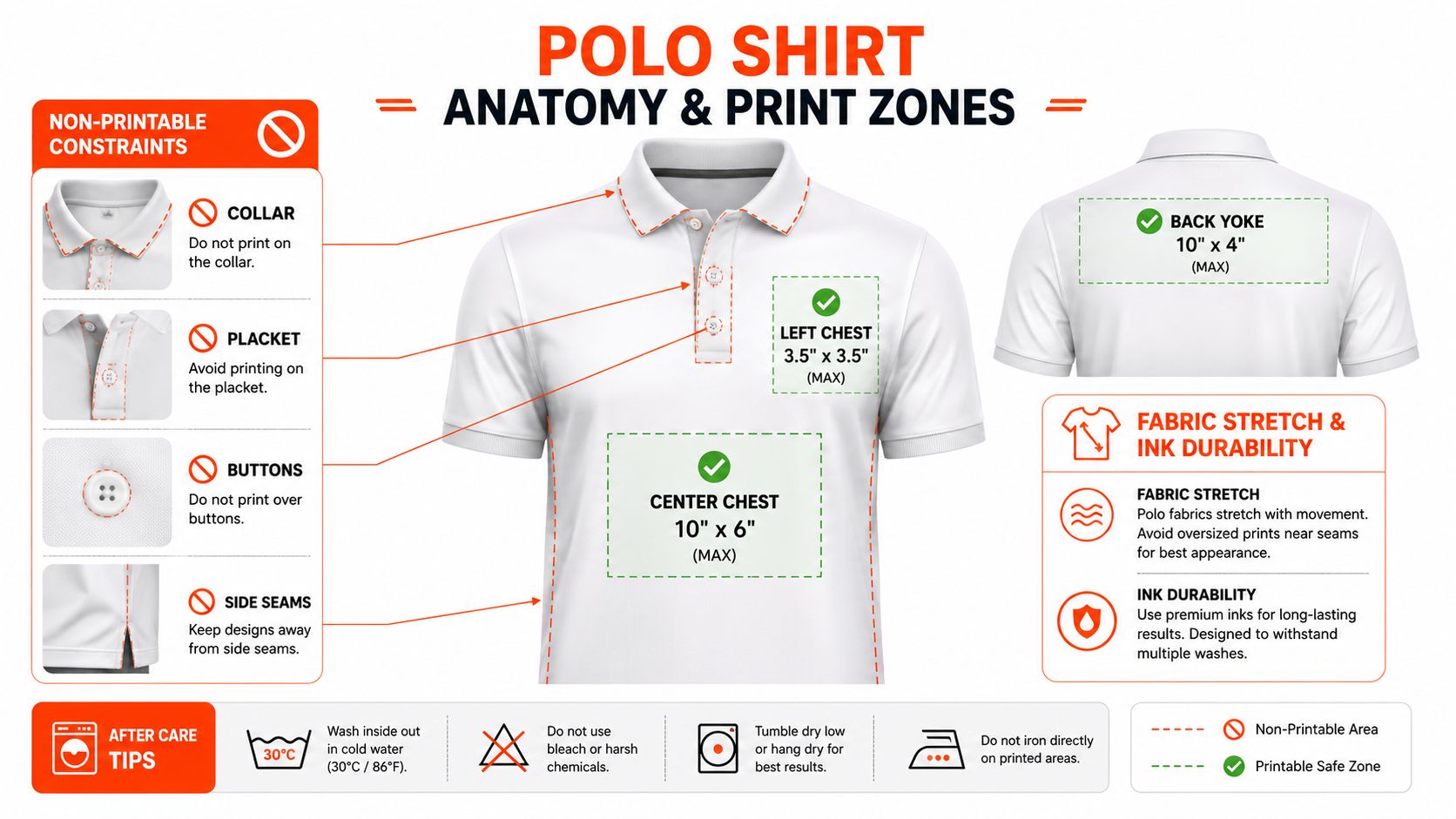
Polos are not flat canvases. The collar, placket, buttons, seams, and shrink behavior all work against sloppy placement, which is why generic T-shirt rules fail here. Once you start printing on a polo, the garment's construction becomes part of the design brief.
Safe zones that hold up
A common production reference lists left chest, right chest, and left-bottom logo areas at 4 in × 4 in, while back placement can run from 1 in × 4 in at the collar to 16 in × 14 in for a full-back print and 3 in × 10 in for upper-back placement as shown in the polo placement guide. Those dimensions matter because the placket narrows the visual field and makes center alignment trickier than on a tee. On polos, small shifts read as mistakes faster than they do on flatter garments.
The keep-out zones around the collar and button placket are where bad planning shows up first. A logo that looks fine on a mockup can drift into the placket once the fabric relaxes on press, or sit too close to the collar seam and feel cramped. That is why I treat placement as a garment-engineering problem, not just an artwork sizing exercise.
What has to be locked before bulk production
One manufacturer-focused guide is blunt about this. Teams should lock a print placement template, define collar and placket keep-out zones, set artwork alignment rules, and approve a wash-tested sample before bulk production the guide is here. That's the difference between a clean left-chest logo and a run of shirts where the mark sits a little off because the garment draped differently on press.
Practical rule: keep artwork away from the placket unless the placement has been engineered for it. “Close enough” is how polos start looking cheap.
If you need a clear reference for how placement choices change with garment construction, this embroidery placement guide is useful because it shows how much of polo decoration is controlled by seams, collars, and body shape. The same logic applies to screen printing. The shirt moves, stretches, and shrinks, so the art has to be positioned for the garment, not just centered on the file.
For buyers comparing decoration methods, find your ideal printing technique after you've settled the placement rules. A print that stays aligned after wash and wear is the true test. That is the production problem that separates a polo that holds up from one that only looks right on the hanger.
Screen Printing vs Embroidery vs Digital Methods
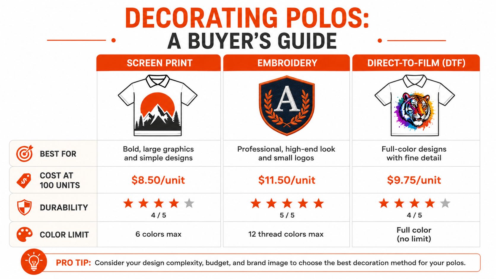
On polos, decoration method is a garment decision first and a budget decision second. A stitched logo reads restrained and polished. A printed logo reads sharper and more graphic, which is usually the better fit when the polo needs to feel like team merch or a limited run. The right call depends on fabric, artwork, placement, and how the shirt will be worn and washed.
Where screen printing wins
Screen printing does its best work on large, bold designs, repeat runs, and production where the art stays consistent. One custom polo guide says styles using screen printing usually require 24+ pieces to justify setup costs in this buying guide. That makes it a strong fit for team drops, event merch, and uniform programs where the artwork is settled and the order volume clears the setup threshold.
It also gives you a cleaner read on heavier polos. On a shirt with enough structure in the body, the print sits flatter and the logo holds its shape better than it does on a thin, clingy knit. On lightweight polos, especially those that drape close to the body, screen print can still work, but the placement has to be controlled and the art should avoid details that get distorted by the placket or collar.
Where embroidery still makes sense
Embroidery still wins when the brief calls for a quiet, premium left-chest mark that needs to hold up under rough wear. A custom embroidery guide notes that embroidered logos are stitched into the fabric, which is why they tend to stay sharp over time, while printed logos can crack or fade with repeated wear as explained here. That is why embroidery remains the default for some client-facing uniforms and conservative brand environments.
It also handles collar and placket structures with less visual risk. If the logo has to sit very close to a seam, embroidery is often more forgiving because the stitched mark can follow the garment better than a print that needs a flat, predictable surface. That said, embroidery is not the answer for every polo. Fine type, large graphics, and anything with a lot of color often read better in print.
Digital and hybrid options
For more specific jobs, there is no single winner. Manufacturing guidance says some polyester performance polos with full-color coverage are cleaner with sublimation, while simpler graphics can work well with screen print, and heat transfer can be a strong option if shine and handfeel are controlled as outlined by Underground Shirts. If you are comparing transfer-based methods more broadly, find your ideal printing technique is a helpful external explainer. For a closer look at DTF specifically, this DTF printing guide is a useful reference.
DTF sits in a different lane from classic screen printing because it handles detailed art and short runs without the same setup burden. That makes it useful when the order is small, the design changes often, or the logo has too much color variation for a clean one-pass screen print. On polos, though, the same garment rules still apply, so a transfer that looks sharp on a flat test piece can still fail if it crowds the placket or rides into the collar zone.
| Method | Best For | Handfeel | Brand Read |
|---|---|---|---|
| Screen Print | Bold graphics, volume runs, simpler art | Flat and graphic | Modern, merch-forward |
| Embroidery | Small logos, premium uniforms, daily wear | Dimensional and textured | Polished, classic |
| DTF | Short runs, complex art, flexible ordering | Smooth but slightly applied | Useful when setup speed matters |
| DTG | Soft tees and some casual apparel | Very soft on cotton | Less common on polos |
| Sublimation | Certain polyester performance polos | Embedded into fabric | Clean on the right blank |
The practical choice usually comes down to how much the polo needs to look like apparel versus how much it needs to look like a branded uniform. Conference merch and culture-driven brand pieces often read better with screen print because the art can feel current and direct. Field staff uniforms and client-facing polos still lean toward embroidery because the texture signals restraint. The mistake is assuming every polo wants the same decoration logic.
Artwork Preparation and Pre-Production Quality Checks
Bad files make good shirts look amateur. That holds on tees, and it shows up faster on polos because the print has less room to hide bad placement, weak separations, or sloppy prep. Before anything goes to production, the artwork has to be built for print, not just for a screen.
What the file needs to be ready for
Vector artwork is the cleanest starting point for logos, wordmarks, and simple geometric marks. The lines stay sharper, the edges hold better, and the file is easier to separate cleanly for screens. Color separations should be approved before the run starts, and any gradient or halftone treatment needs careful review so it does not turn muddy on fabric. If the design depends on brand colors, Pantone specs should be set early, not after the sample comes back.
The cheap mistake is assuming the printer will “fix it.” The printer will usually just print the problem faster.
Why sample approval matters
A wash-tested sample approval is the safest check. The important part is judging the sample after actual wash and wear, not only on a clean flat table, because that is where alignment shifts, shrinkage, and small ink issues show up. On polos, that matters even more because the placket, collar, and button line can throw off a design that looked centered on the mockup.
A practical pre-production checklist looks like this:
- Artwork in Vector Format: Send .AI or .EPS files so the lines stay sharp.
- Color Separations Approved: Confirm each ink layer before screens are burned.
- Pantone Colors Specified: Lock the target color values instead of guessing from a monitor.
- Print Placement Mockup Signed Off: Approve the location on the actual polo, not just on a flat mock.
- Pre-Production Sample Approved: Confirm that the first sample matches the brief.
- Wash Test Completed: Check durability after laundering, not just on delivery day.
For teams that want a managed design path, custom design services can reduce some of the back-and-forth before production starts. The point stays the same either way. A clean e-proof, a verified sample, and a real wash test save more money than they cost.
How Banger Handles Screen Printed Polos End to End
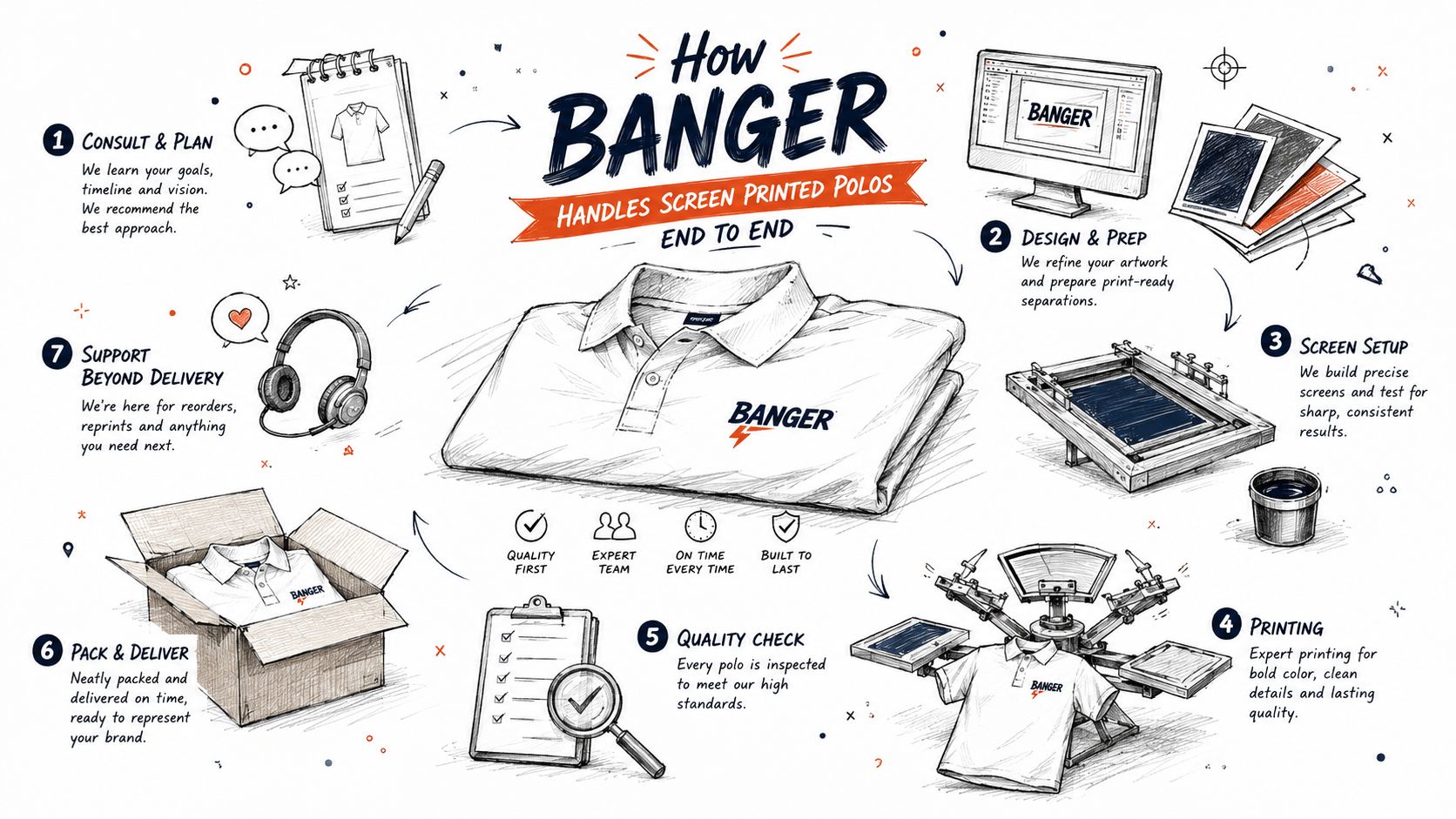
A good polo program starts with the blank, not the logo. In practice, that means choosing premium fabric that lands in the usable weight window, then holding the print to placement rules that survive wear. For teams that need that handled under one roof, Banger sources premium blanks, produces in French ateliers, and runs the process with direct factory pricing and low minimums, which makes the order path less like old-school swag buying and more like actual product sourcing.
What the workflow looks like
The useful part is the sequence. You upload the logo, get a product preview in 24 hours, approve the e-proof, and move into production. Worldwide delivery lands in 10 to 15 business days, and multi-address shipping is available for distributed teams and event drops. That's a cleaner operating model than juggling separate vendors for blanks, print, and fulfillment.
Banger also keeps ordering accessible with low minimums, including 1 unit per item on most products and a 10-unit minimum per apparel order. That matters for team pilots, creator merch tests, and smaller event runs where a print method should fit the idea, not block it.
Why the production setup matters
The French atelier side of the process is where placement precision and wash-tested quality become less theoretical. The value isn't a slogan, it's consistency across sizes and repeat runs. For distributed teams, the shipping model matters just as much as the decoration method because a polo program is only useful if the logistics don't turn into a project.
If you're comparing options, Banger is one route among several for printed polos, not the only possible one. It's a fit when you want branded apparel handled with premium blanks, controlled decoration, and a faster handoff from design to delivery. That's the sort of setup that suits startups, fintech teams, creators, and culture-driven brands that care how the piece feels in real life.
Care Instructions and Long-Term Print Durability
The order doesn't end when the shirts arrive. Screen printed polos stay sharper when they're washed cold or gently warm, turned inside out, and dried with low heat or air-dried when possible. High heat is what ages both the print and the collar faster, especially on performance blends that are already doing a lot of work.
For ironing, keep the heat off the print itself. If the shirt needs pressing, do it inside out or with a protective layer. Detergent should stay simple, because aggressive chemicals and heavy cycles wear down color faster than most buyers expect.
Durability questions usually come down to use case. For recurring team wear, screen print can hold up very well with proper care, but embroidery still has the edge when the garment is being worn and laundered constantly. That doesn't make print a bad choice, it just means the buyer should match the decoration to the role of the shirt.
Practical rule: if the polo is for a long-life uniform, choose the blank and decoration together. Don't treat them as separate decisions.
When a printed polo starts to soften, fade, or lose edge definition, that's your reorder cue. Teams that wait until the whole batch is visibly tired usually end up replacing the program under pressure instead of on schedule.
If you want screen printed polos that feel deliberate instead of default, Banger can handle the blank, decoration, and fulfillment in one flow. Explore Banger if you're ready to build a polo program that looks good on day one and still holds up after real wear.