Team Shirts Design: The Playbook for Merch People Wear
You're probably here because someone on your team said, “We need company shirts,” and your brain immediately pulled up a mental archive of stiff cotton, tiny left-chest logos, and tees nobody wore twice.
That reaction is fair. Most team merch isn't bad because people didn't care. It's bad because the process usually starts too late, the references are too safe, and the decisions get made like it's office supply procurement instead of branded apparel. Good team shirts design sits closer to product design and closer to fashion than organizations often acknowledge.
The upside is that the playbook has changed. The custom t-shirt printing market was valued at $5.16 billion in 2024 and is projected to reach $9.82 billion by 2030, with a projected 11.5% CAGR from 2025 to 2030, according to Printful's t-shirt industry statistics. Teams are using apparel as a real branding asset now. That only works if the shirt has wardrobe value, not just logo placement.
Table of Contents
- What file format works best for team shirts design?
- Can one order include different sizes and garment types?
- What if we have an idea but no designer?
- What's the most common mistake teams make?
Why Most Team Merch Misses the Mark
Most company shirts fail in three places. The blank feels cheap, the fit feels off, and the graphic feels like compliance approved it.
That's why so many team tees end up as sleep shirts, gym backups, or drawer filler. The problem isn't that branded apparel can't work. The problem is that teams often still treat merch like a giveaway item instead of a wearable extension of the brand.
The old merch formula doesn't hold up
The standard formula is familiar. Pick the cheapest blank that clears budget. Drop the logo on the left chest. Add a slogan on the back. Approve the mockup on a screen. Hope it lands.
It usually doesn't.
A shirt has to compete with everything else in someone's closet. If the silhouette is awkward, if the fabric feels thin, or if the design reads like generic conference collateral, nobody's reaching for it. That's true whether you're outfitting an internal team, shipping onboarding kits, or planning event giveaways.
Good merch doesn't ask for brand loyalty. It earns a place in rotation.
There's also a bigger shift happening in the market. Teams aren't buying custom apparel only for utility anymore. They're using it to signal taste, sharpen identity, and create something people want to post, keep, and wear outside work. If you're still thinking in terms of “free t-shirt,” you're already behind.
Culture beats logo placement
The better approach is to think like a brand, not like a procurement manager. Ask what people on your team would wear if the logo wasn't involved. Start there. Then build back toward brand cues, graphic systems, and placement that feel intentional.
That's the difference between throwaway merch and a shirt that means something inside a team.
If you're still in idea mode, it helps to look beyond the usual conference booth formula. A roundup of swag ideas that don't feel generic is useful at this stage because it forces a better question than “what can we print?” The essential question is “what fits our culture well enough that people would choose it?”
The Blueprint Building Your Design Brief
A strong shirt usually doesn't start in Illustrator or Figma. It starts when someone gets specific.
If the brief is vague, the design gets generic fast. “We want something clean” is how teams end up with safe, forgettable merch. Good team shirts design needs intent before aesthetics.
Start with the reason, not the logo
The first question is simple. Why does this shirt exist?
That answer changes everything. An onboarding tee should feel easy to wear and broad enough to suit different people. A conference shirt can be louder and more graphic. A milestone drop for an internal launch can carry deeper references that only your team understands. A community release has to stand on its own as apparel.
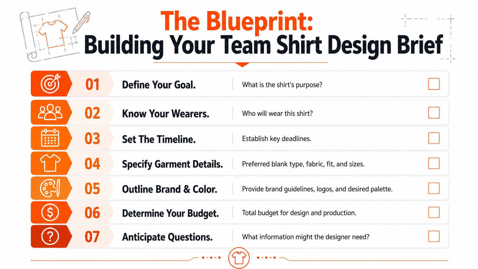
Use a brief that answers these points:
- Purpose: Is this for onboarding, an event, a retreat, a launch, or a limited internal drop?
- Wear context: Will people wear it at work, on Zoom, at a conference, or on weekends?
- Audience: Is it built for employees, customers, creators, contributors, or mixed groups?
- Taste level: Minimal tech? Internet-heavy graphics? Clean editorial? Streetwear-adjacent?
When teams skip this, they end up designing for an imaginary average person. That person doesn't exist.
Build a brief that a designer can actually use
A useful brief includes constraints. Designers need direction on fit, garment type, print style, and what absolutely shouldn't happen.
A few prompts that work:
| Decision area | Useful prompt |
|---|---|
| Visual reference | What 3 brands or merch drops match the energy you want? |
| Brand boundaries | What logos, colors, or taglines are required, and what feels overused? |
| Garment choice | Is this a tee, heavyweight hoodie, sweatshirt, or mixed order? |
| Taste filter | What would make this feel too corporate, too loud, or too trend-chasing? |
You also need a clear approval path. Too many good concepts get flattened because five people jump in late with opposite opinions. Pick one decision maker on aesthetics. Pick another on budget and logistics. Keep those roles separate.
Practical rule: If your brief can be interpreted in three different ways, your first round of concepts probably will be.
If you don't have internal creative bandwidth, working with a partner that handles concepting and production can save a lot of revision cycles. Services like custom design support for merch projects are useful when the team has a strong vibe in mind but no in-house apparel designer to translate it.
The Canvas Choosing Blanks Fabrics and Fit
The shirt itself does half the branding work. People feel quality before they judge the graphic.
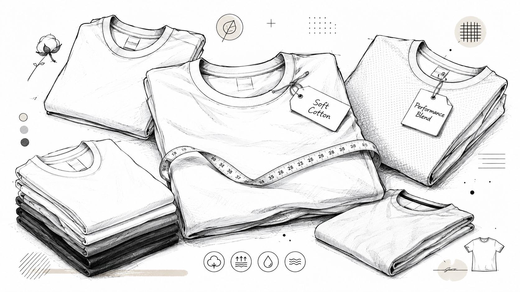
A sharp print on a bad blank still reads cheap. A minimal graphic on a great blank can feel more premium immediately. That's why blank selection isn't a technical detail. It's a design decision.
The blank sets the ceiling
Fabric weight, hand feel, collar structure, and finish all shape how the final piece is perceived. If you're making hoodies or sweatshirts and want that dense, premium feel, heavyweight construction matters. In apparel manufacturing, the cross-lapper machine affects the final thickness and uniformity of the inner core, which is part of what keeps GSM consistent in heavyweight hoodies and sweatshirts such as the 400-500 GSM range noted in this manufacturing reference video.
For tees, the decision is less about chasing the heaviest option and more about matching the garment to the use case. A founder retreat shirt and a trade show giveaway shirt shouldn't feel identical. One needs longevity and shape retention. The other may need broader size flexibility and easier repeat ordering.
A few practical filters help:
- For premium internal merch: choose blanks with structure, a solid collar, and fabric that holds shape after washing.
- For warmer climates or event volume: softer midweight options can make more sense than going heavy for the sake of it.
- For sustainability-minded teams: organic cotton and recycled blends align better than generic promo stock.
Fit is the design
Fit changes the entire read of the garment. The same front graphic can look polished on a boxier, slightly oversized cut and completely lifeless on a narrow promo tee.
A lot of startup teams default to “unisex” without asking what that means in practice. Usually it means standard fit and broad compromise. Sometimes that's fine. Often it isn't.
Use this lens instead:
| Fit direction | What it signals | Where it works |
|---|---|---|
| Standard fit | Neutral, practical, familiar | Large mixed distributions, event basics |
| Relaxed fit | More current, more wearable | Startups, creator teams, internal drops |
| Oversized fit | Fashion-aware, graphic-led | Culture-driven brands, launches, community merch |
The blank should support the visual system, not fight it. If the art leans bold and centered, a relaxed silhouette usually helps. If the branding is understated and tonal, a cleaner standard fit can carry it.
If you're comparing options, a curated range of premium blank t-shirts is the right place to calibrate quality, fit, and fabric before you even think about print placement.
The Art Customization Layout and Color
A founder approves a shirt on a laptop, everyone likes the mockup, the order lands, and nobody wears it twice. That usually comes down to layout and color, not effort.
Good team merch reads like a brand decision. Weak team merch reads like procurement. The difference is often simple. Scale, placement, contrast, and restraint.
Choose the method for the look
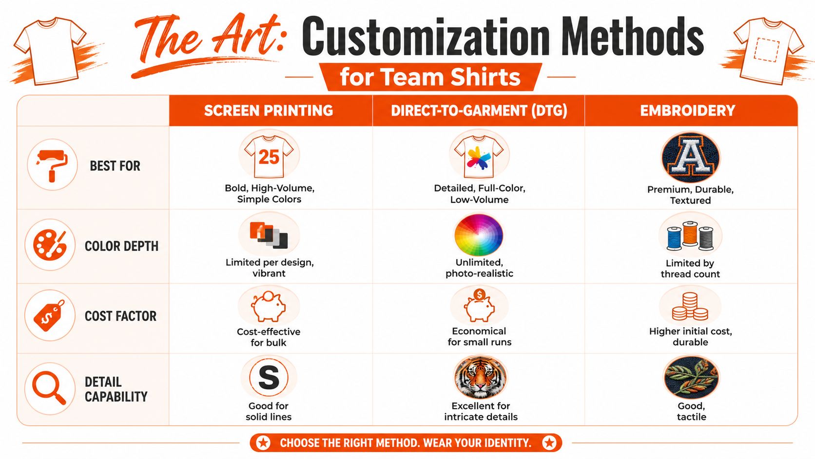
Screen printing, DTG, and embroidery are aesthetic choices first. Production comes right after. If you pick the method only by unit cost, the shirt usually ends up feeling generic.
| Method | Best use | Visual feel | Trade-off |
|---|---|---|---|
| Screen printing | Bold graphics, simpler color stories, larger runs | Crisp, graphic, high impact | Gets more complex as color count climbs |
| DTG | Detailed art, gradients, lower-volume runs | Softer photographic or illustrated look | Not every graphic benefits from that finish |
| Embroidery | Small marks, premium texture, understated branding | Tactile, durable, elevated | Not ideal for highly detailed large artwork |
Screen print still owns the strongest graphic language. It has weight. Ink sits with intent, especially on larger front or back hits. DTG works better when the art depends on tonal detail, texture, or illustration that would get messy once separated for screens. Embroidery is strongest when you keep it disciplined. A chest hit, cap mark, or sleeve detail can feel expensive. A huge embroidered graphic usually feels stiff and overworked.
A practical shortcut helps. Use screen printing for authority, DTG for image-driven artwork, and embroidery for subtle branding. If you need a clearer production read on what each process is good at, these custom shirt printing methods are useful to compare by visual outcome, not just setup cost.
Here's a quick visual breakdown before choosing your method:
Placement rules are not laws
A left chest logo is safe. Safe rarely creates a shirt people reach for.
Current team apparel works better when placement matches the silhouette and the attitude of the brand. A centered front graphic on a relaxed tee can feel current and intentional. The same art shrunk down to corporate-logo size often loses all of its energy. Lower placements can read more fashion-aware. Small sleeve hits can add detail without clutter. Back graphics work best when they earn the space instead of filling it because “merch needs a back.”
OOShirts' design tips article points to a clear preference among younger buyers for larger, more centered graphics over default left-chest branding. That lines up with what lasts beyond the event table. People wear pieces that feel designed, not merely labeled.
Looking outside apparel helps train your eye. Bold composition in things like automotive vinyl designs sharpens your sense of scale, negative space, and how graphics travel across a surface. The medium is different. The core lesson is the same. Strong layout wins because it commits.
If the shirt looks like a deck template with sleeves, the team won't save it by being enthusiastic.
Color has to survive the real world
Color gets judged in daylight, on skin tones, under office LEDs, and after a few washes. That is a harsher test than any Figma mockup.
Printful's t-shirt design tips note that contrast has a direct effect on legibility, especially at distance. The same guide also warns against tiny type that looks refined on screen but breaks down once printed. That matters for startup merch because teams love to squeeze in taglines, product language, launch dates, and internal jokes. On a shirt, that usually reads as hesitation.
A few rules hold up in practice:
- Contrast first: event shirts, conference shirts, and community drops need to read fast.
- Tonal palettes need separation: tonal can look expensive, but only if the values are clearly distinct.
- Limit the color story: too many ink colors can make a design feel busy before production costs even become a problem.
- Protect small details: thin lines, tiny serif text, and delicate scripts are often the first things to fail.
The best team shirts usually use fewer moves, not more. One strong graphic. One confident placement. A palette that still reads outside. That is how merch starts acting like something people would buy, not something they were handed.
Production From E-Proof to Unboxing
The easiest way to kill a strong shirt is in production.
A graphic can feel sharp on screen and come back looking cheap because nobody pressure-tested the file, the blank, or the packing experience. This stage is less about creativity and more about protecting intent. Teams that get this right treat production like brand control, not admin.
The file check that saves the order
Approve files like someone who has seen a bad reprint before.
Print vendors can only reproduce what you send them. If the artwork was built for a mockup instead of a press, the shirt usually pays for it. Resolution still needs to hold at final print size. Color needs to be reviewed for print, not just for screens. Placement needs to be checked against the garment itself, because a front graphic that sits a little too high can shift the whole silhouette from considered to awkward.
Use a simple preflight pass before sign-off:
- Resolution: artwork should stay clean at the size it will be printed.
- Color mode: review print color output, not just RGB screen color.
- Placement: check distance from collar, side seams, and hem.
- Type and line weight: fine details are usually the first thing to break.
This part sounds technical, but it is aesthetic too. Premium-looking merch usually comes from teams that are fussy about small decisions before the press starts.
Sampling catches what mockups hide
A sample tells the truth fast.
Flat proofs hide the stuff people notice the second they put a shirt on. The neck can feel too tight. The body can run long and tubular. Ink can sit heavy on a soft cotton blank and turn a good graphic into a stiff chest panel. Those are wardrobe problems, not production notes, and they matter if the goal is a piece people keep in rotation.
Sizing is where trust gets lost fastest. Collect team measurements before production if the run is large enough to justify it, or at minimum compare the blank specs against shirts your team already likes. A startup can spend serious money on a merch drop and still miss because the fit reads promo instead of product.
Sample review should cover more than the print:
| Sample check | What to look for |
|---|---|
| Fit consistency | Compare garment measurements to your planned size split |
| Seam durability | Check reinforcement at shoulders and underarms |
| Print behavior | Look at texture, opacity, and edges after handling |
| Placement on body | Review the graphic while worn, not flat on a table |
Approve the sample on a person. Better yet, on the kind of person who would be hardest to please.
Vendor judgment matters too. If you are sourcing through marketplaces or unfamiliar factories, credibility checks help you avoid middlemen, weak QC, and vague answers around compliance. This sourcing video about evaluating Alibaba suppliers is a useful primer on what to verify before you commit.
Banger is one option teams use for design previews, production, and multi-address merch fulfillment services in one workflow. That setup is practical when the project includes custom packaging and split shipments, not just printing.
Packaging finishes the job
Unboxing sets the tone before the shirt even comes out.
For remote teams, the package is the first physical expression of the brand. A generic mailer makes the whole thing feel disposable. A clean fold, a branded shipper, a small insert with context, or even a sticker sheet can frame the garment as something with point of view. The goal is not luxury theater. The goal is coherence.
Good team merch borrows from streetwear for a reason. Presentation tells people whether this was ordered in bulk or designed with taste. If the shirt is supposed to strengthen your brand, the last mile needs the same attention as the graphic.
The Drop Launching and Distributing Your Merch
A team shirt doesn't land when production finishes. It lands when people receive it, post it, and start wearing it without being asked.
That's why launch matters. Internal merch should feel closer to a drop than a bulk shipment.
Treat it like a release
Build some anticipation before delivery. A cropped close-up in Slack, a packaging preview, or a hint at the graphic system is usually enough. You don't need fake hype. You need context.
A few launch formats work well:
- Internal reveal: share the concept story and why the design looks the way it does.
- Timed delivery: try to land shipments in the same week so the team experiences it together.
- Wear day: give people a reason to put it on immediately, whether that's an offsite, all-hands, or photo thread.
The shirt gets meaning when the team ties it to a moment.
Distribution is part of the experience
Remote teams need a cleaner plan than “we'll ship them out after the event.”
Collect addresses early. Confirm size data before production. Keep the packaging consistent across regions. If you're sending to multiple countries, use a workflow built for split shipments instead of manually rebuilding each order.
That's where merch fulfillment services for multi-address shipping become useful. They're less about convenience and more about keeping the drop coherent when your team is spread across cities, countries, or time zones.
The easiest mistake is treating distribution like admin. The smarter move is to use it as culture design. A good launch makes the shirt feel earned, timely, and connected to the team's identity.
Team Shirt Design FAQs
What file format works best for team shirts design?
Vector files are the safest starting point for logos and typography because they scale cleanly. For print-ready raster artwork, make sure the file is built at final size and meets the production standard covered earlier. If a file came from a slide deck or screenshot, it usually needs rebuilding before print.
Can one order include different sizes and garment types?
Yes, if your production partner supports mixed size runs and flexible minimums. That's common for modern merch programs, especially when teams want a mix of tees, hoodies, and different fits in the same project. The key is to lock the size split before production, not after.
What if we have an idea but no designer?
Start with references, not adjectives. Pull examples that match the mood, fit, and graphic intensity you want. A good merch partner or freelance apparel designer can turn that into a usable concept much faster than trying to write a vague creative brief from scratch.
What's the most common mistake teams make?
Choosing based on mockup appeal instead of wearability. The shirt has to work on a body, in real light, after washing, and next to everything else someone owns.
If you want help turning an idea into merch people keep wearing, Banger can handle the design, product sourcing, customization, packaging, and worldwide fulfillment. You can explore the catalog, request a quote, and get product previews within 24h.