Custom Tissue Paper Printing: Your 2026 Guide
You're probably here because the product is handled, the garment looks right, and the packaging still feels flat.
That's the gap custom tissue paper printing fixes. Not in a loud way. In a smart one. A branded mailer gets attention. A good hoodie earns approval. But the layer someone touches first, unfolds first, and photographs first often decides whether the whole thing feels generic or considered.
For high-end merch drops, onboarding kits, creator sends, and client gifts, tissue paper isn't filler anymore. It's a brand surface. Used well, it makes the package feel finished, protects the product presentation, and gives your visual identity one more place to land without screaming for attention.
Table of Contents
- Choosing the material by brand feel
- Quick comparison
- Picking the print method
- What actually affects print quality
- The file setup that usually works
- The mistakes that keep showing up
- A better creative direction for tissue
More Than Filler Why Custom Tissue Matters
A generic unboxing kills momentum fast. You open the box, see plain paper, and the whole thing starts feeling like commodity fulfillment instead of an intentional brand moment.
That's why custom tissue paper printing matters more than many businesses realize. It sits in a strange sweet spot. It's subtle, relatively lightweight, and easy to overlook on a budget sheet. But in the actual experience, it changes the read of everything underneath it.
Branded tissue works because it turns protection into presentation. It creates a pause before the product reveal. It gives the package a visual rhythm. It also tells the recipient that someone cared enough to finish the details.
A widely cited packaging survey noted that consumers perceive products with branded tissue paper as 24% more valuable than identical products without it in a 2022 survey of over 1,000 shoppers, which is why this detail matters far beyond decoration (custom tissue paper survey insight).
Why the detail lands so hard
The strongest packaging details usually do three things at once:
- Signal intent: A repeated logo, monogram, or custom pattern makes the package feel designed, not assembled.
- Support memory: When the inside of the box matches the rest of the identity system, the brand feels more coherent.
- Improve content value: Better unboxings get shared more often because they look complete in photos and short-form video.
Practical rule: If the product inside is meant to feel premium, the first layer inside the box can't feel like an afterthought.
This is also where branding stops being abstract. If you want a useful refresher on the broader benefits of strong branding, it helps explain why consistency across small touchpoints compounds over time.
For merch teams, tissue sits in the same category as woven labels, custom neck prints, and good trims. It's not the whole story, but it changes the story's quality. If you're already thinking about what makes merch feel intentional, this guide on how to create merchandise is a useful next layer.
The Vibe Check When to Use Custom Tissue Paper
Not every package needs branded tissue. A bulk internal shipment of standard tees probably doesn't. A drop kit, founder gift, press send, or community reward usually does.
The best use case is any moment where you want the recipient to feel a shift from transaction to experience. That's when tissue stops being nice-to-have and starts doing real work.
The category itself is growing because more brands now treat packaging that way. The printed tissue paper market is projected to expand at roughly 4.8% CAGR between 2026 and 2034, reaching about USD 1.35 billion in 2034, driven by demand from fashion, beauty, and ecommerce brands using tissue to enhance unboxing and visual identity (printed tissue paper market projection).
Moments where it earns its keep
Some examples are obvious. Others get missed.
- New-hire onboarding kits: First-day merch sets the cultural tone. A clean wrap around a hoodie, notebook, or cap makes the box feel like belonging, not procurement.
- Limited merch drops: If you're building scarcity, the packaging needs to respect that logic. Plain filler weakens the whole release.
- Creator gifting and PR sends: People film what looks good. Tissue gives the camera an opening frame.
- Investor, partner, or client gifts: When the contents are restrained and premium, branded tissue keeps the presentation polished without adding clutter.
- Event giveaways worth keeping: For VIP kits, speaker gifts, or side-event drops, tissue helps distinguish the package from standard conference handouts.
When not to overdo it
Not every brand needs loud all-over logo print. In some cases, the best tissue is almost quiet.
A minimal wordmark, a tonal pattern, or a single-color repeat can feel much more premium than trying to fit campaign messaging, taglines, and multiple icons onto a delicate substrate. Tissue rewards restraint.
Good packaging design doesn't ask for attention from every angle. It controls where the eye lands first.
A simple planning question helps: is this package meant to be opened, noticed, and remembered? If yes, custom tissue belongs in the mix. If you're mapping packaging around launches, conferences, and gifting calendars, these event swag ideas can help identify the right moments to deploy it.
Decoding the Specs Materials and Print Methods
Many design efforts often get pulled into spec-sheet language and lose the aesthetic thread. The better question isn't just “what can be printed?” It's “what feel are you trying to create?”
Material and print method shape that answer together. One controls hand feel, opacity, and durability. The other controls how your artwork lands on the sheet.
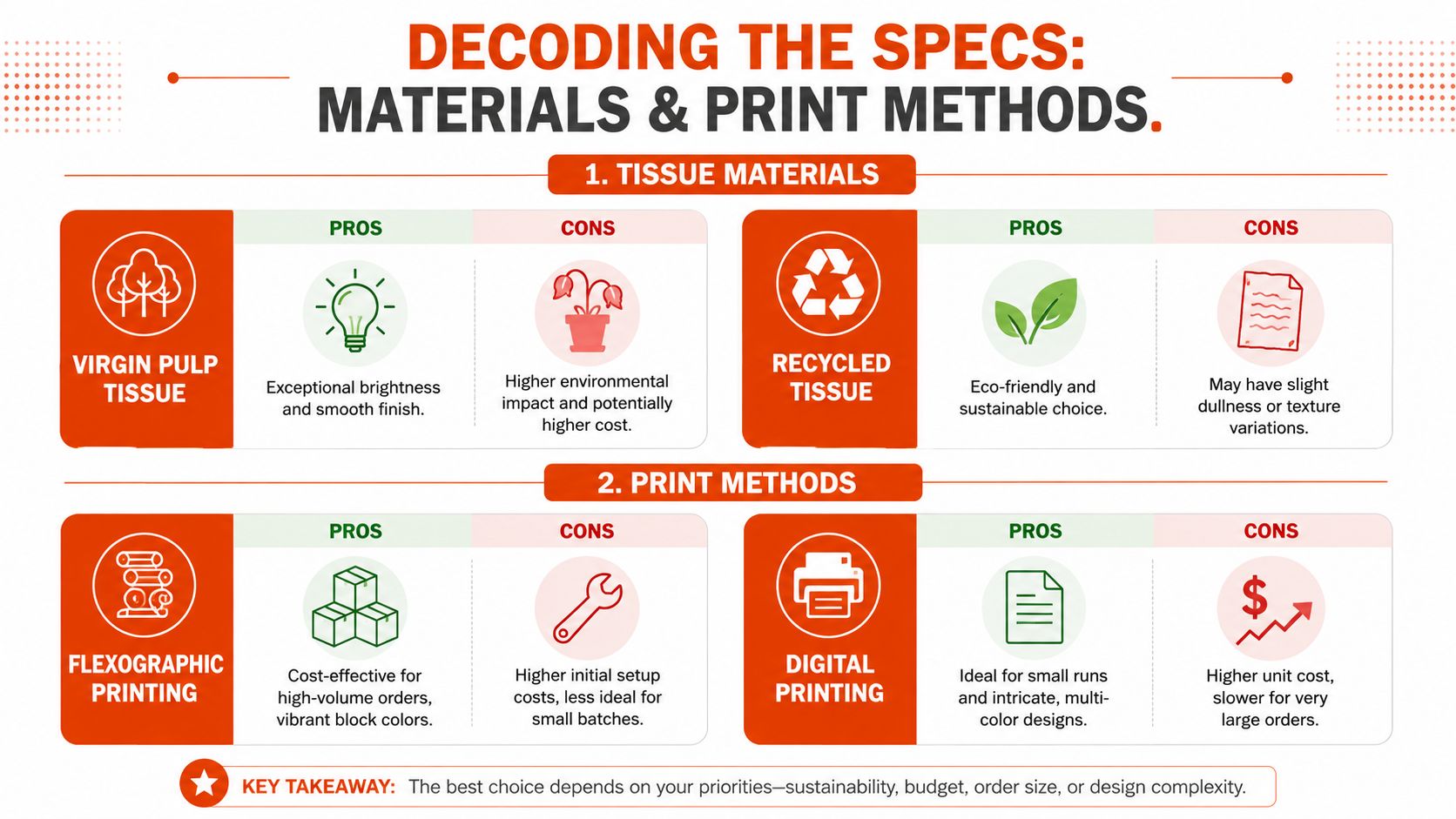
Choosing the material by brand feel
Virgin fiber tissue usually gives you a cleaner, brighter surface. That matters if your brand leans crisp, minimal, sharp, or fashion-led. Black logos print with more clarity on a brighter sheet, and subtle pattern work tends to read cleaner.
Recycled tissue has a different mood. It can feel softer, slightly more organic, and more grounded. For brands with an earth-toned palette, sustainability-first positioning, or a less polished visual language, that texture can work in your favor.
But there's a real trade-off. A 2023 European environmental report noted that recycled tissue fibers can reduce tensile strength by 15 to 20% versus virgin fiber, which matters when you're wrapping heavier or sharper products (recycled tissue strength trade-off). If the box includes metal drinkware, electronics, hard-edge accessories, or anything with friction points, a fragile sheet can work against both presentation and protection.
Quick comparison
| Option | Best for | Watch out for |
|---|---|---|
| Virgin fiber tissue | Bright, sharp brand systems, premium monochrome prints, clean fashion-style presentation | Less aligned with sustainability-led messaging |
| Recycled tissue | Organic palettes, softer aesthetics, sustainability-first packaging | Lower tensile strength, more visible texture variation |
Picking the print method
On the production side, most commercial custom tissue paper printing relies on water-based flexographic or offset web printing, and color management is usually the make-or-break variable. In practice, the print method changes what kinds of jobs make economic and visual sense.
Flexographic printing is usually the right fit when the artwork is simple and the quantities are higher. Repeating logos, strong block colors, and all-over patterns tend to work well here. It's built for consistency once the setup is dialed in.
Digital printing makes more sense when the run is smaller, the design is more complex, or you need fast iteration. It's useful for tests, short drops, and multi-color artwork where flexibility matters more than scale efficiency.
What actually affects print quality
A 2022 packaging benchmark found that flexographic printers using ISO 12647-2/3 workflows achieved average color accuracy of ΔE < 4 on tissue at 18 to 24 g/m², versus ΔE ≥ 6 on presses without standardized profiling. The same benchmark found that 68% of mis-registration issues came from improper web tension control, and optimizing nip pressures and dancer-roller settings reduced registration errors by 42%. It also noted that 76% of reprints in tissue batches were caused by uncorrected ink penetration on low-basis-weight stock.
Those numbers point to one takeaway. Tissue is unforgiving. It absorbs quickly, shifts easily, and exposes weak press control fast.
The prettiest artwork in the world won't survive bad tension control, poor profiling, or too much ink on lightweight stock.
If your design depends on exact brand color, fine contrast, or a premium matte finish, ask your printer how they handle profiling, tension, and proofing on lightweight uncoated tissue. If you want a broader read on decoration methods before choosing a route, this overview of merch printing techniques gives useful context.
Designing for Impact From File to Finish
Most failures in custom tissue paper printing happen before the press starts. The file looks clean in Illustrator, the mockup looks expensive, and then the printed sheet shows muddy edges, weak contrast, or logos that disappear once folded.
That's not a tissue problem. It's usually a prep problem.
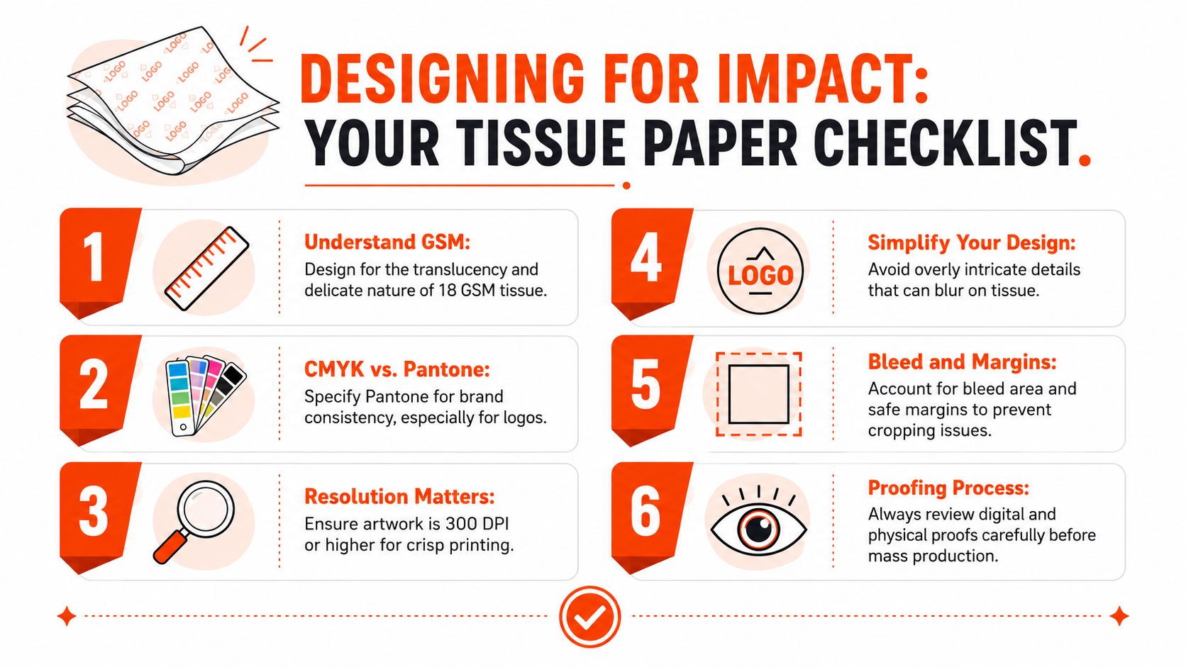
A strong workflow matters because tissue magnifies small mistakes. A 2023 analysis found that workflows using 300 to 400 dpi CMYK artwork, optimized pattern repeats, and substrate-specific RIP settings achieved an 89% first-run approval rate, compared with 54% for ad-hoc processes. It also found that 71% of complaints were tied to poor contrast from incorrect file prep.
The file setup that usually works
Start with the basics that hold up on lightweight stock:
- Build artwork at 300 to 400 dpi. Lower-resolution graphics can look passable on screen and weak in print.
- Work in CMYK or specified spot colors. RGB is one of the fastest ways to lose control of contrast and saturation.
- Strengthen fine logo elements. Thin lines often soften once ink hits tissue, so delicate marks need reinforcement.
- Use a repeat pattern that feels intentional. Spacing matters as much as the logo itself. Too dense feels cheap. Too sparse feels unfinished.
- Set bleed and registration properly. Tissue shifts more easily than rigid packaging, so the layout needs breathing room.
- Tune the file to the actual substrate. Lightweight uncoated tissue doesn't behave like coated paper or apparel print surfaces.
The mistakes that keep showing up
Designers who don't work with tissue often make the same calls:
- Tiny details: Fine text, intricate line art, and micro-icons usually don't improve the final piece.
- Low-contrast palettes: A muted brand system can look elegant in a pitch deck and almost invisible on tissue.
- Over-inking: Heavy fills can spread, especially on lighter stock.
- No trap strategy: Dark inks next to other dark or saturated tones can bleed into each other without proper separation.
Studio note: If the logo only looks good when you zoom in to 300% on screen, it probably needs simplification before it goes on tissue.
A useful external guide if your team needs a practical refresher on how to prepare files for print is worth sending around before approvals start.
Here's a visual reference showing the fundamentals in motion:
A better creative direction for tissue
The best tissue designs usually lean into one of three lanes:
| Design direction | What it looks like | Best use |
|---|---|---|
| Minimal repeat | Small logo or symbol in a balanced all-over grid | Fashion-led merch, onboarding, premium gifting |
| Bold statement wrap | Larger marks with more negative space | Limited drops, campaign sends, creator packaging |
| Tonal pattern system | Brand motif or monogram in restrained color contrast | Mature brand systems, elevated client gifting |
The move is to design for the material, not force existing social graphics onto it. If your internal team needs help translating identity into production-ready packaging assets, custom design services for merch can close that gap quickly.
The Numbers Game MOQ Pricing and Lead Times
This is the part that decides whether the idea survives planning.
Custom tissue can be visually simple and still become a production bottleneck if the supplier only wants big runs, slow calendars, or expensive rush handling. For small teams, fast-moving launches, and seasonal events, those three variables matter as much as the design.
What the market usually looks like
Many suppliers set the floor higher than people expect. Minimum order quantities often start around 50 to 100 sheets per design, lead times typically run 7 to 14 business days, and fast-ship options can add roughly 20 to 30% to base pricing, which is why low-MOQ and sub-10-day options stand out in this category (custom tissue MOQ and lead time norms).
That doesn't automatically make tissue expensive. It means the economics change depending on how precise your order plan is.
Where cost pressure actually comes from
A few things usually drive friction:
- Too many versions: Separate artwork for each campaign, market, or SKU can add complexity quickly.
- Late packaging decisions: If tissue gets added after the rest of the kit is approved, rush fees start creeping in.
- Over-customization at small scale: Custom everything sounds great until every variable hits the minimum separately.
One smart way to think about it is to standardize the tissue and vary the inserts, sticker, or card. That keeps the core branded layer consistent while giving your team room to localize or personalize the package.
If you're ordering tissue for one short campaign, optimize for simplicity. If you're ordering for a broader merch system, optimize for reuse.
If your team is trying to lower the cost of custom packaging runs without flattening the creative, these strategies to reduce MOQ costs are a practical place to start.
The bigger point is planning discipline. Packaging works best when it's scoped early, not squeezed in at the end. If you need a clearer sense of how quantity, customization, and fulfillment shape budget, this breakdown of custom merch pricing helps frame the trade-offs.
Beyond the Box A Cohesive Unboxing Strategy
Tissue paper does its best work when it belongs to a full system.
On its own, it can still enhance a package. But the full effect is achieved when the outer shipper, opening sequence, inserts, product arrangement, and follow-up all speak the same visual language. That's when the unboxing feels less like packaging and more like art direction.
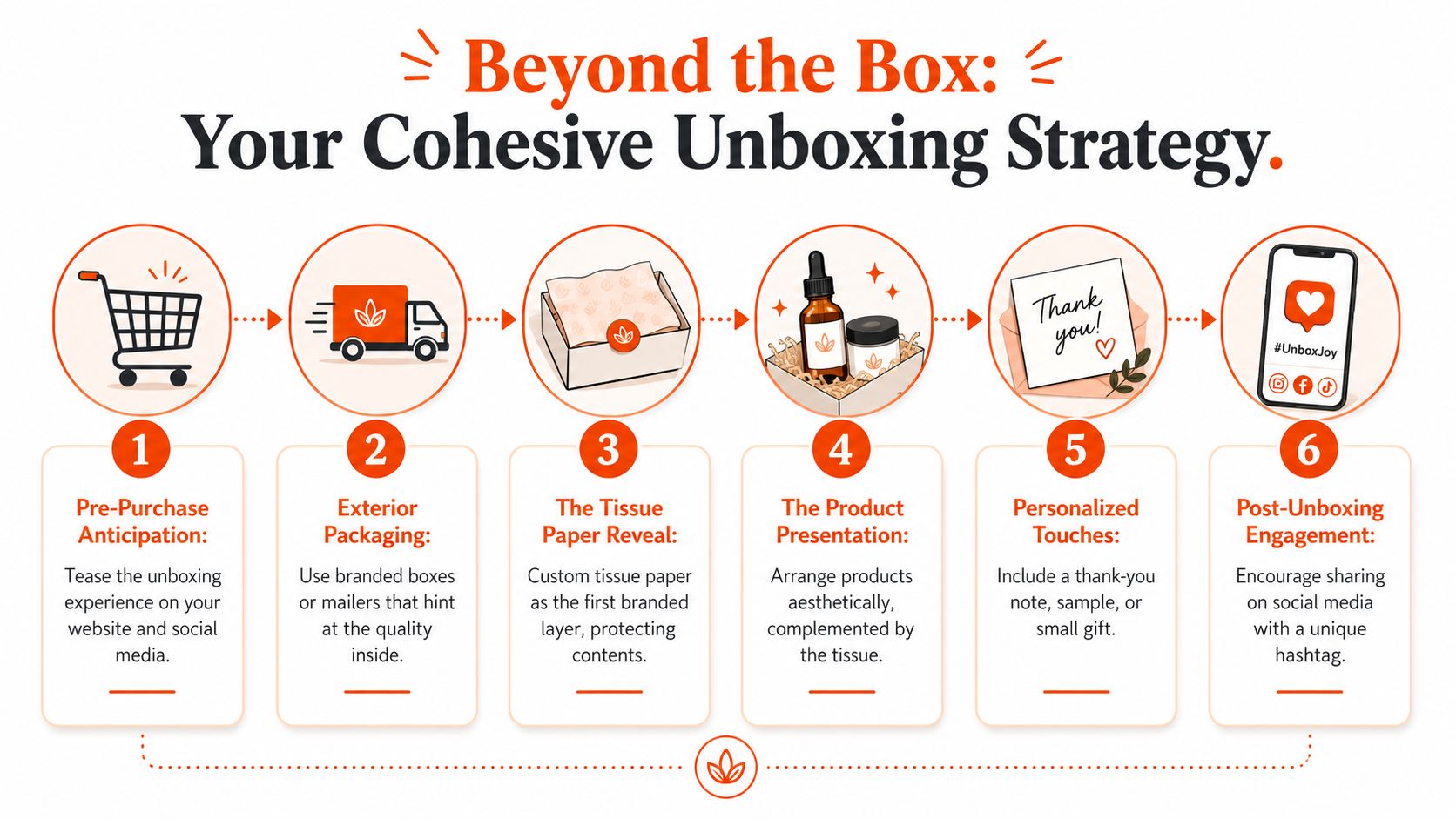
Build layers, not clutter
The cleanest unboxing systems usually have a clear sequence:
- Exterior signal: A mailer or shipper that feels on-brand without overexplaining.
- First reveal: Tissue paper as the soft visual layer that introduces the identity.
- Core product moment: The garment or object presented neatly, not buried.
- Support elements: Sticker, card, thank-you note, or insert that adds context.
- After-effect: A package people want to photograph, repost, or keep.
Every layer should have a reason to exist. If the mailer is loud, the tissue can be quieter. If the product is visually minimal, the tissue can carry more of the pattern language. Good packaging design is mostly about balance.
What cohesive actually looks like
A polished system usually gets these details right:
| Packaging element | Job in the experience |
|---|---|
| Mailer box or shipper | Sets tone before the package is opened |
| Custom tissue paper | Creates the first interior brand touchpoint |
| Insert card | Adds message, context, or campaign framing |
| Sticker or seal | Gives the wrap a finished close |
| Product fold and placement | Controls how premium the contents feel on reveal |
A cohesive unboxing doesn't need more components. It needs fewer mismatched ones.
This matters even more for distributed teams and modern ecommerce operations, where brand experience gets assembled across different orders, addresses, and timelines. The tighter the system, the more consistent the outcome.
For internet-native brands, that consistency matters because the package isn't only opened by the recipient. It gets seen in Slack photos, TikToks, desk setups, event recaps, and internal team posts. A good unboxing extends the identity into all of those surfaces without feeling forced.
The strongest packaging choices are usually the least chaotic ones. One good tissue design. One clear insert. One thoughtful seal. One product arrangement that feels deliberate. That's enough.
If you want custom tissue paper printing that fits a wider merch system, Banger helps internet-native teams build the whole thing properly. From branded apparel and packaging to French atelier production, low minimums, and worldwide fulfillment, the goal is simple: create merch people want to keep, and packaging that makes it feel worth opening. Explore the catalog, request a quote, or get product previews within 24h.