Screen Printed T Shirts: The Gold Standard for Team Merch
The most popular advice on branded tees is also the reason so much merch looks forgettable: optimize for convenience first, then hope people wear it. That logic breaks the product before it's made. If the blank feels cheap, the print looks flat, and the design reads like internal comms, no production method will save it.
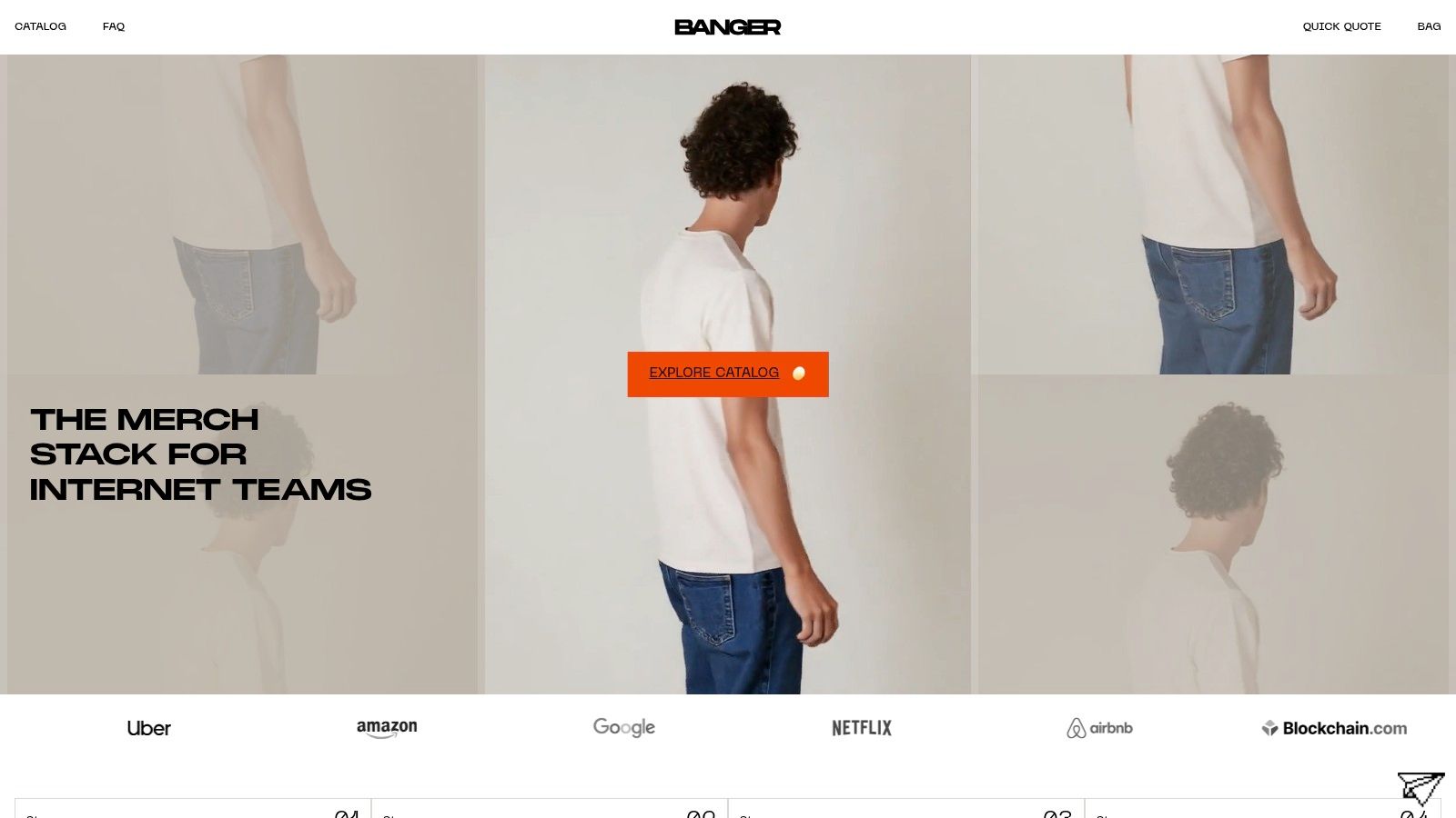
For teams that care about culture, screen printed T shirts still sit in a different lane. Not because they're old school, but because they force better decisions. Fewer colors. Stronger graphics. Cleaner hierarchy. More intention. The result usually feels less like promo merchandise and more like a real piece of apparel.
Table of Contents
Why Most Merch Ends Up in a Drawer
Most branded T-shirts fail before they ever leave the box. The issue usually isn't that people hate merch. It's that they hate wearing something that feels disposable, looks overdesigned, or advertises a company harder than it expresses a point of view.
That matters because demand for custom apparel is very real. One market estimate valued the global custom T-shirt printing market at USD 5.4 billion in 2023 and projected it to reach USD 16.2 billion by 2033, with an implied 11.6% CAGR, according to Market.us custom T-shirt printing market data. So the category isn't dying. People still want branded apparel. They just want it done well.
Bad merch usually makes the same mistakes
A lot of teams still treat apparel like a checklist item. Order some tees for onboarding, ship shirts to a conference, throw a logo on the chest, done. The result is predictable.
- The blank is wrong: Thin fabric, awkward fit, weak collar, cheap hand feel.
- The design is trying too hard: Too many elements, too much copy, not enough restraint.
- The print method doesn't match the idea: Fine-detail artwork gets forced into a production method that wants bold shapes and clear separation.
- The shirt has no cultural role: It doesn't signal belonging, taste, or identity. It just says the company had budget left.
Good merch doesn't beg to be worn. It earns it.
The shirt is the brand
This is the part a lot of teams miss. A T-shirt isn't neutral packaging for a logo. It's an object people put on their body in public. That makes every decision visible. Fabric choice, print style, scale, placement, and finish all communicate what kind of brand you are.
Screen printing works because it has conviction. It favors graphic clarity. It rewards strong art direction. It holds up. And when the design is right, it creates the kind of visual permanence that feels at home in streetwear, music merch, skate graphics, startup team drops, and community uniforms.
If your goal is “something cheap that proves we made merch,” almost any method will do. If your goal is apparel people keep reaching for, screen printing stays in the conversation for a reason.
The Screen Printing Process Explained
Screen printing is basically a high-precision stencil system. That's the simple version. The important part is that it's repeatable, physical, and built for consistency once the setup is dialed.
To ground the process, here's a clear visual.
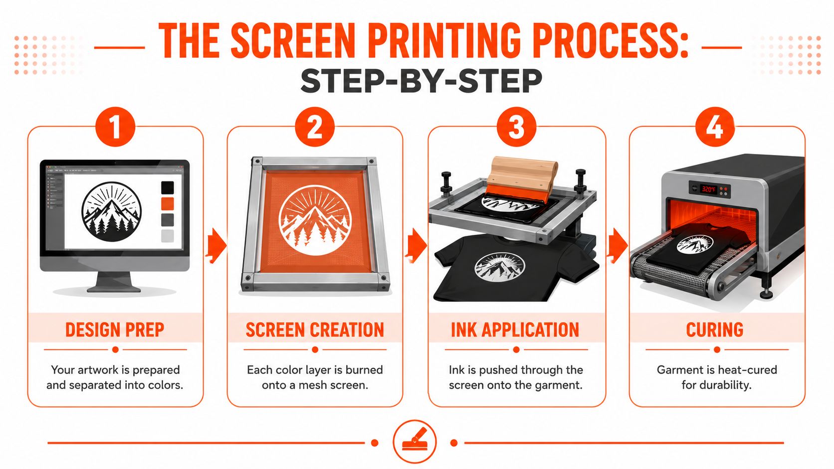
It's a stencil process with real discipline
A printer starts with artwork that has to be separated by color. Each ink color gets its own screen. That screen is a mesh frame coated so certain areas block ink while the design area stays open. Then ink gets pulled across the screen with a squeegee, pushing color through the open areas and onto the garment underneath.
That sounds simple because the concept is simple. The craft is in the setup.
Registration has to be tight so the colors land exactly where they should. Ink deposit has to be controlled so the print looks solid without becoming heavy. The garment has to stay stable on press. Then the print has to be cured correctly so it lasts.
A useful breakdown of related merch decoration methods lives in Banger's guide to merch printing techniques.
Why the result looks different
Screen printing has a long lineage because it solves a real production problem elegantly. Historical summaries trace the modern method to 1907, when Samuel Simon patented silk screen stencil printing in England, and note that it was adapted for mass-market production in the 1960s. A later industry summary says screen printing accounted for 40% of the custom T-shirt printing market in 2025, as covered in Everpress's history of T-shirt screen printing.
That staying power isn't nostalgia. It comes from how the finished piece reads in real life. Screen prints tend to look more intentional on bold graphics because the color sits with conviction. Logos feel crisp. Large placements feel graphic instead of muddy. On bigger runs, the method also makes practical sense because once the setup is built, repetition becomes efficient.
Later in the process, curing locks the print in. That's what gives good screen printed T shirts their durability and visual stability after repeated wear.
If you want to see the motion of the process instead of a static diagram, this is a useful reference:
Screen Printing vs DTG vs DTF vs Embroidery
Choosing a decoration method isn't a technicality. It changes the entire personality of the product. The same logo can feel refined, cheap, athletic, fashion-forward, or overly promotional depending on how it's applied.
If the shirt is supposed to feel like a real garment, not a giveaway, method selection should follow the use case.
Decoration Method Cheat Sheet
| Method | Best For | Feel | Durability | Cost at Volume |
|---|---|---|---|---|
| Screen printing | Bold graphics, team tees, event apparel, larger runs | Can feel smooth to substantial depending on ink and coverage | Strong when produced well | Usually strong for larger quantities |
| DTG | Full-color artwork, painterly graphics, smaller batches | Often softer on detailed prints | Good, but depends on garment and print conditions | Usually less favorable at higher volume |
| DTF | Versatile placement and mixed fabric needs | Can feel more like an applied layer | Good for many practical use cases | Useful when flexibility matters more than classic screen print economics |
| Embroidery | Logos, caps, polos, hoodies, premium texture | Raised and tactile | Strong for the right applications | Works well for logo-driven pieces, not large graphic fills |
For a broader overview of custom apparel options, this custom shirt printing guide is a useful companion.
How to choose without overthinking it
Screen printing wins when the design is graphic, the quantity is meaningful, and you want a piece that feels grounded in classic merch, streetwear, or event apparel. Think two-color chest prints, back graphics, bold icon systems, clean slogans, and branded uniforms that need to look consistent across the whole run.
DTG works better when the artwork behaves more like an image than a logo. If you're printing a detailed illustration, gradient-heavy art, or something closer to a poster graphic, DTG can preserve that complexity better on small batches. It's less about graphic punch and more about image fidelity.
DTF is the practical operator. It handles varied fabrics and can be helpful when production needs flexibility. But aesthetically, it can read differently from a strong screen print. If your brand language leans premium or fashion-aware, that surface feel matters.
Embroidery belongs in a different category altogether. It's not a substitute for a full front graphic tee. It's a textured branding move. Great for caps, left chest placements, hoodies, and uniform-style applications. Wrong for oversized illustrated statements.
Decision filter: If you'd be happy seeing the design on a vintage band tee or a well-made skate shirt, screen printing is probably the first method to test.
One more thing. Teams often compare methods only on price or turnaround. That's too narrow. The better question is: what should this object feel like in someone's wardrobe? Screen printing usually performs best when the answer is durable, graphic, and intentional.
Designing for Screen Printing
A lot of bad outcomes get blamed on production when the underlying issue started in the file. Screen printing rewards discipline. If the artwork is clean, the result can look amazing. If the file is messy, overcomplicated, or built for a different method, the shirt will show it fast.
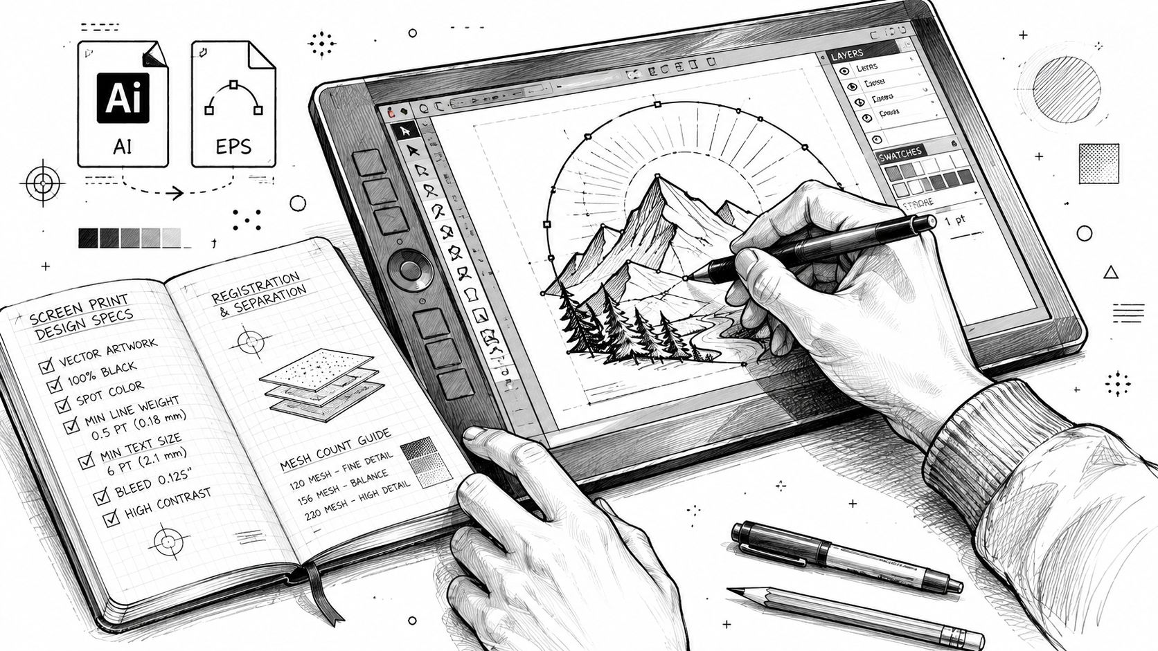
Design for the method, not the mockup
The biggest mental shift is this: don't design a screen print like it's a social graphic. Design it like it's going through a press.
In screen printing, each color requires its own screen. Industry guidance in the provided sources says most presses handle about 8 to 12 colors, while practical artwork recommendations often keep screen-print designs at 6 colors or fewer. That guidance, plus the point that graphics should typically start about 1.5 to 3 inches below the collar, appears in Rely Media's screen printing guide.
That has creative implications:
- Strong shapes beat tiny detail: Fine texture that looks great on a monitor can disappear or become noisy on fabric.
- Limited palettes usually look better: Fewer colors often make the shirt feel more confident, not less refined.
- Negative space is part of the design: Let the garment color do work instead of filling every inch with ink.
- Photorealism usually fights the method: If the art depends on subtle tonal transitions, use another print method.
If you're working across tees and fleece, it also helps to understand how the same graphic behaves on heavier silhouettes. This hoodie blanks guide is useful for thinking about fabric, weight, and how print scale shifts across garment types.
Placement matters more than most people think
A design can be beautiful and still wear badly if placement is off. Mockups tend to flatten the shirt into a perfect rectangle. Real garments have collars, seams, folds, plackets, ribbing, and body movement.
Push the artwork too high and it crowds the collar. Push it too low and the print looks like it's sliding off the torso.
Good placement usually respects the structure of the garment. Front graphics need breathing room below the collar. Back prints should account for shoulder slope and how the shirt hangs on an actual body. Oversized prints need enough margin to feel deliberate rather than accidental.
A few rules hold up well in practice:
- Start with the garment, not just the artwork.
- Scale the graphic to the silhouette. A heavyweight boxy tee can carry more visual mass than a slim lightweight blank.
- Check the print near seams, collars, and edges before approving anything.
- Ask how the ink coverage will affect wearability, especially on larger front prints.
The best screen printed T shirts don't feel constrained by production. They feel sharpened by it.
Cost MOQ and Why Volume Matters
Screen printing is one of those processes where the economics make more sense once you stop looking only at the final unit price. The actual cost story starts before the first shirt is printed.
This visual gives the clean version.
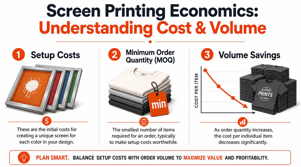
Where the cost actually comes from
A big part of the labor lives in setup. Screens have to be made. Artwork has to be separated. Colors have to be aligned. Test prints happen. Presses get dialed in. That work exists whether you're printing a small batch or a much larger run.
Then color count changes the equation again. More colors mean more screens, more alignment, more complexity, and more chances for small production issues. That's why a clean one-color or two-color tee often has much better economics than an overbuilt multicolor graphic.
Practical rule: If you want screen printing to feel efficient, simplify the artwork before you negotiate the quote.
Why volume changes the math
Once setup is absorbed, larger runs usually become much more favorable on a per-piece basis. That's where screen printing shines. The method is built for repetition.
This is also why teams should think in systems, not one-off panic orders. If you're producing onboarding kits, conference apparel, community merch, or internal team uniforms, it often makes more sense to combine demand, standardize core designs, and reorder proven graphics instead of reinventing the project every time.
Operationally, fulfillment matters too. Production is only half the job. Storage, pick-and-pack, and global shipping can shape the overall cost of a merch program just as much as print setup. That's where a practical guide to merch fulfillment services becomes useful, especially for distributed teams and recurring drops.
MOQ isn't just a factory term. It's a signal about where the method becomes sensible. Screen printing can absolutely be worth it for smaller premium runs, but it reaches its most natural form when the quantity is high enough for the process to work the way it was built to work.
Use Cases For Teams Brands and Events
The best argument for screen printing isn't technical. It's cultural. When it's done right, the shirt becomes proof that a brand has taste, not just a logo.
The onboarding tee
A strong onboarding shirt doesn't need to scream “employee merch.” In fact, it shouldn't. The better version feels like a clean brand artifact. Small front mark, sharper back graphic, good blank, balanced placement.
This kind of piece works because it gives new hires something immediate to wear that doesn't feel like office-issued uniform. It creates internal identity, but it also survives outside work. That's the test.
The community drop
For creator brands, crypto projects, niche internet communities, and culture-driven teams, screen printing is especially effective when the shirt acts like a badge. Not forced belonging. Chosen belonging.
The art direction here can go harder. Bigger back print. Limited color palette. A symbol, phrase, or graphic language insiders understand instantly. The durability of the print matters because these shirts often become favorites, and favorites get worn hard.
The event shirt that doesn't feel like an event shirt
Conference tees usually fail because they're overloaded with sponsor logic. Too many marks, too many obligations, no restraint. The wearer becomes a walking banner.
The smarter move is to design the shirt like a product first. Build around one core graphic. Control the hierarchy. Put secondary branding where it belongs. Treat the shirt as part of the brand environment, not as a printable spreadsheet.
A few use cases where screen printed T shirts tend to work especially well:
- Team uniforms: Clean visual consistency across launches, offsites, and content shoots.
- Founder or community drops: Graphic tees that feel collectible rather than corporate.
- Conference apparel: Higher-impact giveaways that people keep after the event.
- Retail-style merch lines: Apparel designed to live next to actual wardrobe pieces.
When teams get this right, the shirt stops acting like a giveaway and starts acting like a signal.
Quality Care and Sustainability
You can spot a weak screen print quickly. Edges look fuzzy. Coverage looks uneven. The print feels thick in the wrong way. After a few washes, it starts telling on itself.
Quality starts with execution, not branding. The lines should be clean. The ink should look intentional. The print should sit on the garment with confidence, not like a sticker that got heat-pressed in a hurry.
What quality looks like up close
A good screen print usually gets a few basic things right at once:
- Sharp registration: Colors land where they're supposed to.
- Consistent coverage: Solid areas look solid, not patchy.
- Appropriate ink deposit: Enough opacity to read clearly, not so much that the shirt becomes stiff.
- Proper curing: The print stays stable through wear and washing.
There's also a physical test people often ignore. Stretch the shirt lightly and pay attention to how the print behaves. A well-made print should feel resolved, not fragile.
Soft hand is not a small detail
Hand feel is one of the clearest separators between throwaway merch and premium merch. Training content for printers explicitly treats soft-hand print techniques as a real production concern, with specific methods and ink recipes used to make the print feel more integrated with the fabric. That point is covered in this soft-hand screen printing training video.
That matters because people don't experience a shirt as a spec sheet. They experience it on skin.
A heavy slab of ink can make a tee feel hot, stiff, and overbuilt. Sometimes that effect is intentional, especially on certain bold graphic applications. Often it's just lazy production. Better printers pay attention to coverage, fabric, ink system, and artwork so the shirt still feels wearable after the print is applied.
For teams thinking about finishing details beyond the front and back graphic, screen printed labels are worth considering too.
Care and material choices
If you want screen printed T shirts to age well, care still matters. Wash gently, avoid punishing heat, and don't treat the dryer like a stress test. Good prints are durable, but every garment lasts longer when people treat it like clothing instead of promo waste.
Sustainability lives in the same conversation as quality. Better blanks, longer wear, lower discard rates, and more thoughtful production choices are usually aligned. Organic cotton, recycled materials, and eco-minded ink decisions all matter, but the most overlooked sustainability move is simple: make a shirt good enough that people keep it.
If you want to build merch people wear, Banger is built for that lane. Premium European blanks, French atelier production, low minimums, and worldwide fulfillment for internet-native teams that care how the final piece looks and feels. You can request a quote and get product previews within 24h.