Design Custom Corduroy Hats: Premium Quality
The most common advice on custom corduroy hats is also the reason so many of them come out mediocre. People start with the logo.
That's backwards.
If you want a hat that feels like real product instead of event swag, the material and silhouette come first. Corduroy already carries a point of view. It has history, texture, and enough visual character to make a plain cap feel considered before a single stitch goes down. Its roots are often traced to Fustat, Egypt, as early as 200 AD, and it hit mainstream fashion hard in the late 1960s and 1970s, when Levi's sold tens of millions of corduroy jeans, according to this history of corduroy and corduroy hats. That's why it still reads as durable, nostalgic, and slightly elevated all at once.
A good custom corduroy hat doesn't just carry a brand. It belongs in a wardrobe. It looks right with washed denim, heavyweight fleece, a crisp overshirt, or a technical shell. That range is exactly why it works for team drops, creator merch, retail-style capsules, and selective event gifting.
Table of Contents
- Embroidery is still the default for a reason
- Patches solve problems embroidery can't
- What usually fails
- Are custom corduroy hats better for merch or retail-style drops?
- What decoration method looks best on corduroy?
- What kind of logo works best?
- Which hat shape should most brands choose?
- Should I ask for a sample before bulk production?
- Is corduroy too trend-driven?
Not All Merch Is Created Equal
Most branded hats fail for one simple reason. They're treated like inventory, not design.
A generic cap with a front logo can technically count as merch, but that doesn't mean anyone wants to keep wearing it. You see this all the time with conference giveaways and team offsites. The blank is forgettable, the logo is oversized, the fit is wrong, and the whole thing feels like a shortcut.
Custom corduroy hats operate differently. The fabric does part of the branding for you. It signals that someone made an actual choice. Texture matters. Weight matters. The way the ridges catch light matters. That built-in character gives a hat more presence before decoration ever enters the conversation.
Practical rule: If the blank wouldn't look good with no logo at all, it probably won't become a hat people reach for later.
There's also a cultural difference between a cotton promo cap and a corduroy cap. Corduroy sits comfortably between workwear, vintage sportswear, and contemporary streetwear. That gives brands more room to be subtle. You don't need to scream. A small embroidery, a tonal patch, or a restrained side hit can carry much more value on the right base.
Three things separate premium headwear from generic swag:
- Material choice: Corduroy adds depth, softness, and a more collectible feel than standard flat twill.
- Design restraint: Simpler graphics usually look stronger on textured fabric.
- Production discipline: Sampling, file prep, and placement checks matter more on corduroy than on flatter surfaces.
That's the key shift. You're not just ordering hats. You're commissioning an object people might style into their week.
The Foundation Choosing Your Corduroy and Hat Style
A premium corduroy hat usually gets decided before the artwork is even on the page. The fabric sets the mood. The silhouette decides whether people wear it.
Corduroy is the statement
Corduroy can read rugged, collegiate, clean, or fashion-forward depending on the wale. Wale means rib spacing, and it changes how much texture the hat carries from a few feet away.
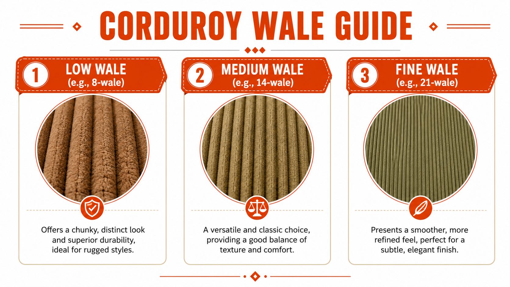
Here's the practical breakdown:
| Wale feel | Visual effect | Best use |
|---|---|---|
| Low wale | Chunkier, more obvious ridges | Vintage, outdoor, workwear-coded drops |
| Medium wale | Balanced texture | Most brand merch and broader audience wearability |
| Fine wale | Smoother, quieter finish | Minimal logos, cleaner retail presentation |
Low wale has presence. It catches light harder, reads more nostalgic, and gives a cap some built-in attitude before you add any decoration. It works well for washed palettes, heritage graphics, and brands that want a slightly tougher hand.
Medium wale is the safest choice, but safe does not mean boring. It gives you enough texture to feel intentional without fighting the logo, patch, or front panel construction. For many custom corduroy hats, this is the right place to start if the brief needs broad appeal.
Fine wale feels more refined. The surface is cleaner, the hat photographs better in close-up, and smaller graphics usually sit with less visual noise. Brands chasing a cleaner retail finish often get a better result here than with a heavily ribbed fabric.
A simple rule applies. The more texture the fabric has, the calmer the rest of the design should be.
Silhouette decides who will actually wear it
After the fabric is set, choose the shape with the same discipline. A good custom hat is not just attractive on a mockup. It has to suit the audience's head shape, styling habits, and tolerance for structure.
Here's how the common silhouettes behave in a drop:
- Low-profile cap: The easiest sell. Softer, more familiar, and better for understated branding.
- Structured cap: Cleaner front presentation and more support for embroidery that needs a stable surface.
- 5-panel shape: More streetwear-coded and more design-aware. Strong option for brands aiming for a retail product, not event merch.
- Bucket hat: Distinct point of view, weaker universal appeal. Good for the right crowd, risky for a broad team order.
The trade-off is simple. Structure improves logo presentation, but too much stiffness can make the hat feel generic. A softer crown feels more lived-in, but weak artwork can disappear on it. I usually advise brands to pick the silhouette that supports the mark and the styling story at the same time.
Closures matter more than many teams expect. Fabric straps with metal hardware tend to feel more premium than basic plastic snaps, especially on corduroy, because the material already pushes the product toward a more considered look. If the hat is meant to feel collectible, the back closure should match that standard.
Some brands realize at this stage that corduroy is giving them the softness and character they wanted without needing a fully unstructured cap. That middle ground often produces the most wearable result.
If you're still comparing directions, it helps to contrast corduroy against adjacent formats like custom trucker hats. That makes the choice clearer. Texture, structure, breathability, and silhouette each send a different signal.
Customization That Actually Works on Corduroy
Corduroy is forgiving stylistically and unforgiving technically.
The ribs give the hat depth, but they also interfere with precision. That's why the right decoration method matters more here than it does on flatter blanks.
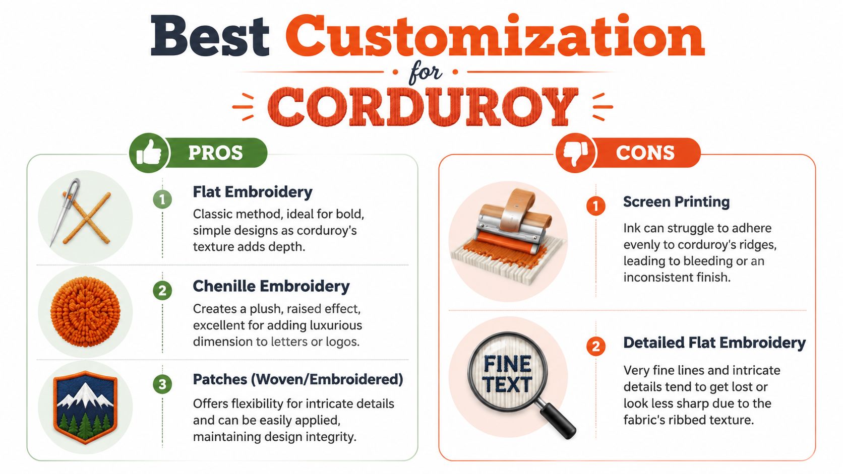
Embroidery is still the default for a reason
For most custom corduroy hats, embroidery is the first thing to test. It matches the fabric well, holds up over time, and feels native to headwear.
Production usually works best when the artwork is digitized first and converted into machine-readable embroidery files such as DST, EXP, or PES, because the stitching itself runs from those formats. Teams also need to lock in thread colors, placement, and size before sampling, and small lettering can distort against corduroy's raised texture, as explained in this guide to embroidered corduroy caps.
That leads to a simple hierarchy:
- Flat embroidery: Best for bold marks, initials, symbols, and short wordmarks.
- 3D puff embroidery: Works when you want a more aggressive, raised statement. Better for larger simple forms than detailed art.
- Tonal embroidery: Usually the most expensive-looking move visually, even if the design itself is simple.
If you're sending a logo for stitch production, this guide to custom logo embroidery is useful for understanding how artwork gets translated into thread.
Patches solve problems embroidery can't
Patches make sense when the logo has more detail than corduroy can comfortably hold. They create a cleaner base and then attach that base to the ribbed fabric.
Here's where each patch type usually wins:
| Method | What it does well | Where it can go wrong |
|---|---|---|
| Embroidered patch | Adds definition while keeping a classic cap feel | Can feel too traditional if the brand wants a cleaner finish |
| Woven patch | Holds tighter detail and cleaner edges | Can feel slightly flatter and less tactile |
| Chenille patch | Gives a plush retro hit that pairs naturally with corduroy | Too much texture if the rest of the hat is already busy |
Chenille is especially strong for collegiate letters, mascots, or simple iconography. It plays well with the nostalgia built into corduroy. Used carefully, it feels intentional. Used carelessly, it starts to look costume-like.
What usually fails
Direct printing on corduroy is the thing people keep trying because it works on tees and flat caps. On ribbed fabric, it's usually a bad trade. The print has to fight the surface.
The common mistakes are predictable:
- Tiny text: It disappears into the ridges.
- Complex crests: They look muddied unless turned into a patch.
- Too many colors: The surface already creates visual movement.
- Centering without scale checks: Corduroy can make a logo feel smaller or more uneven than it looked on screen.
The safest formula is simple artwork, tested placement, and a decoration method chosen for the fabric instead of habit.
If the mark is complicated, don't force embroidery just because it sounds premium. A clean patch often looks more expensive than badly resolved stitching.
Designing for Corduroy Prepping Your Files
Corduroy exposes lazy file prep fast.
The wale adds its own rhythm, shadow, and interruption. If the artwork is too fine, too busy, or built for a flat screen instead of a textured cap, the factory can only do so much. Premium results usually come from editing the brand asset down to its strongest form, then building the files around the decoration method.
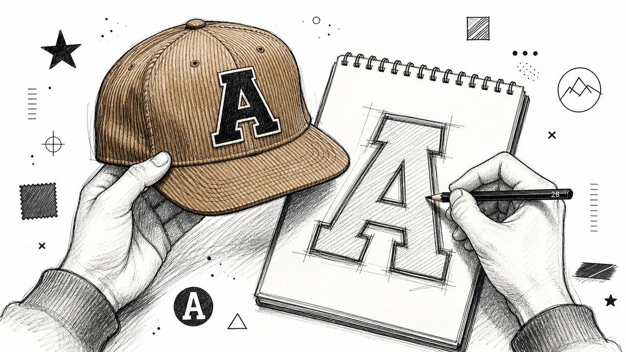
Simplify before you stylize
A good hat logo is rarely the full brand system dropped onto a cap. It is a reduction. On corduroy, that usually means deleting micro copy, cutting the palette back, widening thin strokes, and committing to one clear silhouette that can survive stitching or patch application.
I usually want to see the artwork in one color first. If it does not read there, extra thread colors will not save it. They usually create more noise.
A practical file-prep checklist:
- Start with vector files: AI or EPS files give the production team clean paths and cleaner stitch mapping.
- Outline all type: Live fonts create avoidable approval problems.
- Remove hairline detail: Fine rules, tiny borders, and miniature interior shapes tend to break up on textured fabric.
- Set real color expectations: Thread, twill, and patch materials will never match screen color perfectly.
- Size for the actual decoration area: A mark that looks balanced on an artboard can feel cramped once the crown curve and seam positions come into play.
If you are still deciding what should be stitched, patched, or avoided, this guide to merch printing techniques is a useful reference before final approvals.
Placement matters as much as artwork
Front-and-center is only one option. It works when the icon is strong enough to carry the hat on its own. If the mark needs supporting text or intricate framing to make sense, the front panel is usually the wrong stage for it.
Some of the best custom corduroy hats are quieter. A small front hit can feel sharper than a large logo because it lets the fabric stay visible. Side embroidery often reads more like retail than giveaway. A back mark above the strap can finish the piece without turning it into a billboard.
The goal is balance. The logo should feel placed, not pasted on. On corduroy especially, restraint tends to look more expensive.
Production Pricing and Logistics for Team Drops
Premium hats get expensive fast when the spec keeps drifting.
Corduroy is not the place for a loose ordering process. Costs stay under control when you lock three things early. The blank, the decoration method, and the distribution plan. Change any of them late and the hat usually gets worse, not better. You end up paying for avoidable sample rounds, rushed freight, or packaging that does not fit the product.
Volume changes the economics
Corduroy hats make the most sense as a focused run. One silhouette. One color story. One decoration layout. Factories price that cleanly, and the result usually looks sharper because the whole drop feels intentional.
That structure suits a few use cases especially well:
- Branded drops: A single spec reads more like product and less like promo.
- Team merch: One approved style is easier to issue across departments without quality drift.
- Event programs: Standardized units are simpler to forecast, receive, and hand out.
- Community releases: A tight edit photographs better and holds its identity across the full run.
The trade-off is flexibility. If half the team wants a snapback, another group wants a 5-panel, and leadership asks for multiple logo treatments, unit cost rises and visual consistency drops. Premium merch usually gets stronger when the edit gets tighter.
Shipping should be scoped at the same time as production. If the project includes remote staff, creator mailers, or staggered sends, a partner with merch fulfillment services for distributed team drops can save a lot of repacking and relabeling after the hats are finished.
Fulfillment should match the audience
A hat for a conference behaves differently from a hat meant to arrive on someone's doorstep as a branded object. Bulk shipping works for the first case. Direct-to-recipient shipping works better for the second. That choice affects cartons, inserts, packing labor, and how much presentation matters once the box is opened.
Use a simple planning grid before you approve the PO:
| Drop type | Best shipping model | Creative implication |
|---|---|---|
| Team offsite | Bulk to venue | Keep packaging efficient |
| Onboarding send | Multi-address | Add welcome collateral |
| Creator gifting | Multi-address | Presentation carries more weight |
| Retail-style release | Warehouse or fulfillment partner | Packaging becomes part of the product |
Banger handles custom merch production, packaging, and worldwide fulfillment for internet-native teams. That matters when the goal is a coordinated drop rather than a stack of cartons someone in ops has to sort by hand.
Good logistics protect the design. If the hats arrive late, crushed, split across mismatched boxes, or missing inserts, the product loses value before anyone even tries it on. A strong drop is planned as one system from factory floor to final delivery.
The Details Quality Checks Sustainability and Unboxing
Most hat projects are decided in the last ten percent.
A decent design on a decent blank can still feel cheap if the stitching is off, the fit is wrong, or the hat arrives in thoughtless packaging. In such cases, branded apparel stops being a logo exercise and starts behaving like product.
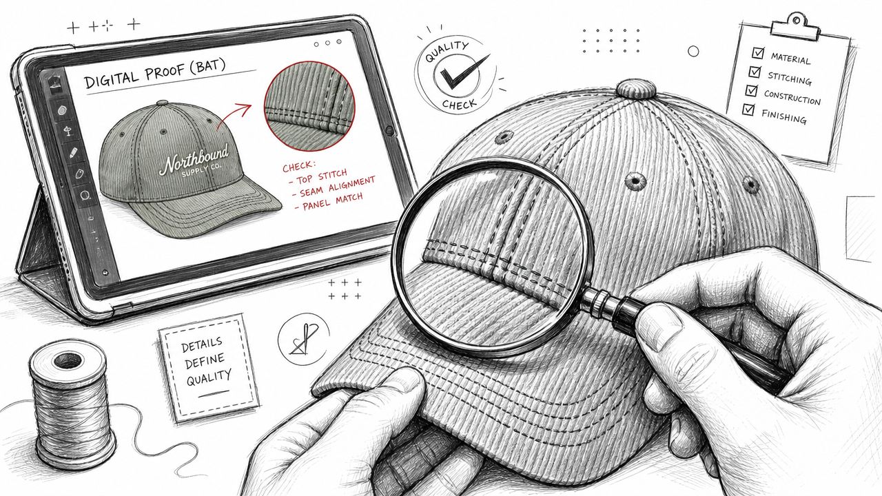
Approve the sample like a product owner
Corduroy introduces more visual variables than a smooth cap. The ribs can affect perceived alignment. Thread can sit differently than expected. A logo that looked balanced on a mockup can suddenly feel too high, too small, or too crowded once stitched.
That's why a sample review matters so much. Existing market content often skips this and focuses only on easy ordering, even though the core question is whether corduroy is right for your use case at all. The bigger tradeoff is visual. The texture can feel premium and collectible, or it can reduce logo legibility and make repeatability harder if the design is too intricate, as discussed in this overview of customization tradeoffs on corduroy hats.
Check the sample for the things people usually miss:
- Stitch clarity: Are edges clean, or are the ridges swallowing detail?
- Placement balance: Does the mark sit naturally on the panel?
- Color behavior: Do the thread and fabric work in natural light, not just under office lighting?
- Shape retention: Does the crown hold the intended profile when worn?
Sustainability also belongs in this review stage. If your brand already talks about material choices, local production, recycled inputs, or better packaging, the hat should support that story instead of contradicting it. Thoughtful branded goods last longer because people keep them longer. That's the useful sustainability argument. Better product, less waste.
If that matters to your team, this guide to environmentally friendly promotional items is a practical starting point for thinking beyond the decoration itself.
A quick production walkthrough helps clarify what to inspect before greenlighting the full run:
Packaging finishes the story
Unboxing isn't fluff. It changes how people value the object.
A corduroy hat tossed into generic packaging feels like leftover promo stock. The same hat in a clean branded shipper, with tissue, a small insert, or even just a sharp sticker seal, lands differently. It feels issued, not dumped.
The product starts at the first touch, not the first wear.
For team drops and gifting, that extra layer matters because it frames the hat as something selected, not something distributed. And once people read it that way, they're much more likely to wear it like real apparel.
Frequently Asked Questions
Are custom corduroy hats better for merch or retail-style drops?
They can work for both, but they lean more naturally toward merch that wants a retail feel. Corduroy has enough character that it can enhance a simple brand mark. If the logo is highly detailed or needs perfect repeatability at small scale, a flatter fabric may be easier.
What decoration method looks best on corduroy?
Usually flat embroidery for simple logos and patches for more detailed art. Chenille can work well when the design language already has a collegiate or vintage sports angle. Direct print is usually the weakest fit on ribbed fabric.
What kind of logo works best?
Short wordmarks, monograms, symbols, mascots with simplified shapes, and bold lettering. Tiny text, gradients, and dense seal-style logos usually need to be reworked before production.
Which hat shape should most brands choose?
A low-profile or structured cap is the safest place to start. Those silhouettes are easier to wear across different teams and communities. If the brand has a stronger streetwear posture, a 5-panel can look sharper.
Should I ask for a sample before bulk production?
Yes. On corduroy, a sample is where you catch issues with stitch clarity, placement, and overall balance. The mockup won't tell you everything.
Is corduroy too trend-driven?
No. It's trend-aware, but not disposable. The fabric has deep roots in fashion and workwear, and when the design is restrained, it holds up well.
If you're planning a team drop, event run, or retail-style release, Banger can help you build merch people want to wear. You can request a quote, get product previews within 24h, and produce custom apparel, hats, packaging, and worldwide fulfillment through one workflow.